The photographer is looking for generalized feedback about the aesthetic and technical qualities of their image.
Description
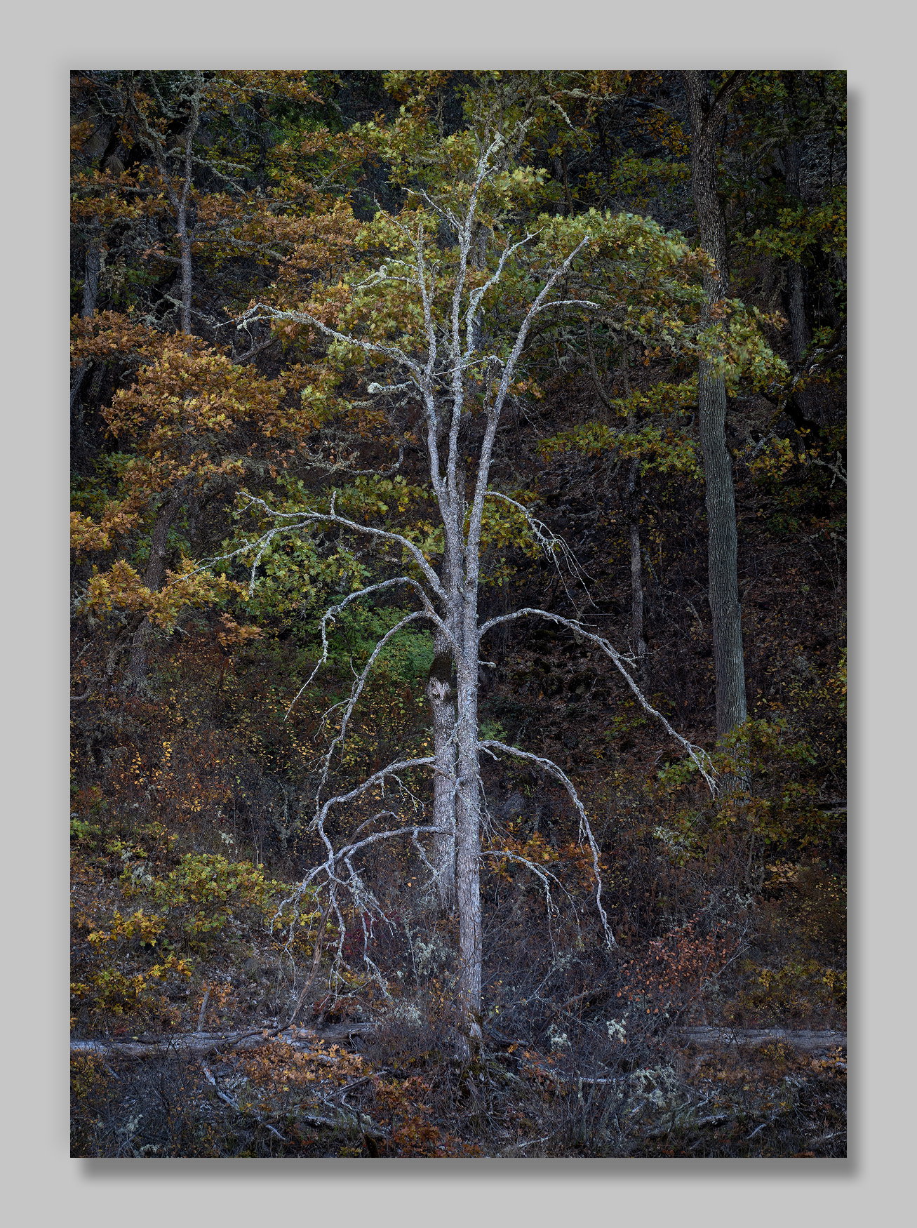
A bit of a different view (from my recent posts) of oak along the Klickitat River in southern Washington State.
Specific Feedback
This one had a stark and lonely feel for me, and I’m interested in your take and any suggestions for improvements.
These trees were tucked in on the far shore, and the sun was just above the top of the ridge behind them. They were in shade, but the sun was blazing into my eyes. I missed that there was a bit of a conifer on the near shore intruding into the bottom right corner, and I’ve cloned it out.
Technical Details
NIKON Z 7II
NIKKOR Z 24-200 f/4-6.3 VR at 200 mm
1/8 sec. at f/13.0 and ISO 64
Critique Template
Use of the template is optional, but it can help spark ideas.
Vision and Purpose:
Conceptual:
Emotional Impact and Mood:
Composition:
Balance and Visual Weight:
Depth and Dimension:
Color:
Lighting:
Processing:
Technical:
The main trees are very interesting, and I love their structure. I do find the large trunk on the right to be mildly distracting because of its mass; perhaps burn it down a tad. I like the subdued color of the leaves that support the main tree. This works for me.
-P
I agree w/ Preston on this one. I’m digging everything about it but that large tree on the right is a minor distraction. I love how the main tree pops from the background. I can’t tell, are their leaves on the main tree or are those behind it? Real nice, John.
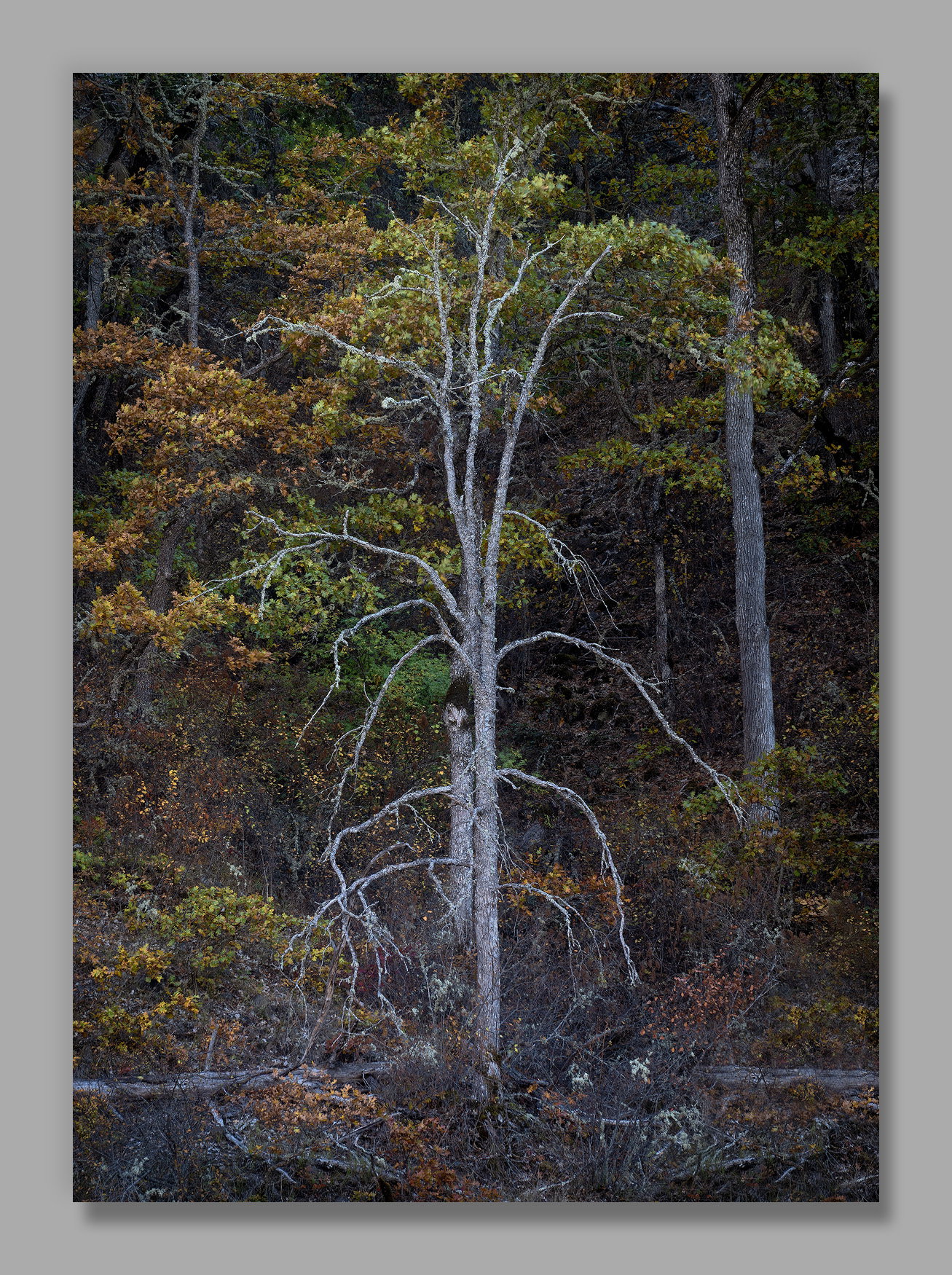
Thanks for the suggestion @Preston_Birdwell . I’m adding a version that is an attempt in that direction. (I also decided I liked the frame a little lighter.)
Looking at the full-size version, I believe they are from behind it.
I like the subdues colors in this Fall colors image, John. I also love the rough textures of the bark and also the debris field that all of the low hanging branches are pointing to on the forest floor. They must be thinking that they’re next.
At first, my eye caught that tree to the right of the main tree and I thought it was a distraction, too bright. But I must admit, I’m not sure the revision is better. I now feel like the right side of the image is lacking in interest and is dark compared to the left side creating an imbalance for me. Now, that may just be me.
I do love the character of that main tree though and the soft colors to the left and behind that tree. And, as I said before, I even like that debris field. It tells a story. Yep, stark and lonely for sure. Well done, John!
Wonderful!!! What an interesting tree and fortuitous arrangement of the leaves behind it! The debris is tonally subdued and works fine for me, although I might burn the horizontal trunk. The tree on the right, I’d maybe go halfway with it. And the area on it above the overlapping leaves caught my eye as more contrasty. Wonderful scene in lovely soft light! A framer for sure!
Yes, the trunks of the main trees have incredible structure and you did well by highlighting them. Everything ties in well to highlight them, especially the darker BG. Like @Diane_Miller, I think you might have burned the tree on the right just a tad too much.
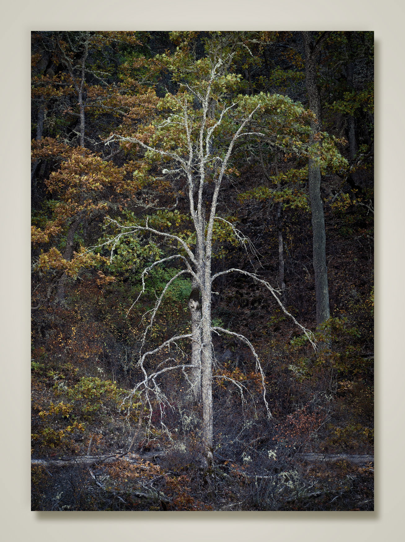
I love this tree. It’s very expressive. I’m in the camp that thinks the tree on the right is a distraction. It’s not really a distraction if you want some of your attention going there but I feel the main tree is so powerful that it should get all the attention. There were a couple of things that I thought could be ‘improved’. I thought the tree was too blue and that it wasn’t bright enough. I suppose if you want to be faithful to what it looked like literally then you leave it alone. But I thought you could exaggerate the tree to make a point. I lightened the tree, moved its color balance away from blue, and added a vignette. It’s something to consider.
John, this is quite stark and burning-in that tree on the side makes it even more so. That treatment also reduces the visual impact of the second tree. It fun viewing to separate the dead tree in the front from its leafy brethren behind.