Not entirely happy with this one but I’d like to get some inputs from you guys. I got into the park pretty late because of LA traffic and I saw the clouds were coming together for a nice sunset. So I decided to just go to this spot thinking that I could come up with something decent quickly. Only after I got home and downloaded the photos that I noticed the ditch on the right. I feel that it’s a big distraction to the scene and I am still upset with myself about it. But I wonder how you guys feel about it. As always, all comments and critiques are most welcome.
You may only download this image to demonstrate post-processing techniques.
The patterns to mountains to a great sky make for a great scene. For me the other elements are strong enough that ditch isn’t a big concern. The awesome sky draws a lot of attention.
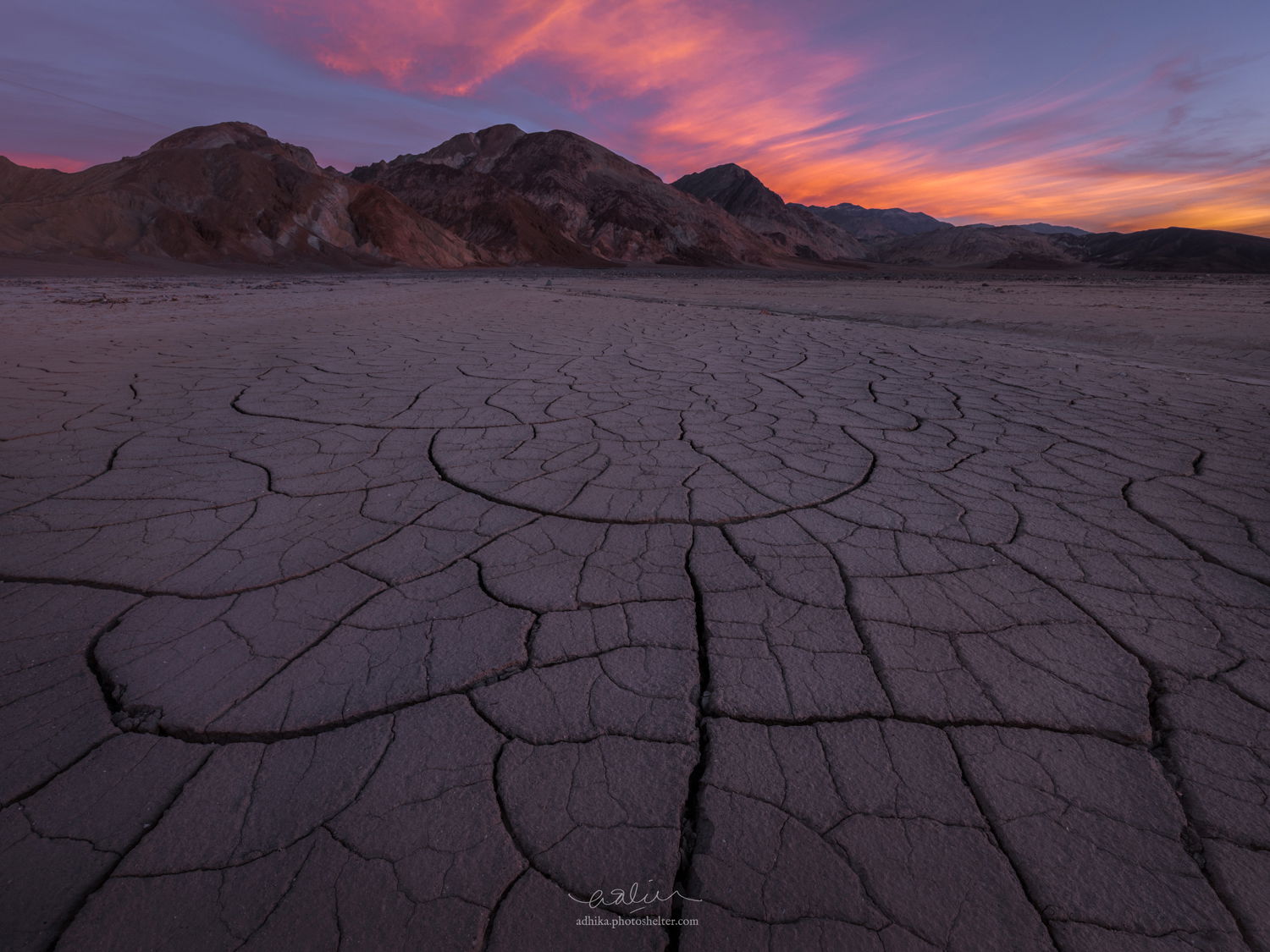
If the ditch bothers you why don’t you try the content aware fill tool to remove it?
Real nice sky for a classic scene. I am of a like mind with you on the ditch. I find it a distraction, but not a total image killer. I second Nathan’s suggestion of trying the CA routine and see what happens.
Thanks, @Nathan_Klein and @Harley_Goldman! I tried CA fill but I didn’t find it convincing… perhaps easier to just go and shoot it again But I will try different selection method though and give it a try again.
The patterns in the mud basin are superb and marry nicely to the sky above being subdued by just about the right amount. Graphically I find the diagonal path that leads off to the right and out of the shot a bit visually disturbing. If you were interested in such a thing (I’m not!), I would imagine eliminating it wouldn’t be too difficult with suitable deference to the PS tool box. I just noticed others have said the same thing.
This is nice, Adhika. The ditch doesn’t really bother me, probably because it leads to the background mountains and sky, and is parallel to the colorful clouds. To me, this feels a little bit foreground-heavy, but not a big deal.
Adhika: i like the image and the comp, but the ditch on the right really does drag me away. I grabbed this file and rather than using Content Aware I used Frequency Separation to remove the ditch. That allows you to deal with Texture and color independently so I was able to clone over the texture of the ditch without messing up any tonal variances in that part of the image. I wasn’t super precise, but you’ll get the idea. on the left there is also a group of darker rocks / dirt that I did the same thing to. Finally I brightened up the foreground just a bit to see more detail. See what you think.
Hey @Adhika_Lie i like how the crack leads the eyes to that semi circle that then leads the eyes to the rest of the image, just great. The light and colour palette its sublime.
The ditch is a bit of a problem for me, not huge, but my eyes keep going there, i think @Keith_Bauer did and amazing job cleaning it (go to try that technique my self), maybe trying it on the original file will get even better.
I definitely did not see it that way initially but you have a point there, Craig and probably that’s what makes me unsure of the ditch. But most of the time I am with @Keith_Bauer and @João_Ferrão here with the ditch being an attention grabber.
This is a new technique for me, Keith and the result that you show does look better than with content-aware fill. I did a quick google search and found the tutorial from Phlearn. Did you create two copies of the layer: one with Gaussian blur applied to it and the other with the blurred layer subtracted from it?
I use the TK luminosity masking tools. in the tools there is a button to create all of the needed layers for Frequency Separation. The TK setup is one layer that is blurred (you decide how much), in normal blend mode. That layer is used to work on Color. The second layer is High pass filter layer in Linear Light blend mode. the two layers are group in a layer group. You work on one or the other with cloning, but be sure the clone tool is set to Current Layer Only, not Current and below. I cloned on the texture because I just wanted to remove the texture from the ditch without affecting the colors.
Far easier to do than explain, especially with the assist from the TK panels.
The link on the tutorial from Sean is a great one and he uses the TK panel to show you how to do it.
Late to the game here @Adhika_Lie, but the image is beautiful. You’ve gone through a nice process of learning how to manage the ditch which I am in agreement would be a deal-breaker for me. The frequency separation method seems to have done a very good to excellent job of dealing with the ditch…good job @Keith_Bauer on the rescue! No other nits/comments. Great conversation and learning here.
Very cool. Thanks for the tutorial @João_Ferrão and @Keith_Bauer. I did not have the TK Panel so I have to do it manually. It’s such a cool feature. I have to play with it a little more.
As for the image, I couldn’t do it convincingly enough on the master file but I think I have lessened its effect somewhat. It’s such a great learning experience. One thing for sure is that I would go back and reshoot it.
Keith, this technique did an amazingly good job of removing the ditch. It really looks natural. Brilliant idea to use frequency separation to accomplish this.
Adhika, I think this is a really strong composition, and you achieved a very nicely arranged / balanced pattern in the mud cracks. But as a matter of personal taste, I prefer the increased luminosity of @Keith_Bauer rework to the darker original.
Adhika, I do not have much to add except I am envious that reshooting is such an easy option for you. I love the cracks you were able to compose, and of course the beautiful sky of the desert.
Adhika, hindsight is such a bummer sometimes…been there and done that way more often that I like to think about. It’s a fine scene. I agree with João about that central semicircle. It has a fine presence and really holds the view together. Having used CA as well as straight cloning, I recognize that “cleaning up” that ditch is almost impossible if you’re thinking about a large print. Meanwhile, keep muttering to yourself and enjoy the prospects of a return.
This is basically it. It’s doable on the 1500px resolution but when doing it on the master file, I was not able to do it convincingly. I am pretty sure my PS skill has something to do with it, too.

 But I will try different selection method though and give it a try again.
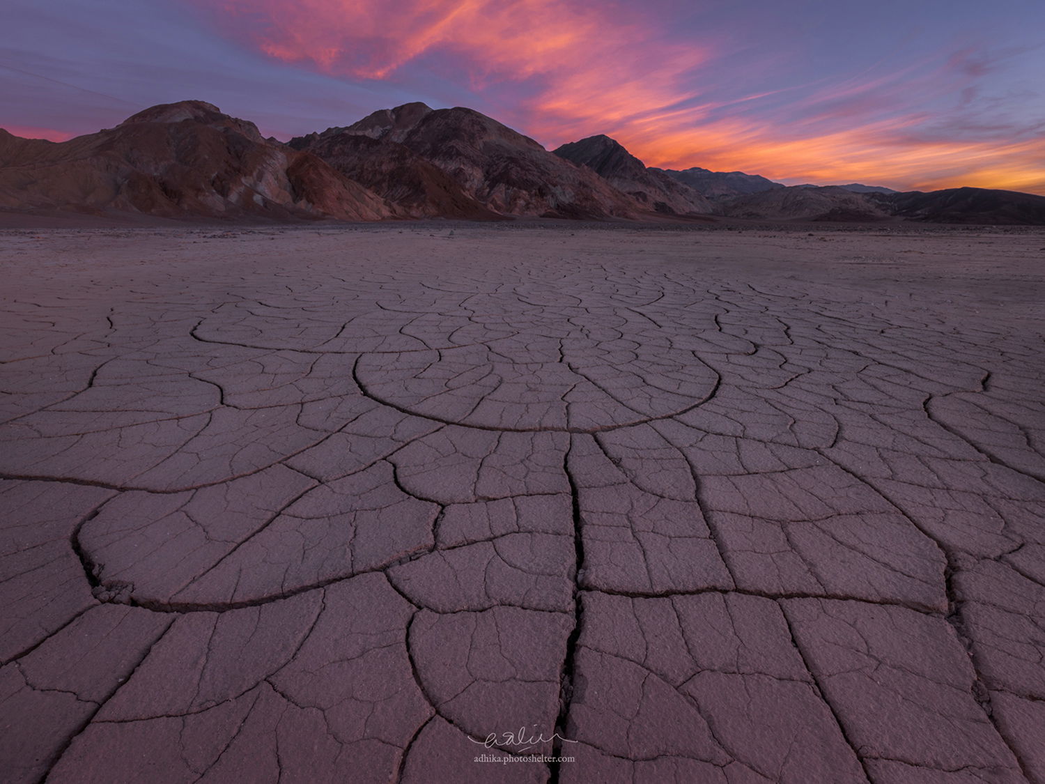

 It’s a fine scene. I agree with João about that central semicircle. It has a fine presence and really holds the view together. Having used CA as well as straight cloning, I recognize that “cleaning up” that ditch is almost impossible if you’re thinking about a large print. Meanwhile, keep muttering to yourself and enjoy the prospects of a return.