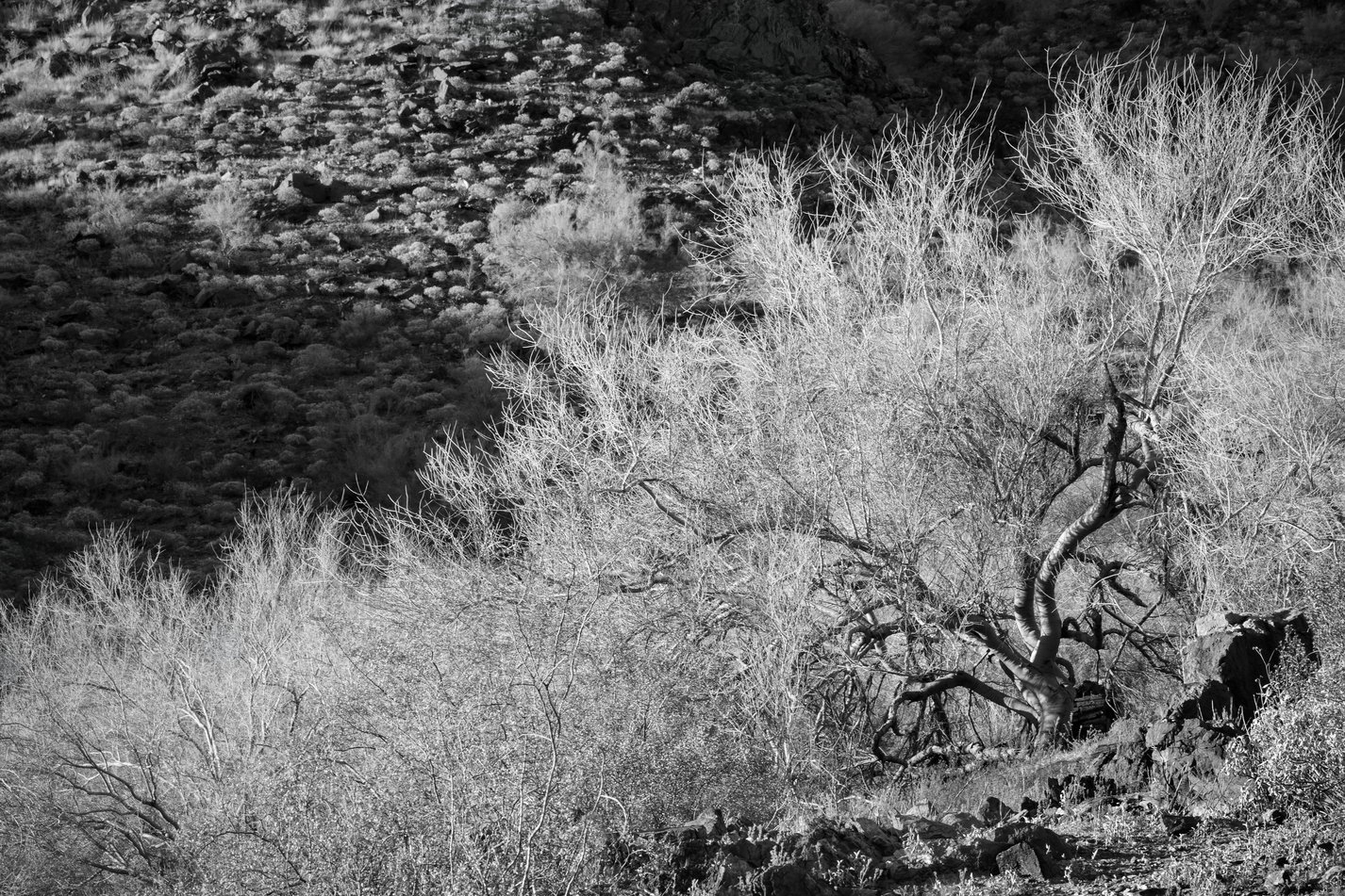
I love the twisted trunk and branches of the Palo Verde, and so the answer for me to your interest question is yes for the right half of the image. The left side, though, does not catch my eye as much.
It would be fun to compare an image from closer, with a wider field of view, using the rocks as anchors with the Palo Verde as the main subject behind.
Hi Don,
I think John is on to something. I like the wash of light and shadow in the background, and perhaps that was part of your strategy when composing the scene. It does feel diffused, though, somehow not close enough to appreciate the twisted branches, or not enough contrast with the background. I would be curious to see this in color. Yes, it’s all about line, but it’s got enough lines that it’s hard to find a focal point.
ML
The Tree and the lines of the Tree in amazing… Great in B&W … I would darken the Background and let the branches shine. Just my opinion. Maybe a slight crop off the left. The tree trunk is the main focus for me.
Great choice to go b&w here. The contrasts are excellent and overall processing spot on.
This certainly is more impressive in the larger view. I’m with Gill in that the core trunk anchors the scene for me. The mass of highlighted little branches enshroud that core beautifully.
I too was thinking of a crop off the left, but the light streaming down from the UL is pretty darn compelling. I sill could see a slight crop, maybe to 4x5 ratio. But that’s pretty minor thought. Actually, after trying it, I think the result creates a pretty compelling Rule of Thirds composition - if you’re in to that. Here’s the visual:
Marylynne, Gill, Lon, sincere thanks for the thoughtful comments. Lon, I like your crop, but for several reasons I try to stick with a 3X2 aspect ratio when I can. In the revision above, I cropped all sides, but mostly the left.
I think I understand what you were after here. The left background triangle is an important counterbalance to the brighter tree triangle. For this reason the an elongated aspect ratio works well. Personally I feel that the highlights in the foreground layer is too bright to a glaring level. I would subdue those highlights.
Totally get and respect that Don. Funny how that all works though… it all depends on the individual’s experience/history. Not hard to understand why my format preference is 4x5… shooting LF for 20+ years. Although personally I try to let the scene dictate what’s needed.