The photographer is looking for generalized feedback about the aesthetic and technical qualities of their image.
Description
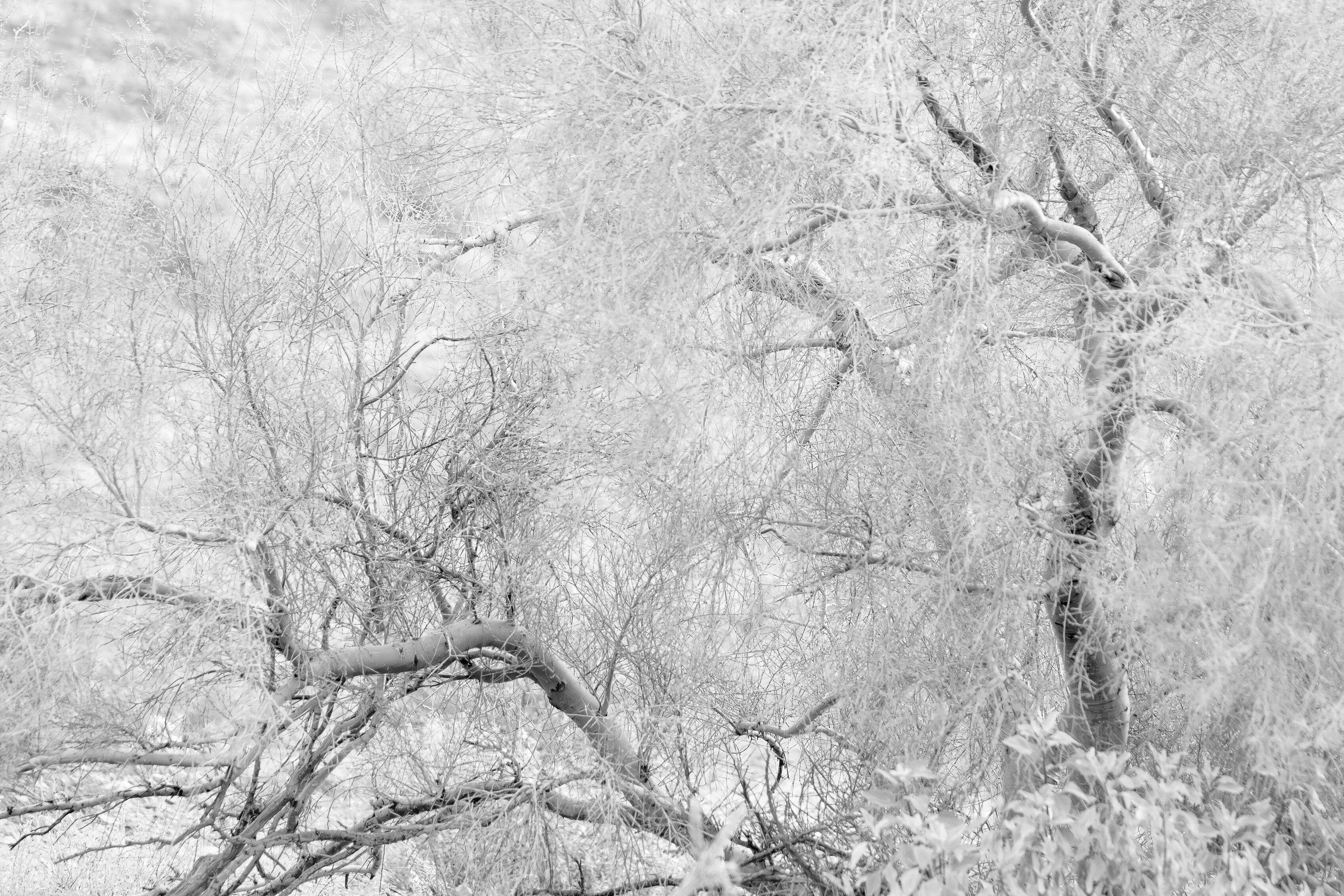
I was walking beside a desert wash and saw this.
Specific Feedback
All comments are welcome.
Technical Details
ISO 800, 135mm, f/5.6, 1/400th sec.
Critique Template
Use of the template is optional, but it can help spark ideas.
Vision and Purpose:
Conceptual:
Emotional Impact and Mood:
Composition:
Balance and Visual Weight:
Depth and Dimension:
Color:
Lighting:
Processing:
Technical:
Lovely structure and high-key treatment! I wonder how some of the so-called sharpening routines would work here – if they would give any sort of artistic filtering effect. Maybe dig out a hint of the what-else it is? Not a criticism of this version, just a loopy idea.
I thought this was a snow scene at first. The only small consideration I have would be to see the image with all the FG limbs a little sharper. They seem a little oof. Don’t know if it would be any better, maybe just different.
I do find some of the blurry foreground distracting, maybe because it feels random. I assume some of those branches are just out of focus, so I wonder if going the other way- increasing the blur of the sharp areas- would be worth trying? It might make the image dreamier- which of course might NOT be what you are looking for.
I do love the high-key treatment. The brightness reminds me of snow!
–Rich
Hi Don,
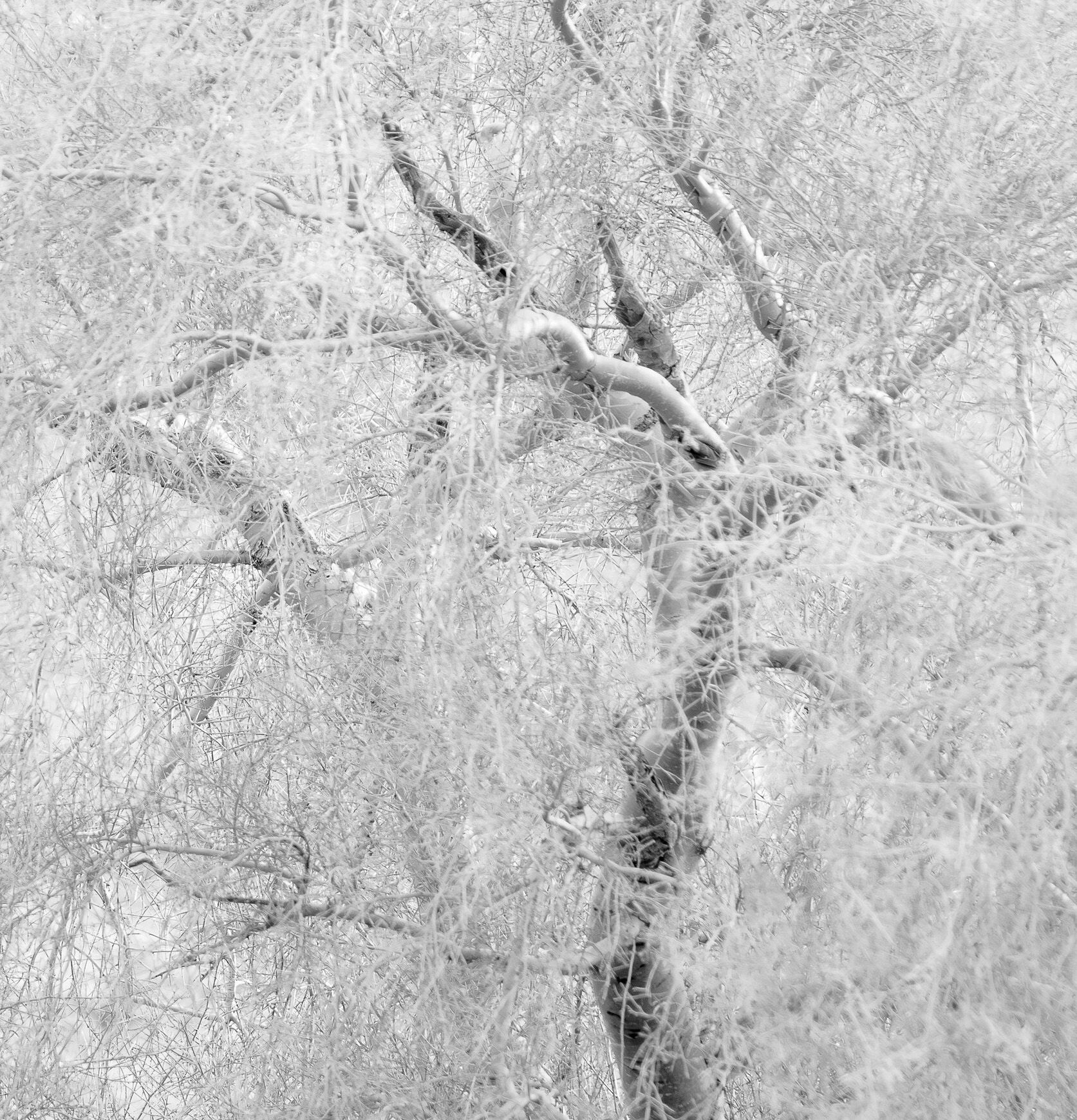
When I first viewed this I too thought it was a snow scene. The high key treatment works beautifully here and reminds me of a pencil drawing. Those OOF areas of vegetation in the FG bother me a little as well. I know this is a pretty radical crop; and may not be your vision; but I find the two trees on the right side a little more interesting than those on the left. I hope you do not mind, but here is a rework with what I was thinking. It also removes some of the OOF areas. Just my opinion of course. This is an intriguing image.
Ed, I like your version and I’m glad you found the image interesting enough to play with.
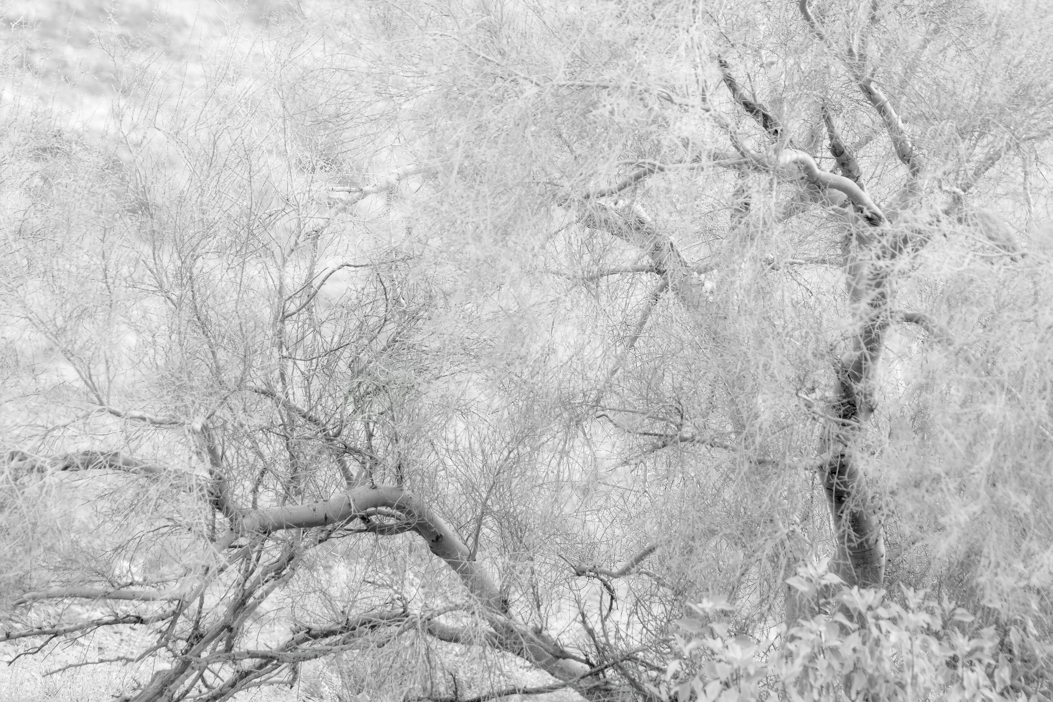
I still like the juxtaposition of the two trees. I paid attention to the comments here and have a slightly modified version that may or may not be final. I lowered the contrast in the tree on the left to make the tree on the right more dominant.