Original post
Edited with David’s suggestions
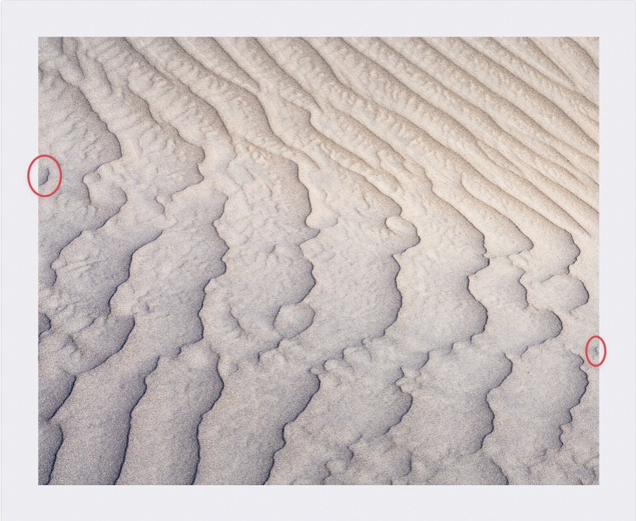
This image is from my recent Death Valley trip. This is just as the sun was setting creating soft bluish warm light and soft shadows. On this outing, I was focused more on shooting intimate sandscapes and how the low angle of the light creates beautiful patterns almost everywhere. I think what I like about this one is that there seems to be texture everywhere. I also like the warm light on the upper part of the image and the slightly cooler light in the shadows below. With sandscapes, the patterns and textures, and lines are constantly changing due to the wind, hence my title.
Specific Feedback Requested
As always, Any and all feedback is welcome and appreciated.
Technical Details
Z7ii, 70-200mm @ 70mm, ISO 80, 1/100 @ f/13, 5 image focus stack
1 Like
Texture is the key word here, David. Nicely seen with the sun angled to accentuate the texture. Nicely done. I like the crop format too. I wonder how this would look in B&W…The two tones of color from the light is striking, but I wonder how monochrome would look contracted solely on the texture. Either way, this is a terrific image, well seen and well captured.
You’re really getting into close intimates now. The texture and lighting is amazing. This has the right amount of texture to it in that it’s alerting yet soothing as well. It’s also interesting to see how there is texture within texture here in this image. Another words smooth texture within the coarser one. Good seeing on your part. Most sand dunes are pretty homogenous within the crests. I do see the color change in the upper part and it works quite well. The combination is interesting because I think I would have made a comp of either one or the other. But the two together work really well and add some complexity to the composition.
Absolutely stunning David. The transitions between the different textures and from cool/warm really make this stand out. Dune textures can become very repetitive if not done well and this is something special. My only little suggestion would be removing a couple of little distractions along the edge to make it nice and clean.
Very interesting and unique with wonderful lines and textures!! I don’t think I’ve seen anything quite like this. It looks like a wind-eroded hard surface. The warmth and different character in the upper corner is interesting but I’m not sure how I feel about it coming close to dividing the image.
Wow, the textures are superb, and the transition between the squiggly vertical lines in the bottom and the angled lines at the top is lovely. I’m with Diane, though, on the warmth of the upper right vs. the coolness of the bottom. My first impression was of unease because of the difference between the URC vs. the lower part, although I couldn’t articulate why it felt odd to me. I fiddled around with color/tones, and tentatively settled on increasing the color difference between the two parts, but still not sure about it. Just throwing this out there for discussion. At any rate, this is very cool. It’s one of those sort of surreal abstract images.
Great feedback everyone. I’ve reposted a revision based on the comments you all, particularly @David_Kingham regarding the the little nubs creeping in from the sides. Thanks for that David. I didn’t see those and the revision I’m posting takes care of those and it’s a major improvement. I also appreciate your kind words.
@David_Bostock Thanks for the comments. I may actually try a Black and white of this but I want to try and nail down the color version first. Thanks for the thoughts though.
@Igor_Doncov You’ve caught me red handed. I’m really enjoying these intimate scenes that seem to be all around us. They feel more artistic to me as well and more like I’m creating my own work rather than the grand landscape type scenes I used to capture from famous locations that everyone seems to have. Thanks for the comments on the coloration. The blueish section was down on the bottom of the dune and the yellower section was higher and more vertical and maybe still catching some golden light that the bottom didn’t get. I have a whole bunch of these blue/yellow dunes images and I’m not sure what to make of them. I like it but it seems to be throwing most of you off so on the revision I’ve tried to tone down the yellows a little bit.
@Diane_Miller I agree Diane, that this looks more like a hard surface than sand dunes. I’ve tried to tone down the warm parts of the image to see if that helps but I kind of like the warm cool gradation. This is full frame so I don’t have any more canvas but maybe there is a crop in there that makes it less 50/50.
@Bonnie_Lampley Wow, that’s a nice take on this image. It’s has way more contrast and you’ve brought the warm parts much further down into the blues and also made the edges a little bit harder. I actually like this Bonnie. I’ll have to sit on it for a little bit but you may have something here. It will be interesting to see what others think. Thanks for taking the time to rework it. Can I ask you how you did it?
PS For some reason I can’t post my revision. The image does not show up anywhere in my computer when this program is open but when I close this program out it shows up on my desktop where I placed it and also in my JPEG photo archives. Really strange. I’ll try again tomorrow. Sorry about that.
I figured out what I did…I exported a Tiff file for some reason and a Tiff is not recognized as a file that can be uploaded so it never showed up. I went in and changed it to a Jpeg and all is good now. I’ve posted the revision.
I can’t seem to get a larger version of Bonnie’s rework to see what you mean about the contrast. There is no link to it from my session. Are you able to do so?
It’s only 600px, so not big enough to trigger the lightbox since it’s already displaying full size.
This is an absolutely fantastic image, David. I love the beautiful soft light and the calm colours. Absolutely no nits from me!
I like the subtle transition from cool to warm tones David. The textures and lines are also very enjoyable.
Your time away was certainly productive. I can imagine how connected you must have felt in the landscape otherwise I can’t imagine how you would have come to take these photographs. Bravo. This one is a beauty. While I like Bonnie’s revision, I do prefer your own subtler revised version. This kind of photography invites the reader to engage the image much as the photographer did in making the picture in the first place - patiently and respectfully - a true dialogue.
Thank you @Tom_Nevesely for your comment. This is very low contrast as the sun had either just set or was just setting. I can’t remember.
Thank you @Eva_McDermott for your thoughts. I appreciate it.
Thanks @Kerry_Gordon . It was early Springtime and I actually was not expecting too much for the Utah portion of this trip as the leaves were just starting to appear on the trees in the lower elevations and lots of trees were still bare in the upper elevations so I figured I’d be doing lots of intimate work and to be honest, this trip was really about going to Death Valley with a couple of other locations thrown in at the last minute. I had already planned my days off and when I went to book the hotel in Death Valley, everything was completely sold out. That’s why I added Utah to the trip (to fill in the first 6 days until I could get a room in DV) because the following week in Death Valley had 1 room left.
Anyway, I had a blast, took lots of pictures and came away very happy with some of them. Thanks as always for your comments Kerry.
Hi David.
This is very nice, a beautiful crafted picture.
I love all the detail and texture, and the beautiful color contrast.
Very nice.
(Your original post is my favorite).
Thank you @joaoquintela. It seems as though about half like the color contrast and the other half doesn’t. I’m glad you like it. I appreciate you comments.
David,
Love this! I think the warm/cool color balance/transition works well here - but the star really is the fascinating textures and patterns. In fact, unless you’re a hard-core sand aficionado… I’d be hard pressed to recognize this from the dunes… This is simply a wonderful nature abstract.
Back to the colors - if anything I might actually reduce the transition rather than increase it. Too much variation from warm to cool seems to just serve the notion of a split composition, a yin-yang composition, etc. A more subtle transition allows the actual patterns, textures and details to be showcased.
Wonderful image - great vision to isolate this one.
Lon
The lines and textures in this image hold my interest throughout the scene. The composition has nice flow and keeps my eye moving around. I do like the repost and think that it’s a nice improvement.
@Lon_Overacker @Brian_Schrayer
Thanks very much for your thoughts on this one. This one certainly has drawn mixed reviews with the color transition. I tried ever so slightly to desaturate the warmth in the repost but it is very minimal. Perhaps I could go a little bit farther to make it even more of a subtle transition as you suggest Lon and Brian. Thanks again. Great to see you posting and commenting so much Lon! I missed your images and your comments. Great to have you back again!!!
1 Like