Critique Style Requested: Standard
The photographer is looking for generalized feedback about the aesthetic and technical qualities of their image.
Description
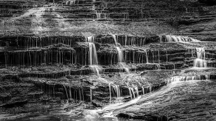
When I originally photographed this scene, one of the smaller cascades on the Subway “bottom up” hike along the Left Fork of North Creek, I didn’t envision it as a black and white. It was still fairly early in the morning and there was really nice light above the cascades along the canyon walls. But the more I worked with it in color, the more I realized that the real interest is in the hundreds of little streams trickling down, accented by larger streams flowing thru the center and also diagonally at upper left and lower right. It became a composition much more of curves, lines and balance. I think it therefore works much better simplified to high contrast black and white?
Additional backstory… I also did not envision when I was photographing this scene that it would be the last images I shot with the DSLR I was carrying at the time. Just a few minutes after shooting this, I went scrambling up the canyon wall a bit to find a higher vantage point. A bit of rock broke off under my feet and tumbled down a few feet, scraping up one shin and the opposite knee pretty good. The camera fared much worse, as I lost hold of it and it dropped 10-15 feet, severely damaging the 24-70 lens as well as the body.
It was the only “real” camera I carried that day, since I was more concerned about hiking in the water. For the rest of my hike to the Subway and back that day, I shot with “just” a Canon Powershot G7X. It’s not a bad little camera, but let’s face it, the Subway deserves more than a compact camera with a 1" sensor. Fortunately, I was at least able to use an undamaged part of my CPL filter by hand-holding it over the Canon’s lens element. Not ideal, but better than my smartphone (Galaxy S21 at the time) could do!
Technical Details
Nikon D780 w/ Nikon 24-70 f2.8 @ 56mm
1.0 Second @ f16, ISO 100; -1/3 EV
Critique Template
Use of the template is optional, but it can help spark ideas.
- Vision and Purpose:
- Conceptual:
- Emotional Impact and Mood:
- Composition:
- Balance and Visual Weight:
- Depth and Dimension:
- Color:
- Lighting:
- Processing:
- Technical:


