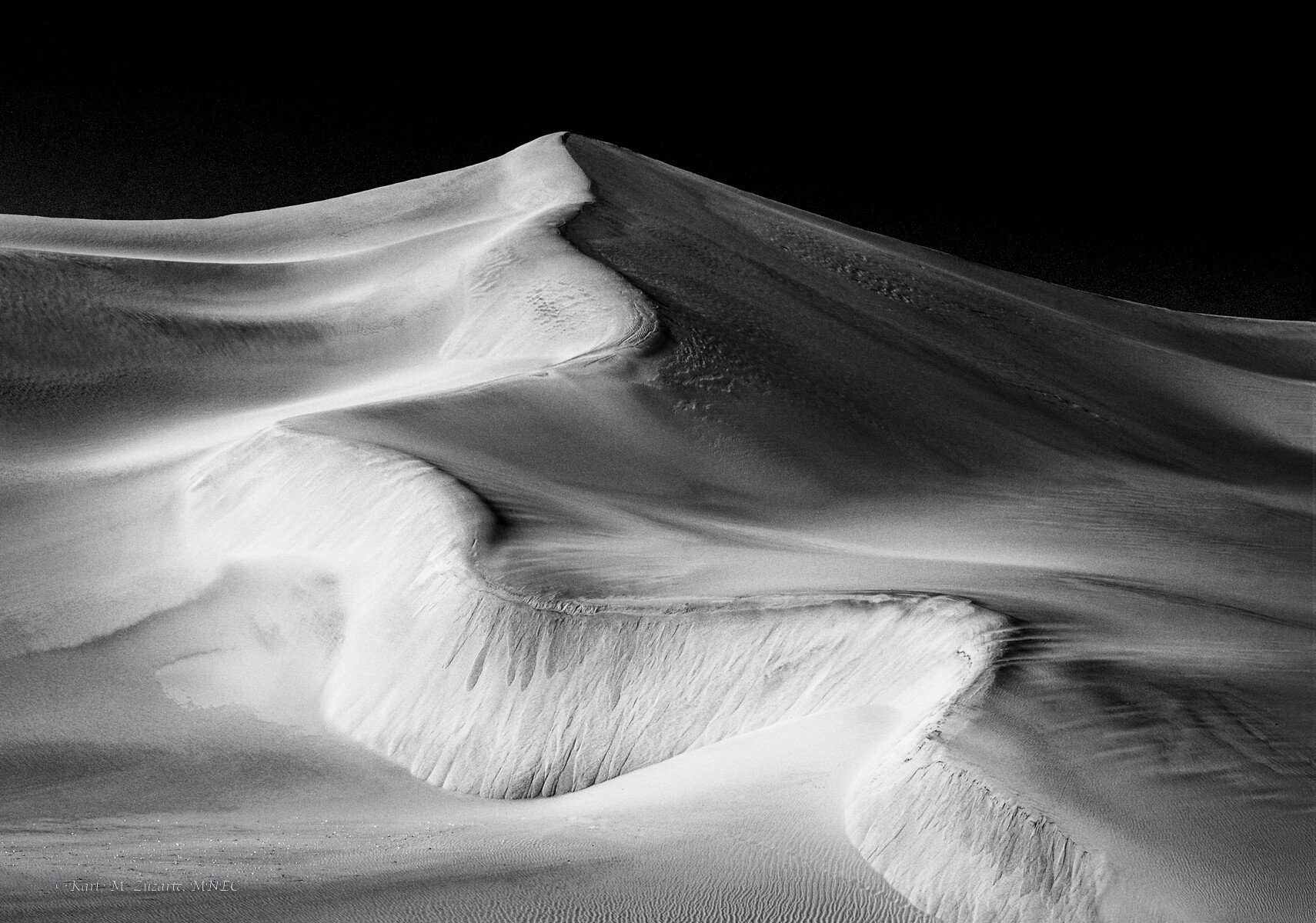
Photographed around 11 am in Swakopmund, Namibia recently - simply trying my hand at B/W conversion
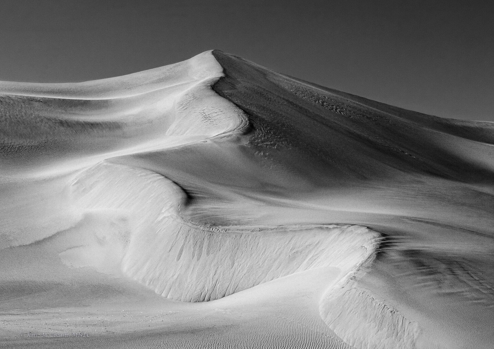
The color version seems OK too even though mid morning
Specific Feedback Requested
Does darkening the sky have an appeal ?
Middle bottom - clone those footsteps ? If so, how to use the clone stamp with Content-Aware ?
I like it and the dark sky, but that’s because I know the magician’s trick here and can appreciate why it was done. It does look a bit odd though since there is so much sidelight. Great textures and the shapes in the dune itself are marvelous. Large it seems a bit softer, but still good. If you could tease out more of the bright areas on the dark side of the sand that could be interesting. Careful and precise luminosity masking would do it - you could use a Lights mask as a stencil with a dodge layer to do it I think. Assuming you have the TK8 panel for Photoshop. Oh and Content Aware with the Clone/Healing brush tool is a checkbox at the top over the photo itself I believe. Next to the drop down for size and near the Use all Layers button. I think the other choices are Proximity and Paint Texture or something like that. But I don’t mind the footprints.
The thumbnail for this grabbed me right away – I think it’s wonderful!! I love the meandering bright dune face. It is all the more interesting because it has the look of a B/W negative. I don’t mind the dark sky – it looks very IR – but might be interesting to compare a version just a bit lighter.
As-is, you have quite a strong monochrome image of dunes. I truly can’t notice the footsteps, meaning I would not bother cloning them out; they add dimensionality to the scene, as well as showing a bit of scale, once noticed.
I would perhaps play around with the overall darkness of the sky. Especially due to the natural lighting of the scene, it may look more refined with a gradiated sky, rather than it being all pure-black. Nonetheless, it looks pretty solid as it stands currently as well.
This is an awesome composition, Karl. And B&W serves it well. I agree with the others that the sky might be a bit too black. I think @Cody_Schultz’s suggestion about a graduated filter would work nicely.
I think the second version is a nice improvement. The relative luminosity of the sky versus the dunes looks more natural. Overall very nice composition.
I like both versions but in the top I would maybe darken some of the brightest highlights in the sand. Having the dark sky makes these highlights look brighter. I agree that the reworked version is perhaps more cohesive and the highlights seem better balanced in the image. Try the opposite and make it a darker moodier image. I did some quick darkening in PS to give you an idea. Great image!
First comment would be to say that regardless of any interpretations, you have an outstanding scene, image and setup that anything after the fact of this composition and set up, is simply personal choice and preferences.
I think your original post is super dynamic and graphic - in the Ansel Adams genre of blacks and whiles and being able to process the contrast, lights and darks to achieve whatever outcome you want. To that point, I don’t mind the black sky - if one imagines a night image illuminated by a rising moon?
I really, really like @bryannelsonca 's rendition. I think the reduction in stark contrast really works well with this image.
As mentioned, a fabulous dune image where this could be taken in multiple directions.
Stunning leading line on this image, Karl. I think the sky in the original post is great and highly contrasty which is fine but I prefer the rework that @bryannelsonca did to better balance the highlights and the darks in this image. I guess it’s all about what you want the image to say. It’s a beautiful image either way.