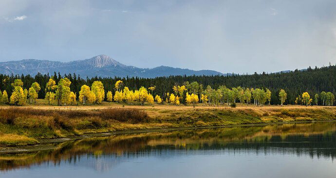
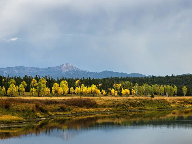
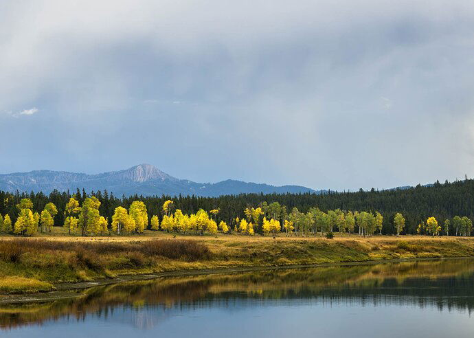
3rd edit (pano):
2nd edit:
Original:
Critique Style Requested: Standard
The photographer is looking for generalized feedback about the aesthetic and technical qualities of their image.
Description
I took this picture last September on a trip to Jackson Hole. This view is looking toward the east side of the valley, away from the Tetons. There aren’t any dramatic peaks in this scene, but I really liked the bend of the river, the bench with the aspens just turning yellow, the low peak in the background, and the moody sky. I thought my first edit looked a little flat, so I recently decided to take another shot at processing this image.
Specific Feedback
I made a lot of light adjustments in Lightroom and used a few different masks on different parts of the sky to tone down some of the bright areas. I played around with removing the tiny, bright clouds, which I find a little distracting, but ended up deciding to leave them. I used the point color tool to brighten up the aspens on the shore. I like this version a lot more than my initial edit, but would still definitely appreciate any feedback and suggestions for improvement.
Technical Details
17-70 mm lens, shot at 64 mm, ISO 100, f/10, 1/160 sec.
1 Like
That’s a lovely view. I love that lower left area John, and played with a crop that’s a bit more symmetrical. I also think warming the image a tad is worth playing with.
Hi @John_Williams, thanks for your suggestions. I like your crop, although I think I prefer a wider view of this scene that takes in more of the shoreline. I tried a slightly tighter crop in a re-edited version, and I also tried warming things up as you suggested. I like the results of that–I think it added some richness to the colors on the shore. I posted a re-edited version above for comparison. It’s not vastly different, but I like the changes. Thanks again for the feedback!
1 Like
John,
This is a wonderful autumn landscape. I too really like the shoreline and of course the line of aspen color against the backrop of the pines - creating nice color contrast and separation.
I really like John’s crop and processing - but I also think I might favor a pano crop to keep the length of the shoreline and treeline in tact. For me I think there’s a bit too much sky/clouds. I can see there’s a hint of stormy clouds which I think is ever so slightly adding drama in the sky, but I’m not sure if there’s enough drama or contrast in the clouds to prevent from considering a crop.
I tried the pano crop, and also attempted to paint some contrast in the clouds - but of course very limited in what one can do with the compressed jpg, so i’m not entirely sold on the processing of my edit here, but wanted to consider the pano crop.
Great thing here is that you have a beautiful scene that with some personal choice tweaks can really make this stand out. Here’s a quick try, YMMV:
Hi @Lon_Overacker, thank you for the feedback and suggestions. I’ve kind of been chasing my tail with this one. I had tried a similar pano crop earlier and for whatever reason decided not to go with it. But I think you are right. Given the horizontal nature of most of the elements in this image, I think it is the best choice. I’m attaching my current version above. Thanks again for your suggestions!
1 Like
Your photo brought back fond memories for me. I used to hunt with my Dad on the tall mountain in your shoot. Bagged my one and only Moose on the other side of that mountain 58 years ago when I was 14 years of age. That’s the emotional part of the critique.
I prefer your panorama. Probably because I shoot mostly panos myself. I do agree with the comments that warming up the foreground a bit looks nice. I might apply a little haze filtering to improve the contrast on the mountains.
Hi @John_Freeman - That is a great story! I’m glad the image reminded you of that experience. My buddy and I saw quite a bit of wildlife when we were on this trip, including several moose. We didn’t see a moose at this spot, although shortly before I took this picture a beaver swam across the river in front of us, which was pretty cool. Anyway, thanks for your feedback and suggestions. I agree that a little more contrast on the mountain might help a bit, so I’ll give that a try.


