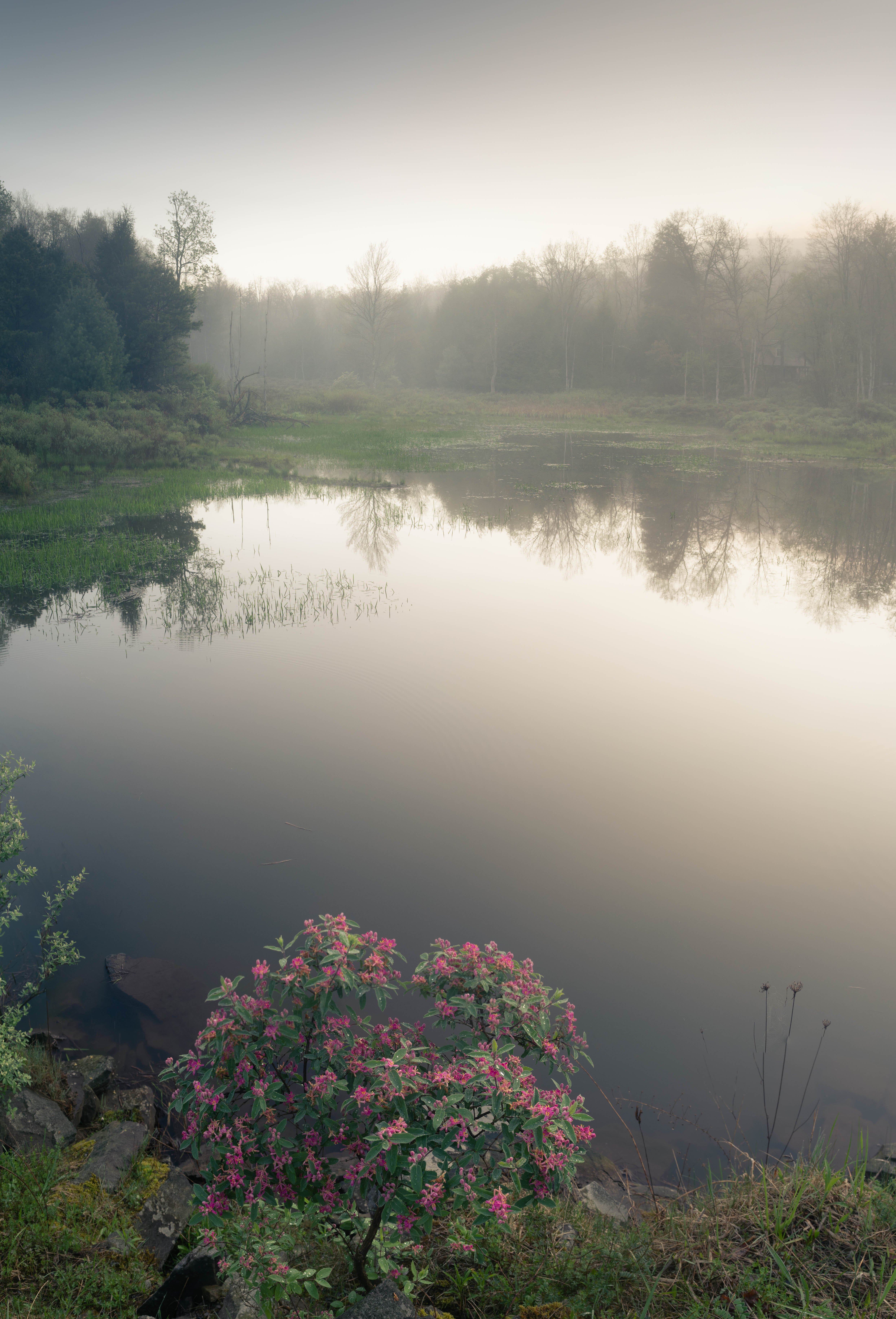
Another image taken during superb early morning misty and foggy conditions near Alpine Lake, WV. Because I only had my 18-55 mm lens available for wider shots, I had to shoot this as a two-shot vertical panorama each at 18 mm, stitched in Lightroom, in order to capture the full foreground with the flowering shrub as well as the pond and misty trees in the background with just enough sky for context. I am really pleased with the final image, as it think it nails exactly what I experienced in the scene in terms of the anchoring foreground interest of the shrub, the perfectly still water with the reflection of the primary lone tree in the background, emerging from the mist.
Looking forward to any feedback or critique, particularly on any technical aspects and especially post-processing.
This is a lovely atmosphere. Thank you for posting!
I think your handling of the processing is very nice. You’ve accentuated the scene so that the foreground (is that a rhododendron?) has a nice amount of contrast and color and fading naturally to the background.
I have two thoughts of feedback. While the mid-/background reflection is gorgeous, the expanse of water between the foreground and the bottom of the reflection seems to disconnect the two. Not knowing how accessible the area is, it would seem that getting a bit closer/lower to the foreground plant would have allowed you to remove a bit of the water in the mid ground and allow more flow between the front and back.
Only one tiny idea for processing. The plants jutting in from the lower left are a little distracting. You might be able to clone some or all of them out.
Adam - thanks for this great feedback. Will have to see next time I can check out this scene again whether it may be possible to capture from a lower angle to reduce the mid-ground. Also, will take a look at removing the small plants at the lower left.
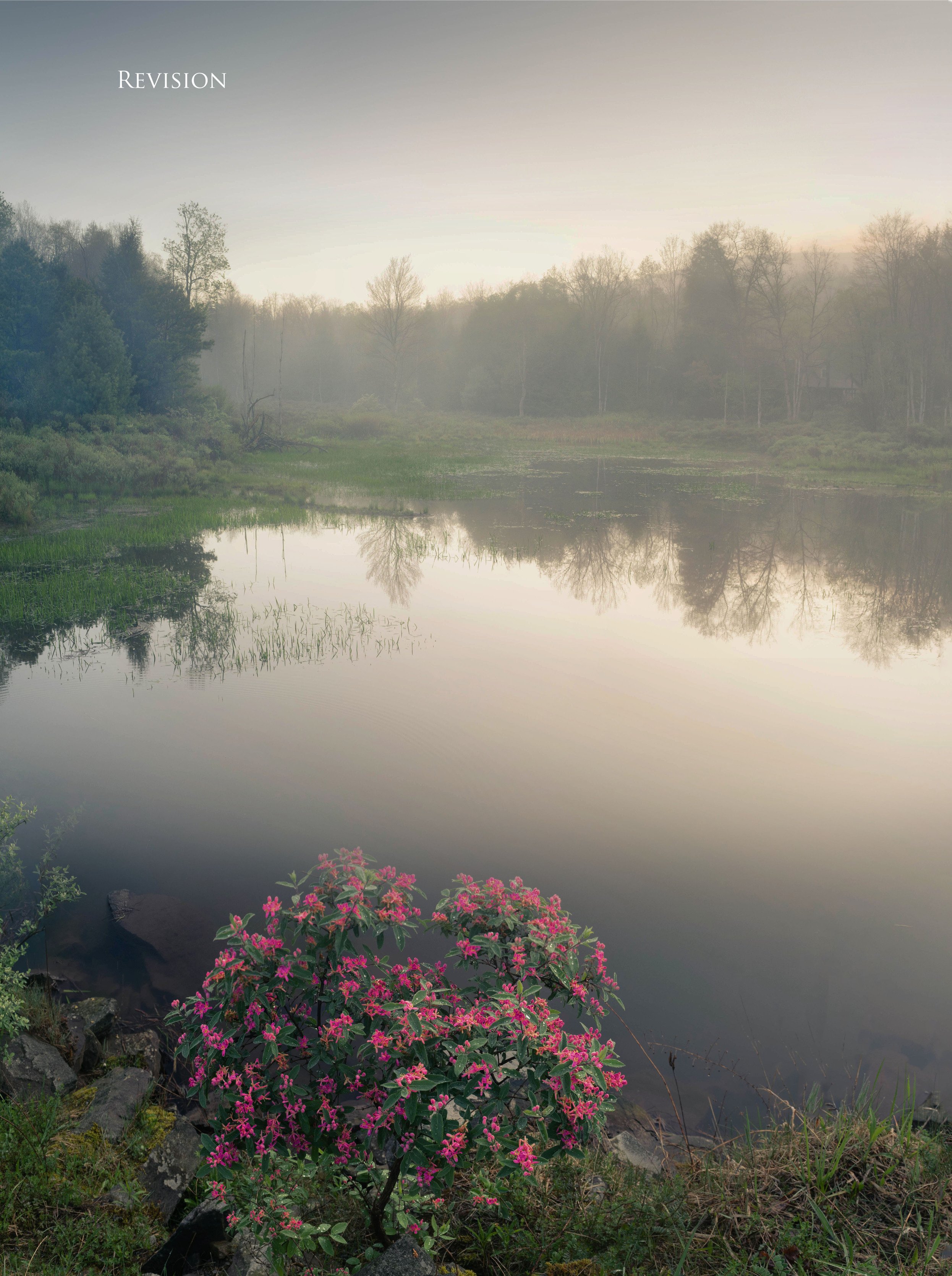
Good morning Griffin. Welcome to NPN. I really enjoy this image because I really enjoy being in places like this! I think @Adam_Bolyard gave you some good advice about the distance between the FG and the BG. Another way to reduce the perceived distance would be to get lower so that the beautiful flowers in the FG would appear higher in the scene and you wouldn’t see so much water between the FG and BG. I downloaded your image and played with it a little; don’t know if I helped or hurt to be honest with you. I tried to allow the FG flowers to “speak up” and I played with the light in the BG to try to give it a little more mysterious feel… That’s the part where I’m not sure I helped at all. Only you can be the judge there.
Thanks Nathan - I agree the image could still work in this format, although I personally hate to lose the foreground interest… curious to hear what others might think on your points though!
The issue with the crop is that the focal point turns into the bits of grass poking out of the water, which to me isn’t much of a subject. This is a good demonstration for why the shrub is important, it’s an effective anchor.
In a perfect world where you could arrange everything just so that crop might stand out if there was a boat in the water or perhaps some wildlife.
Thanks Seth - I think your explanation for why the foreground here is needed expresses how I was thinking about it as well. Appreciate you putting that into words better than I did!
Griffin, I love the mood and atmosphere you have in this scene. The fog adds a very soft and delicate feeling, which contrasts nicely with the relative sharpness of the foreground flowers. I do think the foreground flowers are a crucial element to both the image, and the story here. I think the soft/sharp contrast thing is important to maintain. While your processing is pretty good, I really like the subtle tweaks done by @Bill_Chambers in his rework. His tweaks elevate an already good image another notch. The increased warmth and saturation the foreground flowers and grass creates some more contrast against the cooler, less saturated background. I also think Bill’s subtle recovery of sky highlights helps.
To me this foreground is important because it creates a variety of contrasts in the image, in addition to it’s obvious role as an entry point/anchor.
While I like this image a lot as presented, I can also see the point raised by @Adam_Bolyard about the amount of mid-ground space, and perhaps getting down lower to reduce the amount of empty water in the scene.
As presented, I don’t think the foreground and background are necessarily disconnected, but rather that they might feel more connected if a different lower perspective reduced the amount of real estate in the water. I did a rework to simulate the look of getting down lower, by using PS masking on two copies of the image to reduce the amount of mid-ground water. I do not recommend you modify your image in this way since it involves some serious PS trickery. But I think it simulates what having a lower perspective might look like, and to me it feels like there is a stronger connection between foreground and background, without losing much of a sense of depth. I started from Bill’s rework since I liked his tweaks. And I cloned away the stalks in the LRC.
A number of folks here at NPN favor the 5:7 aspect ratio over 3:2 for vertical images. Being an old 35mm slide film guy and devoted to 3:2, I kind of struggled with accepting the bias towards 5:7 for verticals. But I think part of their reasoning is the degree of foreground to background connection in 5:7 creates a more intimate feeling. I’m still personally coming to grips with 5:7 vs. 3:2, but in some cases I can see the point, even though I am biased towards 3:2 myself.
Hi Griffin. It will be nice to see more of your images. This image nicely conveys a rare gentle beauty.
You have a lot of thoughtful ideas to consider from all the comments. My two bits worth include
crop from top left to delete the willow on lower left, and to abate the dark sky area in ULC.
add some color saturation to bring out interest in the water and sky. Or maybe warm the color temperature.
I like the LRC sticks, as they fill in the expanse without demanding attention
Some saturation might also work in the rhodie, and lakeside vegetation.
This is a beautiful scene and it must have been a pleasure to enjoy. There are a lot of nice elements in the image. I have a couple of minor nits. First of all, the leaves that are protruding into the frame in the lower left hand side are a little distracting. I would recommend either including more of them or excluding them completely. Secondly, I would recommend a slightly lower shooting position and moving in closer to the flowering plant in the foreground. The reason for this is that there is not a strong connection between the foreground and the background. I think having less of the lake in the frame and featuring the flowering plant more prominently would resolve this issue. It would also probably help you eliminate the protruding branches.
I like this version better, personally. I felt that there was a disconnect between foreground and background in the original. I find this to be more relaxing as my eyes don’t move back and forth.