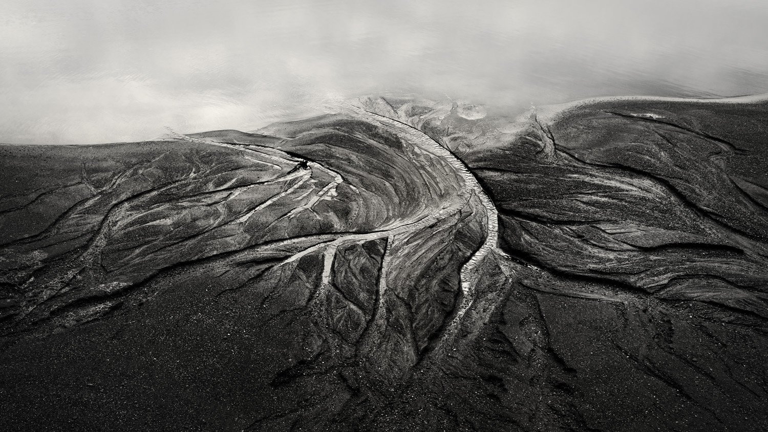
This is a fun little detail! I would be interested in two options, one being knocking the brightest highlights back a bit. The way it is now my eye really gets stuck on the main “tributary” but I’d like to explore more. Two, I know you mentioned it is dark, maybe darkening it down even more to really just make it about the lines and shapes. A 2x1 or 16x9 crop may be interesting as well, removing most of the bottom 1/3. Cool little scene though!
I like the fade to black look in the lower part, so my thought is to leave that and take some off the top slightly. You could even darken the lowest edges more as well. The dramatic shapes and the way you’ve managed to tonalities to focus our attention on them is really skillful. It could be anything from a shot from a plane to a small scene if we let our imaginations off the leash. Terrific texture (the scale give away, but I still think it looks aerial). Wonderful!!
Wonderful intimate scene, Bonnie. I think B&W adds a lot and helps us focus on texture, line, and luminosity. I can see cropping a smidge from the top to get rid of the lighter area in the upper right corner. I think keeping the rest as dark as you have works very well. There’s also a lack of a sense of size, which adds to the mystery. Well done.
Fantastic Bonnie! Love this. And even without seeing the color, I’d say great choice with the b&w.
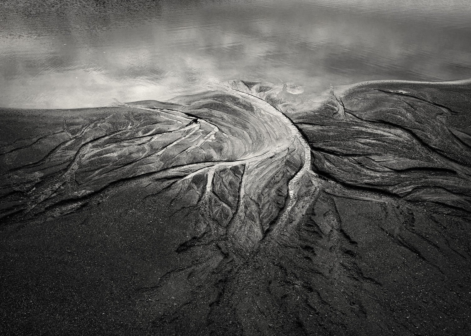
Kind of in line with Kristen’s comment of “fade to black”, I like the idea of taking that more literally to the entire image - in other words dark to light, bottom to top or light to dark top to bottom… And with that, my only suggestion, and really it’s less about tone, than detail, but that UL area is fine with detail of windy evidence on the water. To me, that kind of puts an edge, or a boundary to the upper part of the image. Not a bad thing for sure, but it’s created a thought. What if you were to introduce a little blur, drop the contrast or something in that area to take detail away? This might make the entire upper half appear as “infinity” rather than a defined boundary. NOt sure if that makes sense, or would even make a difference. Just thinking out loud.
But for sure, the main subject matter of the pattern in the sand is fascinating and I think you’ve crafted yet another beauty.
Great use of lines and textures in the image. I’m a little torn about the water at the top of the frame. On one hand it tells the story of the scene and gives it a sense of place. On the other hand, from a purely aesthetic point of view I think I would like this more if it were a tighter composition that focuses only on the sweeping lines and textures in the middle of the image.
Yes, I can see what you mean - that relatively large, bright area in the middle is a bit much. It breaks the flow of the rivulets. I went back and darkened midtones in that area and dodged some of the lights in the farther out rivulets. I think that worked to accentuate the flow lines better.
Lon, this is a most excellent suggestion. Part of what attracted me to the scene was the reflection of the clouds in the water - the water looked sort of like sky. But the fine ripples did obscure that, and it hadn’t occurred to me to make the water look more like sky by “de-clarifying”. I did that and lightened it, also. Thanks!
Rework posted with your ideas - they made a significant improvement in the image. Thanks!!
Late to the party here Bonnie and not sure why I missed this one but this is a really cool abstract. AS others have mentioned, it looks like a drone shot or an aerial from a plane as there is no sort of scale in the revision. Those are some fantastic lines and textures in the sand. I think the rework took care of all of the suggestions and was reworked to perfection. @Lon_Overacker suggestion to rework the water made a huge improvement as did toning down those very bright spots in the main flow. This is a very unique and incredible image Bonnie.
Excellent Bonnie. I much prefer the rework. It works wonderfully as an abstract in that I have no real sense of scale. It kind of reminds me of one of Burtynsky’s photographs of the Niger delta. It has that very organic feel - sinew, muscle and bone. I’m not crazy about the aspect ratio (16:9?). I would prefer a little more on the top and a little off both sides (2:3, 5:7) but that’s a matter of personal taste. Beautifully seen.
Wow.
This is a lovely little detail.
I just love the shape of it.
I much prefer your original tones and composition but sure understand what your are trying to do with the upper part.
Maybe the sweet spot will be somewhere in the middle.
Sorry, meant to comment earlier, but I head off to Yosemite for a few days and didn’t get a chance!
Definitely an improvement, especially getting rid of the ripple detail up top. I do miss the presence of the reflected clouds and tonality there - so maybe a compromise between the too - but definitely losing the ripples up top. In the end though, of course this is your image and your vision.
Thanks again for t he time and effort and considering other members suggestions.
Bonnie, I like both views. They are notably different, with the original being good because of all of the details. The redo with it’s crop and lack of detail in the water has the feeling of looking at the edge of a cliff with the sky above…obviously not true, but that dichotomy of feeling adds intrique. The cropped view emphasizes the braided channels very well.
My first thought upon seeing the top image (rework) was “massive glacier-type landscape with the top of the mountain shrouded in clouds”. Very interesting to see the original. That is some developing of an artistic expression from a very fine shot through collaboration and a skilled hand. Brilliant job!
Wow, Bonnie. This one’s amazing. I like both versions. They’re so different that it’s amazing to realize that they’re the same photograph. I guess the rework may be a bit more suggestive. Can’t understand how I missed this one.
Thanks @Igor_Doncov and @Ola_Jovall. Now that I revisit this one after a few months, I do like the rework much better. I truly appreciate the input from NPN-ers.