The photographer is looking for generalized feedback about the aesthetic and technical qualities of their image.
Description
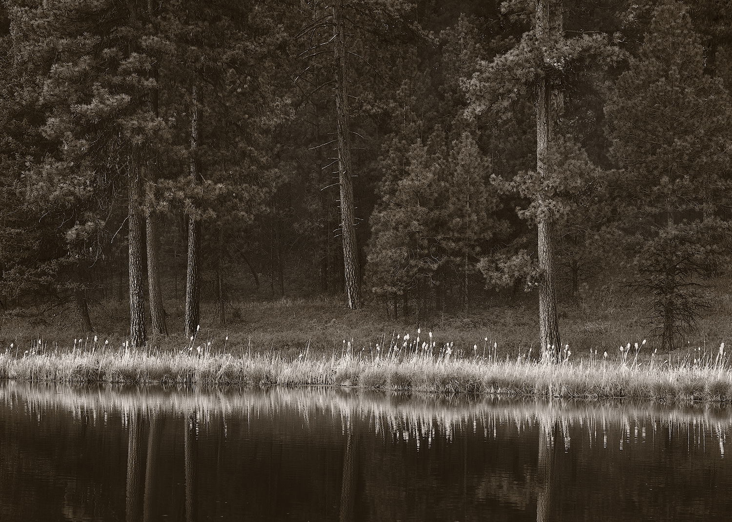
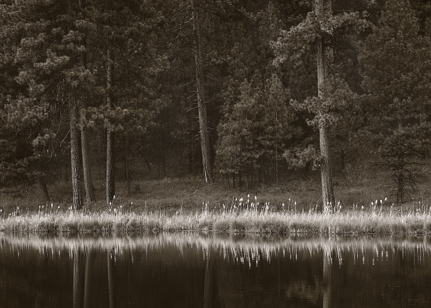
Another from Bull Prairie Lake in eastern Oregon. The bright cattails really caught my eye (they were bright in the color version, too). The conifers had lovely reddish trunks, but the b&w version felt more like the experience of the overcast evening.
Specific Feedback
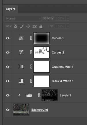
I fiddled a lot with the toning on this. I like the duotone that Lenswork uses for b&w, but doing a duotone in PS is a pain and (I think) you lose quality - it involves converting to grayscale, then to 8 bit, then doing the duotone thing, then converting back. So, I used a gradient map to do it. Does it work? Any suggestions for better ways to do this?
Hand held, not sure about a CPL; processed in ACR & PS. Targeted dodging/burning; toned with a gradient map:
Here’s the layer stack in PS. I did an initial b&w conversion, but you wouldn’t need to, as the gradient map can do the same thing, although the b&w tool does allow for more targeting of the luminosity of each color.
Interesting idea on the processing of this fine image, Bonnie. I think it works really well.
The cattails and shoreline sedges are really sweet, and the reflection is well handled.
Not really a nit, but you might consider just a slight dodge of the lighted portions of the tree trunks just to give them a little more pop. Another thing you might consider is cloning those bright spots in the far background. They grab my eye in the larger version.
The images you’ve been posting lately are top drawer and this one is no exception.
-P
There are many ways to tint photos in PS. The gradient map is one. Another I like is to apply a black and white layer in PS, even if you’ve already converted the image to black and white, and check the “tint” box. Then pick the color you want. You can increase or decrease the tint by adjusting the opacity of the BW layer. I think this is the easiest way to go.
I also like using a selective color layer. Set it to adjust neutrals and tweak the colors until you get a mix you like. You can dial the tint up or down by adjusting the opacity of the adjustment layer.
First, kudos for stepping out of the box a bit. Just looking at the scene I wouldn’t have thought b&w, and like Preston, “interesting” take on the scene is my thought as well. Honestly - and we can be right? The toning works, but as the viewer, the results give me more of a nostalgic, photo of history, a time gone by… (ie. sepia toning look of 19th century photographs,) rather than depicting a mood or experience. Of course, I wasn’t there and didn’t experience the mood, hence my thought of this being a photograph from say the John Muir days… That’s neither good nor bad, just my observation.
I would also agree with Preston on the bright spots. Also and even more so, the dark area in the ULC pulls my eye a little. The line of cattails really makes the image.
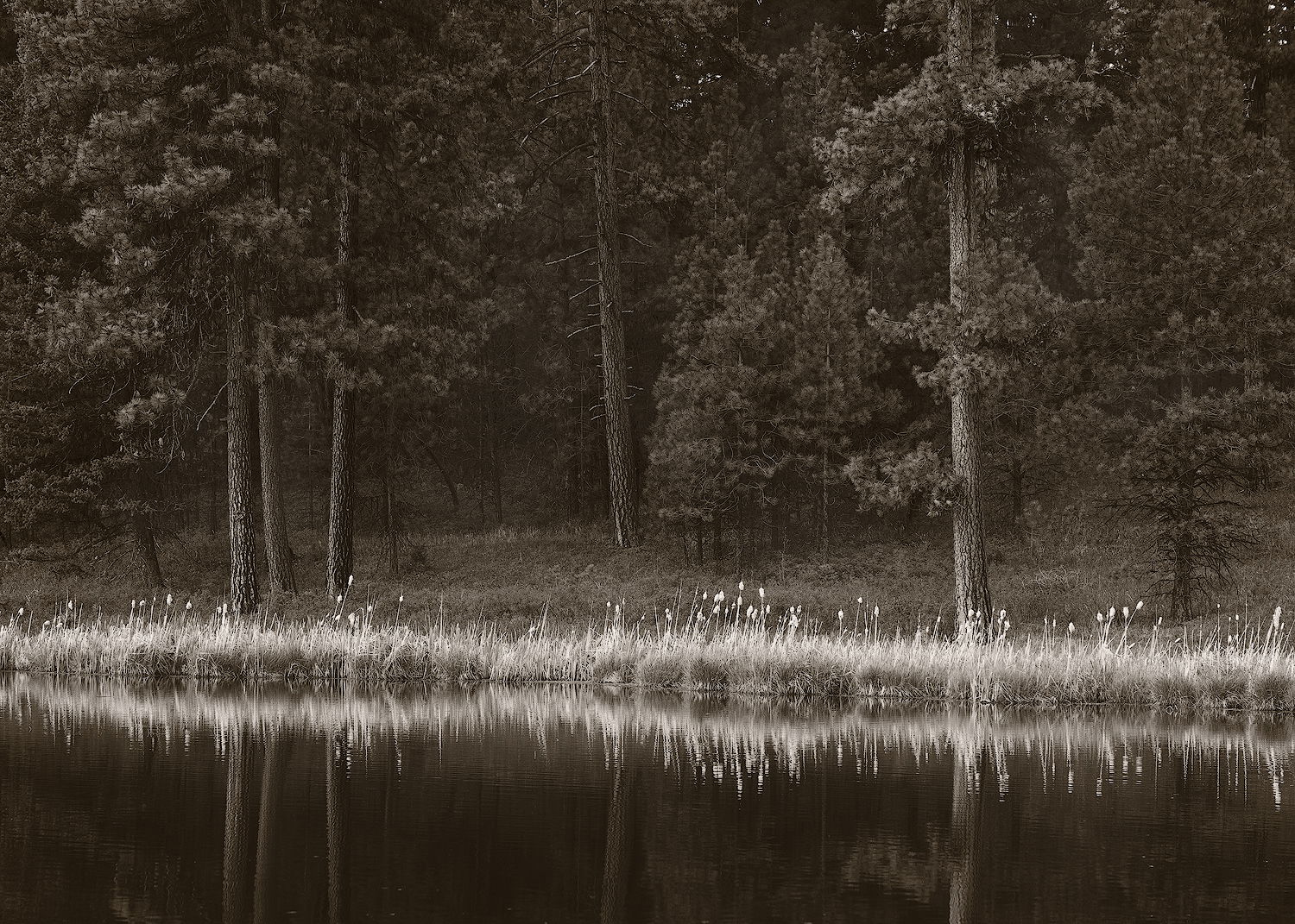
In looking at the larger view, the toning works much better and I have a bit less of that old-time look that I just commented on.
I had those light bits on the trunks a lot brighter, than I toned them down. And I knew someone would comment on the sky bits. Made both of those adjustments and posted a rework - thanks!
Yes, I do this sometimes, too. In this case, I was trying to put different shading on different tones, which the b&w toning option can’t do.
Now that’s something I’ve never used for b&w toning. Will have to give it a whirl. Thanks.
Well, that reaction works for me. That is sort of the feeling I get on overcast evenings at dusk.
I’m late here but have to say how much I like this! The scene is classic and the tinting – yes! – Lenswork! I might never think of it for a scene like this but it works so well! And removing the bits of sky was the perfect final touch. No nits!
Back in the last century I used to obsess over toning, but it sounds so easy today – I’ll have to try it again. It does add a wonderful feeling to a B/W image.
Bonnie, This looks great in sepia and has excellent contrast - I like the extra whitening you did in the grasses. Have you considered straightening the line of grasses? I’d also clone out the spots of rogue highlights near the top. What do you think?