Let me have it. I really like this photo but without messing with the contrast or saturation too much, I like the dead of winter feel, what else could be done to improve the impact of the image?
What technical feedback would you like if any?
Processing suggestions?
What artistic feedback would you like if any?
Comp or crop?
Pertinent technical details or techniques:
(If this is a composite, etc. please be honest with your techniques to help others learn)
Single exposure on a rainy Oregon day in the Winter.
If you would like your image to be eligible for a feature on the NPN Instagram (@NaturePhotoNet), add the tag ‘ig’ and leave your Instagram username below.
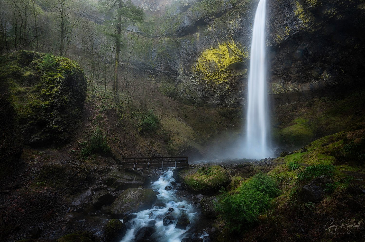
Wow, very powerful image as is, Gary. I would open the shadows in the lower left of the image so the area balances with the lower right and the above left of the walking bridge. There is much to marvel at in this subdued light…the mossy boulder, the braided stream, the trees, the misty light along the gorge wall. I don’t know what is at the top of the falls but I really wish I knew, and I long to see more of that cut off Pine tree. My critique would be the square format; with the falls drop it kind of whispers to me for a vertical presentation. However, it is still a very strong impactful image.
Hi @Gary_Randall. Lovely scene. I don’t mind the top of the falls not being visible. I know how tall they are the fact it isn’t in this image is fine with me.
I do think the image feels flat and decided to give it a go with some PS work to selectively work parts of the image. Added some of my special sauce of Dodging and Burning to help with flow in the foreground particularly . See what you think.
@Stephen_Stanton there’s harsh sky up there, which is the reason why I stopped the framer there. I do have some shot vertically from the same day closer to the creek. There was no real foreground at this spot. Square crops, unless they’re medium format film, bother me for some reason. I just struggle with square cropped landscape shots. They kind give me the willies. I can probably blame that on Instagram.
I would agree that opening up the shadows in the left side would work, I went with dark because of the shadow cast there by that large rock. Even in the upper right corner.
Thank you. I appreciate the input.
@Keith_Bauer Thank you Keith. Thanks for taking the time to do an edit.
What you did was what I was trying to avoid, minimizing the fog and emphasizing the colors. The mist and the lack of color in the scene was a part of what I liked about it, but I do agree with you. To a viewer the more contrast and color would be more desirable. It might be the right formula for this image… no matter what I think. lol
I really like what you did to the lower left shadow area especially.
This is lovely. The tones, color, and light are beautiful as-is, although I do like what Keith did with the darker bits in the lower left (but not the dodging/burning). I could see an 8x10 ratio crop, with the falls just to the right of the right third, but that’s a nit.
@Keith_Bauer, I was thinking you increased the overall contrast with dodging/burning - that’s what I was referring to. Your dodging in the LLC was perfect. I just preferred the original lower contrast look - apologies for not conveying that better.
@Bonnie_Lampley Thanks for your reply. That helps clarify. No apologies needed. Great to have these conversations and understand the way other folks see images. It’s so cool to have these conversations on NPN. Great place!
@Bonnie_Lampley@Keith_Bauer - I appreciate these conversations very much. I’m glad to have NPN here even if only for this purpose. I direct my students and clients here when they are needing critiques of their work. It can be terrible asking for feedback at Facebook, for instance. Holy hell that place can be crazy.
I will be revisiting this photo tonight. I’ll post what I’ve done once I’m through, but will definately be opening up the shadows more at the lower left. I swing back and forth with shadows. From seeing everything to seeing nothing.
I like the overall dark look that this image and many your images of Oregon’s rainforests take. I also like Keith’s reduction of some of the darks while keeping preserving the mood somewhat. However, I prefer the original color scheme a bit more particularly in the greens below and to the right of the bridge. Here’s another version that plays with the misty interpretation and adds a very slight crop from the right.
I’m coming in late here, but I have to say this has been a very informative discussion about how different people perceive the image. I love what @Igor_Doncov did with his rework, I think it preserves the delicate feeling of the fog, while opening up some shadow details at the bottom. I think Igors rework helps the stream below the bridge, and both of the lower corners. With this type of fog, my preference is to emphasize the light, and not let colors that are very strong dominate the image.
And Gary, BTW I really like the composition here, it is so nicely balanced. The inclusion of the trees and the large rock on the left create a more sophisticated composition without taking too much attention away from the falls. There is something interesting to see in many parts of the image, and they work very well together.
Hi @Gary_Randall, i personally like the original image, i love composition and how you processed the light. The tree shape in the left resembles that of the waterfall and rock balances the composition. I like the flow of the water that creates leading lines. I really love this image, thanks for sharing.
What I appreciate most here is that from my view, I think you succeeded very well in capturing and portraying the “dead of winter feel.” Sure there’s no snow to indicate winter… but the barren trees sure do.
I would agree with others in opening the shadows just a tad along the bottom - although not by too much as detail is available in the larger view.
With strong verticals like the falls, it’s usually pretty clear why one would not include the top of falls (bald skies, etc.) So the key becomes where to frame things without making it look or feel cut off. And I think you’ve done that. Sure, we can’t see the top of the falls - but do we need to? And it fits my own personal guidelines - If you’re going to cut something off, do it on purpose… I think you’ve made the right choice for this scene. Well done! Great mood and atmosphere too.
Alright. Where was I? Sorry for the absence. I had some business to take care of in Central Oregon.
@Bonnie_Lampley@Igor_Doncov Thank you. I tried the 4:5 crop and it seemed to take away much of the expansiveness and the panoramic feel of the amphitheater. Instead I tried a 5:7 ratio crop and I think that it appears to still address your suggestion as well as Igor’s crop suggestion and still give it a wide feel. How does it look?
@Ed_McGuirk Thank you Ed. Thank you @Igor_Doncov Igor. Igor and I are seeing the same thing in different degrees. Thank you very much Igor. I appreciate your kind words and your input. I tried to preserve the misty feel of the photo in the reworked version. I also opened up all of the shadows hopefully enough to show detail even in the darkest corners. I liked the non saturated colors and didn’t introduce any saturation over the RAW file’s interpretation. I appreciate your comment concerning the composition. Of all of the aspects of landscape photography, I pay the most attention to my compositions.
@masdamb Greetings Massimo. Thank you sincerely my friend. I appreciate your kind words.
@Lon_Overacker Hi Lon! Thank you very much. I was with a student at Multnomah Falls one day and I had just explained exposure, including reading the histogram. I had one fellow who was struggling to get an acceptable histogram without it spiking up on both side. It was mid-day. We weren’t bracketing at that point in the lesson. I saw that he was frustrated and went over to ask why. He said that he keeps blowing out the sky. I looked at him and said, don’t include the sky. He brought the frame of the photo down a bit just to the top of the falls and got the shot… and the histogram. He looked at me and said, “Why didn’t I think if that?”. lol I said, “Choose your battles”. Thank you for your kind words.
And so here’s my reworked version. I tried to take everything into consideration in the latest version. How did I do? Did I affect it enough?
Maybe a little late to the game, but I would exaggerate the drama here by increasing contrast, deepening the shadows, adding a vignette to focus attention on the waterfall, or perhaps adding an Orton effect to increase the misty effect.
Contrary to popular practice, I wouldn’t automatically attempt to open up all shadows and tone down highlights and make all parts of an image visible and mid-toned. I think there’s great value in mystery and drama, which shadows and highlights provide. Discretion for their magnitude is entirely yours. I’d love to see what this image could become.

 I can probably blame that on Instagram.

