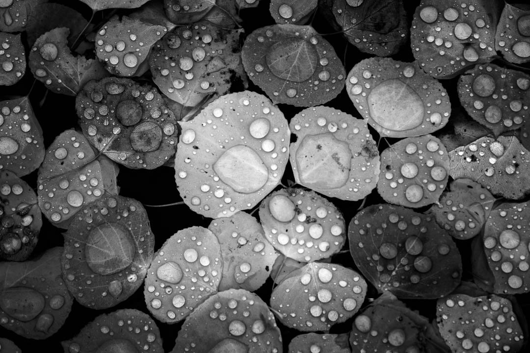
I’m finally starting to work on some photo projects which I have been reluctant to do in the past, but I must say it is extremely rewarding and I look forward to doing more now! This is a collection of vibrant aspen leaves in the fall after an early snowstorm. I felt black and white brought attention to what was important, the droplets. The color overwhelmed the images to me, but I love the textures and tones the black and white draws out.
Most are not sharp throughout the image due to a bad lens (didn’t realize at the time). In black and white this doesn’t bother me, but maybe it does for others?
What artistic feedback would you like if any?
I did significant burning and dodging to draw the eye where I wanted, open to any further suggestions.
Pertinent technical details or techniques:
These were all taken in the 70-200 range, I had to raise the ISO to 400 since the leaves were moving slightly. BW conversion done in Lightroom with more burning and dodging in Photoshop.
If you would like your image to be eligible for a feature on the NPN Instagram (@NaturePhotoNet), add the tag ‘ig’ and leave your Instagram username below.
Nice collection, David. The 3rd one stands out for me. I would expand the lighter part of the dark background a bit to have more of the dark texture playing against the leaves. Although the decaying leaf is a bit of an issue.
I’m sure others will prefer #1. And I like it as well.
These are really beautiful. I do like the first one best for all its tones. It is a happy scene to me! #4 reminds me of a sting ray. I love the bright spots on the bright gray leaf and dark (deep sea) background! I also like #5 for the tiny points of the leaves, especially the point of the left leaf overlapping the leaf on the right…the veins almost continue on a path from the one leaf to the other.
Wonderful photos Bill. I too like the b/w versions. My favorite is #2, but all of the others bring back very fond memories of when we live in Colorado and I spent many days trying to capture these beautiful aspen leaves. Nicely done.
I’m not very good at giving critiques but I know what I like. Number 3 is my favorite. I like the different tones and levels of luminosity in each leaf, and the messy feel to them; more natural maybe? I did notice some of the images were soft, but not every image HAS to be sharp.
Not sure what color these all were before conversion, but it would be neat to see it in comparison. But what a beautiful collection. Love them!
Thanks Igor, that’s my favorite as well. I went back and forth with a lighter or darker background on this one and eventually settled on darker so the attention would remain on the leaves.
@Mark_Muller Thanks Mark, I see the sting ray now! Haha
Thank you @linda_mellor, I’m not sure who Bill is I assume you meant David… There’s nothing more that I love then being in the aspens in the fall, truly spectacular.
Thank you @Barbara_Livieri here’s what one of them looked like in color for a point of reference. Beautiful in it’s own right, but a lot more in your face with the colors.
Nice collection, David! For me, #5 just beats out #6. I enjoyed how the pair of leaves filled the frame making it not entirely obvious what leaves they are. With the more macro shots, it really does become about the droplets. And I do agree the b&w works very nicely!
I apologize David . . . . I should have known not to try to carrying on after having spent the weekend with a very sick dog and work with only 3 hours of sleep. . . . .
Really nice collection, David. I like all but #2 stands out for me. I also quite like the color version, but a completely different mood and feel. It is not even fair to compare the two.
It is a fine collection of images, David. I also prefer the B&W. Thank you for providing the color one so we can see how the colors takes away from the droplets. The color is pretty, but the B&W works really well.
The black and white was a great idea David, not something we see much of for this type of photo. I think the burning or vignette might be a bit strong though as there is a lot of symmetry here that’s getting lost in the shadows. With that said I wish these were mine
Beautiful series. Raindrops on leaves are always striking. If we’re picking favorites, I’d have to say #1 and #5 are mine. I love #1 for the repeated pattern (round drops and round leaves) that makes for a pleasing overall texture. #5 is cool because of the magnification and distortion of the veining from the water drops and those two little points of the leaves. The only nit I see is the vignetting on #4; it feels like it’s infringing on the right-hand edge of the leaf, which looks a tad dark.