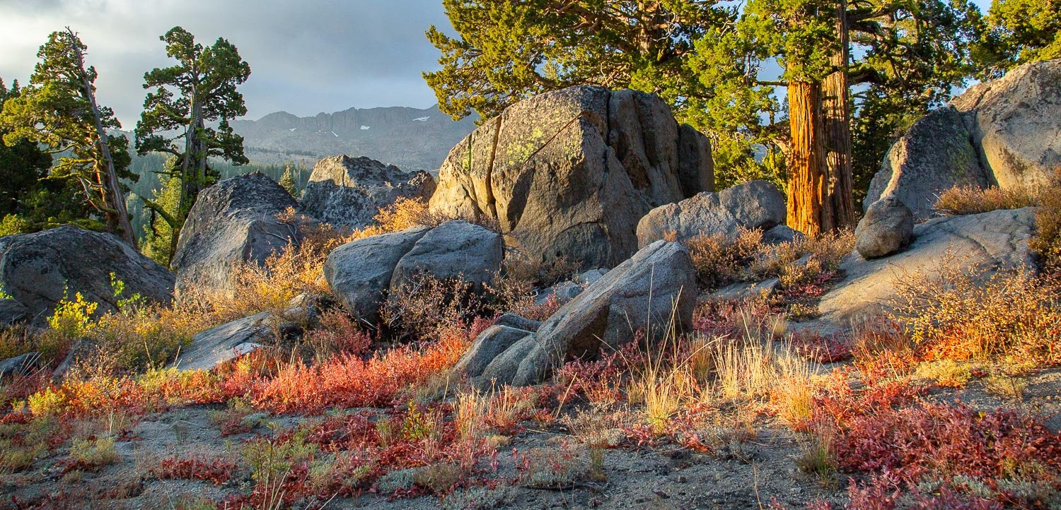
I am wondering about this composition. I cropped a bit off the sky because I wanted to emphasize the beautiful dried grass and leaves in the foreground. How does that work?
I am always torn about how much to emphasize colors and would like feedback on this one. It was very early in the morning so there was some nice, soft light. Perhaps I should bump up the contrast?
Is there enough of interest here?
ISO500, f/13, 24mm, 1/160 sec.
What technical feedback would you like if any?
What artistic feedback would you like if any?
Any pertinent technical details:
I love these scenes - granite rocks, tress, fall colors, anything Sierra Nevada  I’m no pro so only share my humble take … would have loved to see more of the big tree. Perhaps a lower angle. The light is soft and beautiful. The colors are nicely balanced.
To my eye, the real heart of this image is the warm grasses and rock. I would experiment with a pano crop to a little above the left two trees to emphasize those elements and maybe pop the vibrance/saturation a bit. It is a real nice Sierra scene.
Nice warm light, and textures, Kathy.
Along with Harley’s pano crop suggestion, you might consider burning down the bright area of sky just left of the left-most tree.
-P
Kathy,
A wonderful Sierra landscape scene - the light is warm and beautiful. The grass/vegetation of the foreground is certainly a lovely focal point, but I’m also enjoying the warm light striking the trees and think any further crop would reduce that warm feeling this image portrays.
I really like this as presented. Colors/saturation and overall processing is quite natural looking. No nits or suggestions from me. Well done, beautifully captured.
Lon
This is a really fine composition that many wouldn’t see. There’s a wonderful balance among the components and it’s a scene that has beauty without grandeur. The shadows are handled pretty well although it’s a bit puzzling why the fg shadows are considerably lighter than the rocks and trees. I might actually bring those shadows down just a tad. There’s really nothing to suggest here (the small tuft of grass peeking from the bottom left). Very good work.
I didn’t realize there were 2 versions here. The one with the more sky is far better than the 2nd one. The sky has some nice gentle features that sets part of the feeling of the place. I would not remove it just because lighter. In fact, the comp is better balanced with it.
Interesting. Now that I see the cropped version, I think the original has more to offer. I agree with Igor’s comment about the sky. The color and tonality in both versions work nicely for me.
-P