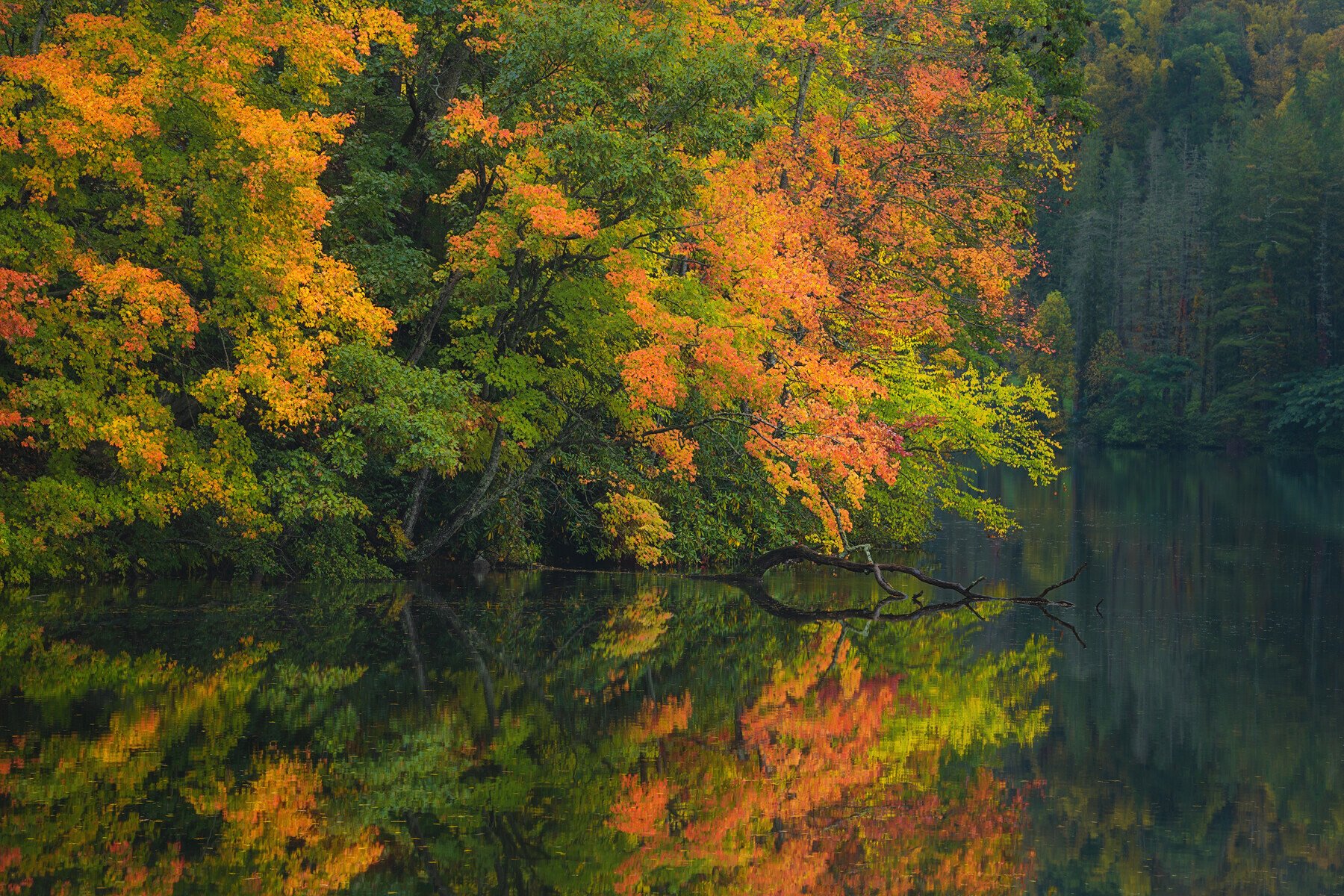
This image was taken between rain showers on a gloomy October afternoon. Everything was wet and saturated. The “direction” of the colored foliage provides a good bit of energy to my eye, heading down towards its reflection near the edge of the stand of trees. Unfortunately, there was little fog at this point, having burned off quickly before I got to this location.
Specific Feedback Requested
I’ve included the RAW file to show how far I’ve taken the image and would be interested in everyones opinion on where this has come.
As you can see, I’ve horizontally flipped this image. It really helped the image “flow” to my eye. Is anyone bothered by the down/right direction of the image? To my eye, the fiery foliage moves hard downward and rightward into the reflection and submerged tree. Does this lead to any sense of negativity?
Technical Details
Is this a composite: No
Single shot, 130mm 1/3 @f/8.0. Plrzr
Wow Jim, you must have spent a boatload of time cloning floaters out of the water, you have way more patience than I do !!
Green and orange certainly can make for a compelling color combination. I absolutely agree that the flipped version is a better composition with its strong left to right flow. The flip also makes the downed tree point in the “right” direction, towards the distant shore. BTW if that downed tree is important to you, then you may want to gently dodge it’s immediate vicinity to call more attention to it.
One suggestion I have is that the far shoreline feels too dark, and the greens there look too cool to my eye (but the greens in the main part look fine). I think you could lightly dodge and warm the land part of the far shore without it becoming so bright that it distracts from the main show.
Gorgeous reflection. I do think the flipped version work better, and it makes sense in a visual flow standpoint, in semiotics the left to right flow is more “appealing” to our brain, its part of our culture, we read in that direction, even represent scales and data increasing from left to right. So the fact that you eyes are caught by the foliage and then go thru them to the branch on the water at the right can be more “appealing” then the reverse flow.
I love the colours and the way you framed those same colours, but to me the image is a bit heavy, a bit too “contrasty”, so i hope you don’t mind that i made a bit of curve adjustment and it ended up like this:
What i did was to open up the brighter parts of the image, and raise up the black from the limit of the histogram to get information to those areas. As always this is just my opinion.
I think the flip on your processed version works well. I like the clarity and colour in the foreground trees and their reflection in the water. I would try leaving the background trees a little less contrasty and de-hazed then your processed version. I think by including more atmosphere towards the back it will give a sense of depth to the image and tonally seperate the background and foreground.
Thanks @Ed_McGuirk…yea - cloning floaters was something I did when I wanted to do SOMETHING in postprocessing but wasn’t feeling the creativity! Would put 30-60 minutes in several times over a couple of weeks.
@João_Ferrão - thanks for consideration of the darkness of the image…I think you’re right and will lift the luminosity a bit.
@Nathan_Klein…seems everyone is in agreement on the darkness not only of the image, but the far shoreline especially. Your point is well taken regarding separation of BG and FG. I agree that was a bit overdone so will take that back into Ps and revise.