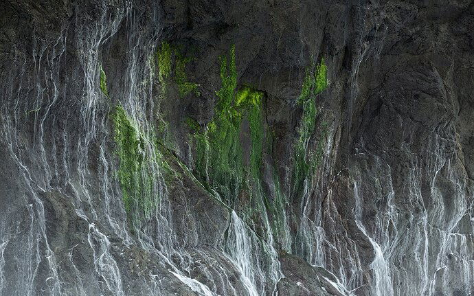
I took this during a workshop a couple of weeks ago. After shooting the waves crashing against the sea stacks for some time - this smaller scene caught my eye. I loved how the green stood out against the dark cliff side and the patterns and lines created by the water.
This is neat, Stefanie. My first impression was that it was granite. Comp looks fine to me. I imagine that you could try different options in terms of color balance, would make this a fun thing to explore.
Thanks Bill! I appreciate the feedback. I do plan on playing around with color a bit more!
This looks familiar! ![]()
This was well seen and super interesting! I think the forms and comp work for this, but if I had a shot like this I’d give it a touch more contrast and try to pull the eye in a little more. The brightness at the bottom of the frame from mist of the waves is keeping my eye pulled down there. The color feels fine to me.
I pulled down the darks using curves on a Darks 2 mask, burned the bottom, and then did a darken edges which was heavy on the bottom edge of the frame and leaving the top alone and a little brightening of the middle.
I know that’s all confusing so I uploaded the layered .tiff here: https://www.dropbox.com/s/c4scqm0x8frfnsz/stef.tif?dl=0
Hey TJ! Thanks for the in depth feedback. This was one of my favorite shots from your workshop! I like the direction you took it in. There was quite a bit of purple and magenta in the rocks and I was having a hard time making the rocks more even toned and one color. Do you have any advice on how I could go about doing that? You’re right about darkening those bottom corners - it looks more balanced.
Stefanie,
Kudos to you for seeing this and recognizing the potential. Honestly, I’m hard pressed to see the water, but regardless, the resulting patterns on the rock wall are simply wonderful. Reminds me very much of some walls I frequent near Yosemite. I would think this would be awesome even without the greens, but the moss and color certainly are a nice addition to the scene.
Processing wise, this image is most certainly worth making it the best it can be. I think the overall color is good. I think TJ’s edits are good, but I think something between the two will work. I do agree that some burning is needed along the bottom, especially LRC. And possible some Lights adjustments in the smaller, brighter areas. Not sure if you have TK’s panel or how far back you go with them. I don’t think Tony has these anymore, but this would be a good image to use the Lights “Triple Play” action. But any changes with this are minor.
One consideration too might be a crop off the right. I really like the flow and lines starting in the UL, with the cascades and patterns flowing down, and then there’s some diagonals that take the eye towards the center. but then it’s the brightness in the LRC that kind of takes the eye and towards and out of the frame. Burning that corner will help keep the eye in the frame. But also, I’m wondering if cropping in from the right would do the same thing. Cropping maybe as much as 25%, just enough to remove the brightest rock/cascade lower right.
Looks like there’s so much potential on this wall and I’m guessing you have more than one frame… 
Lon
Stefanie, this is pretty neat image. Even after reading your description of what it is, i find it intriguing that there is almost no sense of size/scale, which keeps me guessing about what I am actually looking at. I think TJ’s re-work helps, especially with contrast and burning down hot areas. I also think Lon is pointing you in another good direction with a crop from the right, because to me the stars of this image are the green moss and rock textures in the left half. To my eye, the color cast of the rock looks pretty good in TJ’s re-work, i’m nt sure color needs any further work here. i would play around with crops to make the moss and left rock texture larger and more prominent in your new composition. Really nice bit of seeing on your part to see this and extract it from the larger landscape.

