I had to put this one down for a while and kept coming back to it in an effort to make it work. I realize this may be processed a bit too far from the original for some. My intention is not to pass this off as journalistic - it was always intended to be impressionistic. I could not find any way to eliminate the weird green hue in the shadows without destroying the rest of the colors. I tried masking it several different ways in PS as well, but as far as I can tell, the blurred nature of the ICM makes creating a targeted mask difficult. Once I made the shadows more orange that helped. Creating even more darkness in the shadows, to me, was more in line with the “mystery” element that I was going for and conveniently hid the green color quite a bit. It’s still there in some places, but I think this is the best I can do! Thanks again to everyone who shared comments and feedback. I will say that I learned a great deal about photoshop and luminosity / color masking in the process so it was a great exercise.
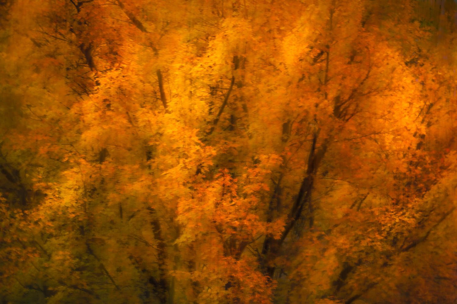
In the fall, I started to experiment with intentional camera movement. A few of these images taken with medium shutter speeds, came out looking painterly and impressionistic. I’ve really been enjoying playing with this technique. I think I have enough to put together a small series and these images were made with my one year old son on my back while on “hikes” near our home. My aim is to convey depth and a little bit of mystery associated with the passion and energy of this particular time in my life and in our collective history.
Specific Feedback Requested:
Does the color convey the intent? I couldn’t quite figure out how to manage those green leaves that are still on the tree in shadow. They are particularly prominent in the jpg compression.
Does the aspect ratio work? I was very intentional in highlighting the yellow leaves that were lit by the evening sun, and had a hard time figuring out how to crop without losing something so I left it at 2:3.
Anything else - beat me up!
Pertinent technical details or techniques:
Is this a composite? No - single exposure, edited in LR and dodged / cleaned up in PS .
80mm
ISO 80
f/22
0.5 sec
If you would like your image to be eligible for a feature on the NPN Instagram (@NaturePhotoNet), add the tag ‘ig’ and leave your Instagram username below.
I’m good with the use of 3:2 horizontal aspect ratio here. Image content should generally dictate orientation/aspect ratio. Even though many folks think of trees as “Vertical” subjects, you chose to emphasize the radial shaped pattern of these tree limbs, and I think the 3:2 horizontal works well for your chosen composition.
In another recent post, @Eugene_Theron had a good take on what helps make ICM images work. He essentially said you need to have some part of the image be recognizable, while conveying some artistry and a message. I think that the amount of camera movement you used strikes that balance.
Color and saturation are very personal and subjective, and even more so in these ICM images, since by definition they are not realistic portrayals of nature. Warm colors usually do not imply a sense of mystery to me, rather warm colors are very inviting and comfortable. But for an autumn subject, you want warm colors, so that’s fine. If you want to convey a sense of depth, you have a good start because the leaves and limbs are not all in the same plane, which creates highlights and shadows, which adds to the depth. You might further enhance the sense of depth by processing for more color contrast. You could get more color separation between orange and yellow, which would add some texture (this can be achieved by shifting hues in Lightroom or Photoshop). The green actually adds some color contrast too. But greens in shadow are usually not this warm, so the greens look a bit off to me. In real life, shadows are cool, highlights are warm, and that’s how our brains expect to see things.
If David can load this image so it can be downloaded, I’d take a stab at a rework to try shifting color to illustrate my comments.
Hi Dan. I like the sort of wild, agitated look you’ve given this tree. I don’t know if the ICM has transformed it that way or if that’s how it looked. I feel this image has a good amount of emotion to it.
@Ed_McGuirk and @Igor_Doncov, thank you so much for the feedback. These are excellent critiques! I really appreciate you taking the time. Ed, I hope that we can get the file issue sorted out. Still not sure what is going on there. I really see what you are saying with the color, and it’s funny, I had a higher contrast edit at one point, and I overthought it. I kept thinking, “everyone always says that new photographers overdo contrast and saturation.” And I felt like this was kind of “out there” already, so I toned it down. I will definitely play with that some more.
Thank you so much for the feedback and encouragement @John_Williams. I love the image of staring into a campfire! Necessity and limitation spurred the ICM creativity - it’s much easier to shoot a moving camera with ‘Bam Bam’ on your back and a crazy lab on the leash. Steady hands are not part of that deal! OIS helps…but sometimes it’s just easier to give in.
@Dan_Wood I think @Ed_McGuirk has said everything I would have here so I won’t go too much further.
I wanted to chip in about the mystery aspect a bit more though. In my opinion I think that the image has to have quite a lot of depth to invoke mystery and also the right tones. I do like your image but don’t feel that it has the right balance of those elements for mystery. To me I’m thinking painting, maybe renaissance. Maybe impressionism. More the latter. While having a maybe subtle subject the colour tells the story of what’s going on. In this case the Fiery colours of autumn taking over rather than depth and cooler tones taking you on a magic mystery tour
@Eugene_Theron - thank you so much for taking the time to review the image and for the thoughtful feedback. I greatly appreciate it. I definitely see what you are saying about the mystery element. It makes total sense and is very helpful to understand how it reads. This is great info moving forward as I decide how I want to continue to work it. I’m working on a couple of others that share this impressionistic feel. These are darker and one has cool tones so maybe they will all hang together as a series with this one being the more passionate of the bunch. You guys have given me a lot to think about. Thanks again!
Okay, now that a large size image can be downloaded, here is a rework that illustrates what I talked about regarding color separation and contrast. You may or may not like the effect, but this intended to consider possibilities. I took the file into Adobe Camera Raw and made Hue shifts to separate yellow and orange (red). The same thing can be done in Lightroom. I made red more red, and orange more yellow, to create separation between yellow and orange. I made yellow less green to mostly eliminate green, and it also makes yellow more yellow. I may have pushed yellow a bit too yellow, but this is more about the concept than the result. The screen shot has color space issues, so focus on the rework.
Depth, mystery, passion, energy…that’s an ambitious undertaking for a single image!
I suppose it’s obvious, but my “passion”, or your “depth” or Eugene’s “mystery” may not be consistent among viewers. There are generalizations many have made in this regard, and I suppose those hold up as generalizations, but at the end of the day, personal creative expression is just that…personal. And while I do endeavor to learn from points others have made in the fields of neuroscience and the psychology of color and tones, your personal sense of satisfaction should trump everything else.
With that said, I think this is a fantastic and powerful image. I would say the lines radiating from the base do convey a sense of intense energy or dynamic power to my observation. The rich saturation of oranges also convey a vibrancy to my eye. This is not a boring image to view!
The balance of the image looks great. I do find that the majority of the lines are tilting slightly to the right and if it were mine, I’d be tempted to straighten that somewhat.
@Jim_McGovern - thank you so much for the feedback and perspective on the color theory. GREAT pickup on the slight R tilt. I absolutely see that now.
@Ed_McGuirk - I can’t thank you enough for taking the time to do a repost with those screenshots. It’s helpful to see the separations and I can see the different directions I can go with those shadow colors that I was picking up. It’s a great exercise to learn more about the artistic opportunities available with the color adjustments and separations. Looking back now at the RAW there’s actually quite a bit of orange and red in the shadows as well so I may opt to warm them up altogether as my experience in the moment was all about the reds, oranges, and yellows.
Will be interesting to see how this turns out. I need to think on it some more! Choices…