TRIPTYCH (David K’s actions rock):
ORIGINAL:
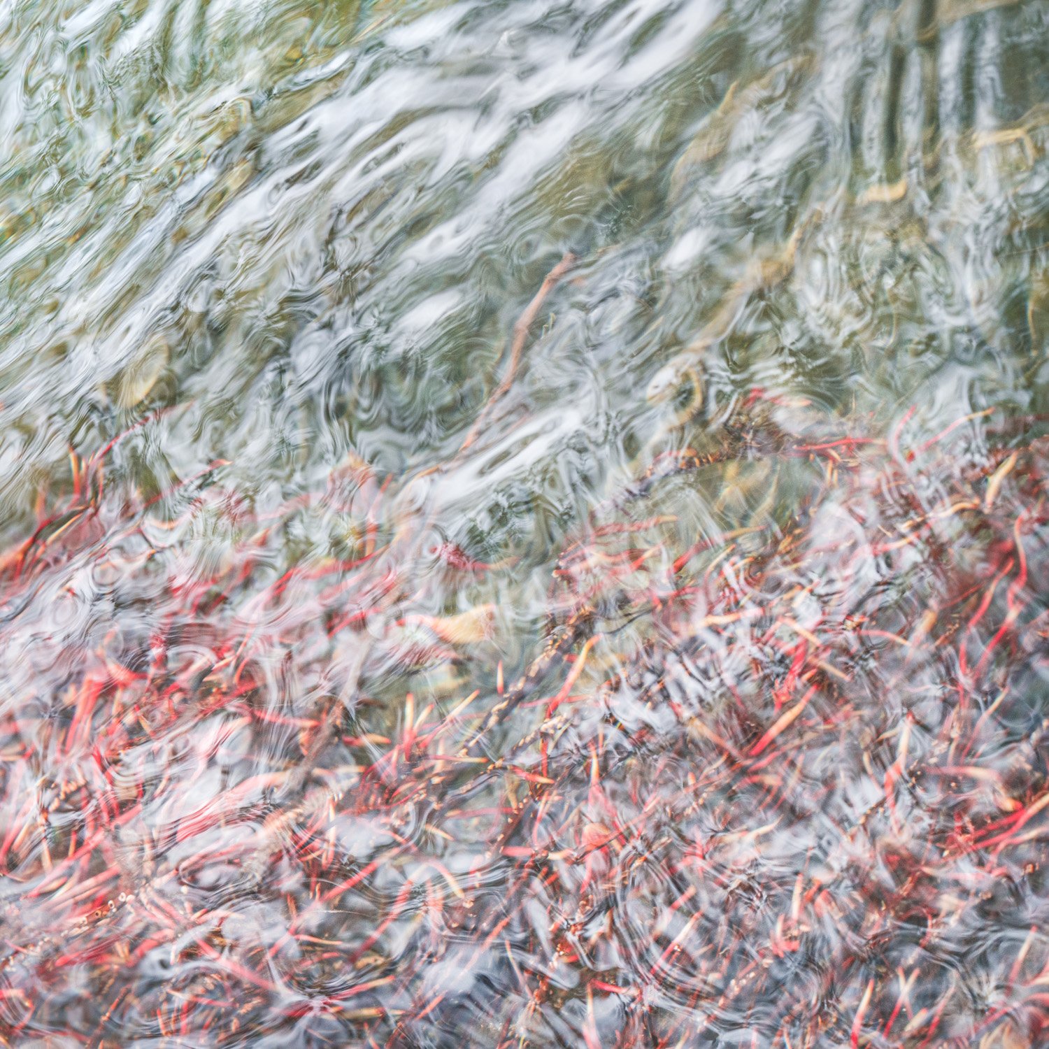
Another roots beneath the water scene. Again, it was the play of the light reflecting off the water surface, highlighting the gentle ripples, with the red roots below, that caught my eye.
Specific Feedback Requested
And again, I fiddle faddled with the contrast. This has more contrast than my previous take, but still no deep blacks. Thoughts? Also, what about that lone stick poking up into the green? Stay or go? I’d prefer to leave it, but if it’s grossly offensive, it could go.
Technical Details
a7r3, 90mm, f/11, 1/50s, ISO 1250, hand held, no polarizer.
4 Likes
Wow Bonnie! I think you struck gold and a gold mine here. Can these get any better? Actually, I’m not sure which I prefer, this one, or your previous. But no matter, these are wonderful!
Previous version a bit more abstract, triggering a bit more imagination. I’m thinking “white fire” with all the flame-like patterns. This one slightly less abstract, but much more divers in patterns and color. In fact, I’m really enjoying the presence of yellows/golds and even the darker tones in the LR, that I imagine almost have a dark blue-gray color to. These in addition the greens and reds. And the variety of reflected patterns keep my eye and engaged.
Regarding the “stick,” I searched and searched thinking it was a stick or something breaching the surface… but no, then I found it… And if it took me a long time to even find it, then clearly it’s not standing out or obtrusive in any way. So no need to remove - even now that I’ve found it. doesn’t bother me.
Just wonderful. No nits or suggestions.
Hey, just for fun… I get you have 3 great candidates for a triptych! 
Lon
Really wonderful image, Bonnie. The square crop accentuates the abstract nature of the scene. Like how the ripples crisscross with the roots underneath. Excellent.
If you have a third one you like, it might be interesting to pull them into a triptych just for fun.
Cheers,
David
Wonderful image! The soft complementary colors work well together. I like the pricklier textures in the red opposed to the more flowing lines in the green.
This is turning out to be a rather nice series Bonnie. The colour palette is wonderful and the soft ripples have the feel of tree roots in themselves. Delicate.
Thank you, @Lon_Overacker, @David_Bostock, @Chris_Baird, and @Kerry_Gordon for your appreciation.
Yes, indeed. I downloaded David K’s action for triptychs and figured it out, so I have no excuse for not making a triptych of these.
2 Likes
I do think these three images would make a nice triptych. I think this is the 2nd best of the 3 with the previous one being the best. The previous one, I thought, was superior because there was a consistent direction and flow to the “flames and smoke” which gave the image power. Here the water lines have a flow to them but the roots are helter skelter which causes more chaos. The second image also stood out because it had less of a 50/50 composition than the other two.
Stay - because it actually helps deal with the 50/50 composition by intruding into that area.
I too think the 3 images would make a great triptych. Would love to see that actually. I think this is right up there with your last image but quite different. It is more chaotic and multidirectional so I don’t quite get the fire and water part like I did in the last image which was more cohesive and unidirectional. I noticed the stick immediately and it does draw my eye but I think rather than cloning it out you may be able to dodge it and reduce the red saturation so that it looks more like the color of the object to its right. But that being said. these last 2 are incredible abstract images and paired with the very first image would make a heck of a triptych.
Thank you @Igor_Doncov and @David_Haynes for your thoughts. I’m glad no one is bothered by that stick.
And since there is a bit of interest in a triptych, I shall post that above.
1 Like
The triptych works very well in this series. In fact, it works as well as your best individuals. It’s actually interesting to see them like that sided by side.
1 Like
Fantastic triptych and what a wonderful series Bonnie!
1 Like
I love the triptych Bonnie. It’s as good or better than any of the individual images and the arrangement is well thought out. I’m so glad you posted this one. Thanks for sharing this.
1 Like
Just seeing… the triptych looks fantastic! thanks for taking the time to put together. I think you’ve ordered them in the best positions. Well done!
1 Like
Just beautiful! I absolutely love your triptych.
1 Like