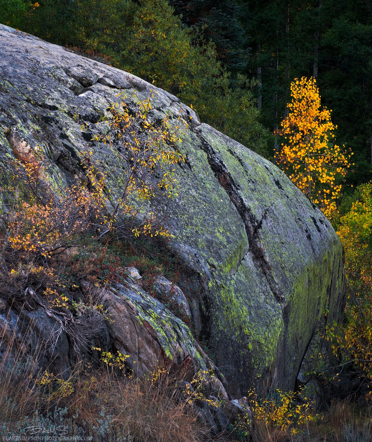
Hey Guys! This is my first post here on NPN, and I wanted to ask for some feedback/critique on a photo I took last weekend near Sequoia NP. Though I wasn’t expecting any, I was treated to some nice fall color and near peak autumn trees.
This small scene had a lot of visual interest to me, and I mostly was drawn to the contrasts found throughout: contrasts in color and contrasts in “alive” and “dead” elements. The biggest challenge I had was arranging the elements into something cohesive that had a main idea or focus.
The main feedback I’d like to hear is whether the photo feels balanced/cohesive or if it feels cluttered/random. Any advice on color, tones, etc. is also welcome. Open to any critique!
Technical Details: Fuji X-T2, 35mm, f/13, 13s, iso 100. This was a cropped three-shot pano in order to capture a slightly wider field of view than my prime lens allowed for in one shot. I photographed the scene right after the sun went down as I was getting slightly better colors than with the sun still up.
Welcome - lots of new people here as this place grows which is awesome! My first real critique post here too.
I like the image, the colours, and the processing however I do feel it is lacking balance. The subject of the photo to me is that bright yellow tree on the right of frame. Because it’s so bright it really commands my attention. If you have more space to include to the right of frame so it’s closer to a third I think that could help. The rock seems quite dominant though I can see there is another yellow tree that appears to be growing out of the rock and providing a leading line into the tree on the right, however its lack of brightness doesn’t make that obvious.
Welcome to NPN! And what a terrific first post - especially appropriate as we charge in to autumn.
I gotta say, I like this image a LOT! A LOT! I think it’s very strong and makes an impact - not just of autumn but of geology and place. I personally like the balance here, and here’s why. Yes, the granite is very large in terms of real estate, space being occupied. But to me, the visual impact is balance by the striking glow of the little tree and how the huge boulder slopes gently to it; there’s a natural flow to the comp. and to top it off, I’m really enjoying the details and color of the lower left elements; the grasses, rock, lichen, the reds, greens, the alder(?) etc. This also provides a nice near/far element to the scene and helps create depth. I think this is beautifully seen. If I had one wish on the comp would be a skosh more breathing room on the right.
Processing wise I think this could use a tweak or two. Mostly the granite itself - need to dial back the blue and bring the granite back a little more neutral. A personal taste and it’s subjective, but the green lichen/moss on the face is bit saturated - at least for my taste. The yellows/reds look great. Also, you’ve got just enough detail in the bg trees in the larger view that this all comes together nicely.
Blake! Great to see you on here man, I love your work! You are always trying to find unique and interesting scenes to shoot, and thats crucial!
This image aint bad man. I love all of the elements in it, but I do feel like its lacking a strong subject. Im not sure what you wanted me to focus on? The tree on the right? The tree on the left? Or the big boulder in the middle? Not sure if there is anything you can do to fix that, unless the subject is the boulder, then I would do some dodging and a vignette or something make it stand out more.
I appreciate the subject matter and the style you’re going for in this image, kudos to you for seeking unique compositions. I’d have to agree with the comments thus far that the bright tree needs more breathing room on the right. I do think the compositional idea overall could work though. I like the 4:5 vertical format. I would have just pointed the camera more to the right or framed it a bit wider on the right and top. The tree is the brightest and most colorful object in the frame, and it has the most contrast being against that dark backdrop, so my eyes are immediately drawn to it. It seems to me based on these factors that it’s intended to be the primary subject of the image, with the rest of the scene supporting it, so I feel it should have a little more central placement. Because it’s so close to the right edge of the frame, I feel like I’m pulled out of the frame and I have to work to explore the rest of the scene.
Blake, I like the concept of using the rock to lead-in to the tree, and the rock is pretty neat with lichen, cracks etc. I actually like the blue tint on the rock, it creates some nice contrast with the autumn hues. I agree with other’s comments about wanting the right tree to be more prominent relative to the rock. The right side of the rock is more interesting. The scraggly trees on the left side of the rock aren’t that attractive to me. I would have moved to the right, got more of the big yellow tree visible, and not shown as much of the left side of the rock. Another idea might be to crop this into a vertical about halfway thru it as presented, leaving only part of the yellow tree on the left.
You’ve gotten a lot of good feedback already but I’ll just throw in an extra opinion. I’m appreciate the creativity, but to be blunt it feels cluttered and random to me. The yellow tree is awesome but the image overall doesn’t communicate a story to me.
Thanks Sam! Honored to be your first critique haha. I was wondering if the balance felt off so that helps to hear. Luckily I do have room to the right of the frame so I’ll try that out. I kept dialing back the blue further and further but looking again it does seem a little much. Thanks for the help man!
Thanks so much, Lon! Glad you like it. I’m glad the balance worked for you and you found flow in the composition. Luckily I do have a photo with more room on the right of the frame. Unfortunately I cropped at the beginning of my workflow though and will have to re-edit the whole thing haha. Any chance you know a way to avoid this in the future besides cropping at the end?? I will keep those processing pointers in mind on my next go at this one! Thanks again and looking forward to seeing more of your work too.
Eric!! Great to see you here too my man I appreciate that compliment, you have been a big help to my growth.
That’s kind of what I was thinking too. After I finished editing, I still loved all the elements in the frame but couldn’t say what I was trying to say or emphasize in the image. I think I want to bring more focus to the bright tree, so I’m going to try and open up some room on the right side like others have mentioned and try to do some dodge/burn to see if I can lead the viewer’s eye over there. Thanks again dude.
Hey what’s up Alex! Thanks for those words. When I was shooting the scene I actually had your image “Rainbow Rider” in the back of mind mind and tried to compose and edit to go for a similar style. I did try pointing the camera more to the right, but when choosing which frame to edit, I didn’t like how that comp cropped the elements on the left side of the frame. I’ll check out my wider shot and see if I can open up some space on the right and top. I definitely think you’re right and that a slightly more central framing of the yellow tree will help with the main idea of the photo. I really appreciate the input man and I’m glad to see you here!
Thank you Ed! Thinking back when I was composing, I did feel I was trying to use the elements on the left and the rock to lead to the back tree. I actually like your idea of the vertical crop and will try that out when I go back to re-edit.
Hey Brent, thank you! I appreciate that input and it makes sense to me. When I was shooting, I liked all the elements in the frame and tried to find balance, but when I was editing, I couldn’t tell what the story of the image was either, and I think that’s the most important element to have. I really enjoy your work and look forward to seeing more on here.
 I appreciate that compliment, you have been a big help to my growth.