The photographer is looking for generalized feedback about the aesthetic and technical qualities of their image.
Description
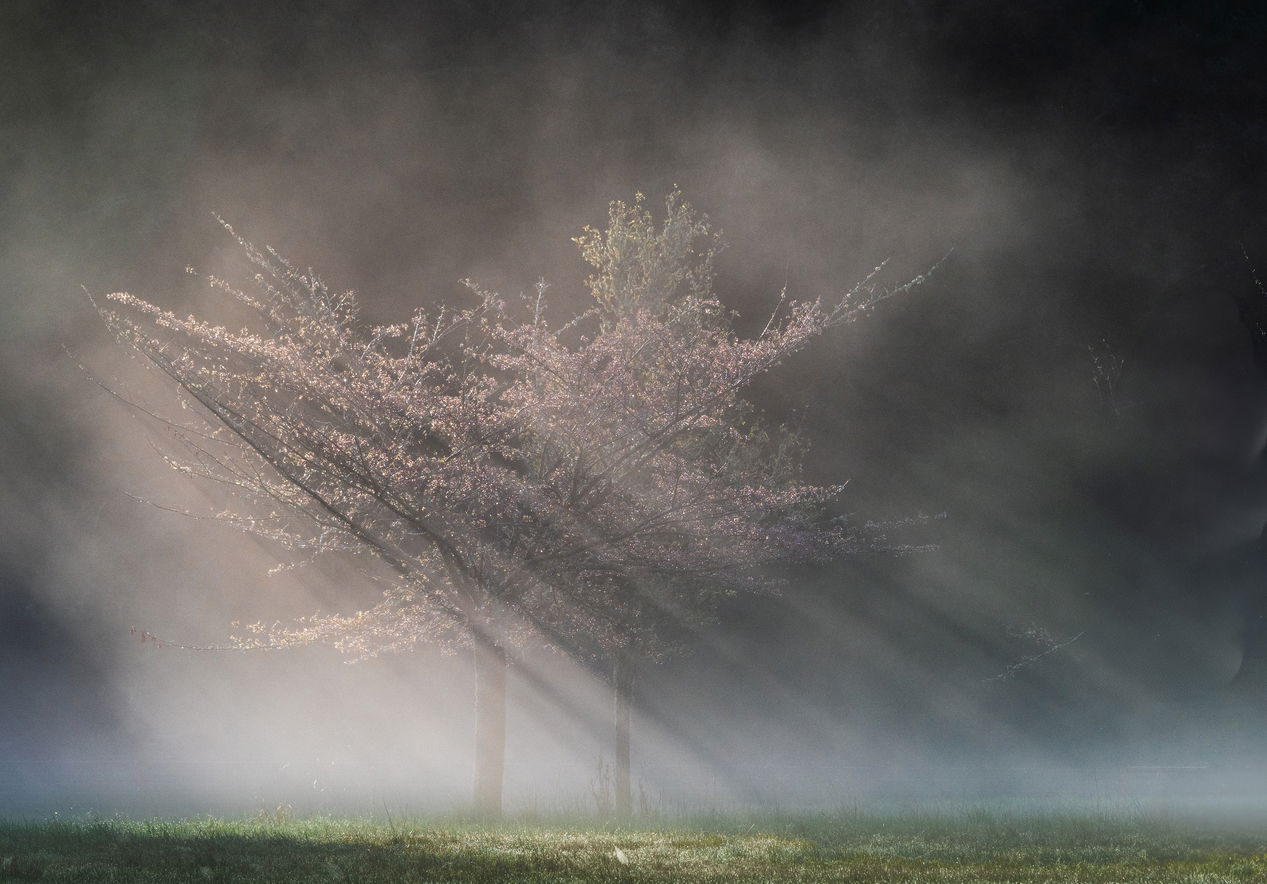
This is a recent Spring morning image of sun rays and fog quite close to our home. It was one of those look out your window and grab your camera before it changes, which it did. The cherry and apple tree have a wall of fir trees as a backdrop which you can get glimpses of.
Specific Feedback
I am looking for any suggestions on how to improve the photo. I have printed it on matte paper and it comes off very soft looking, which I don’t mind. I might be interested in getting input on whether to bring out more of the pink color and some of the definition of those early blooms, and how to do that best in LRC. Thanks in advance!
Technical Details
Sony A7RIII, Sigma 100-400, ISO 640, F8, 1/2000 of a second.
Critique Template
Use of the template is optional, but it can help spark ideas.
Fantastic light you caught there Pat. I only do basic adjustments in LRC, so hopefully others who do more there can give you suggestions on your specific question.
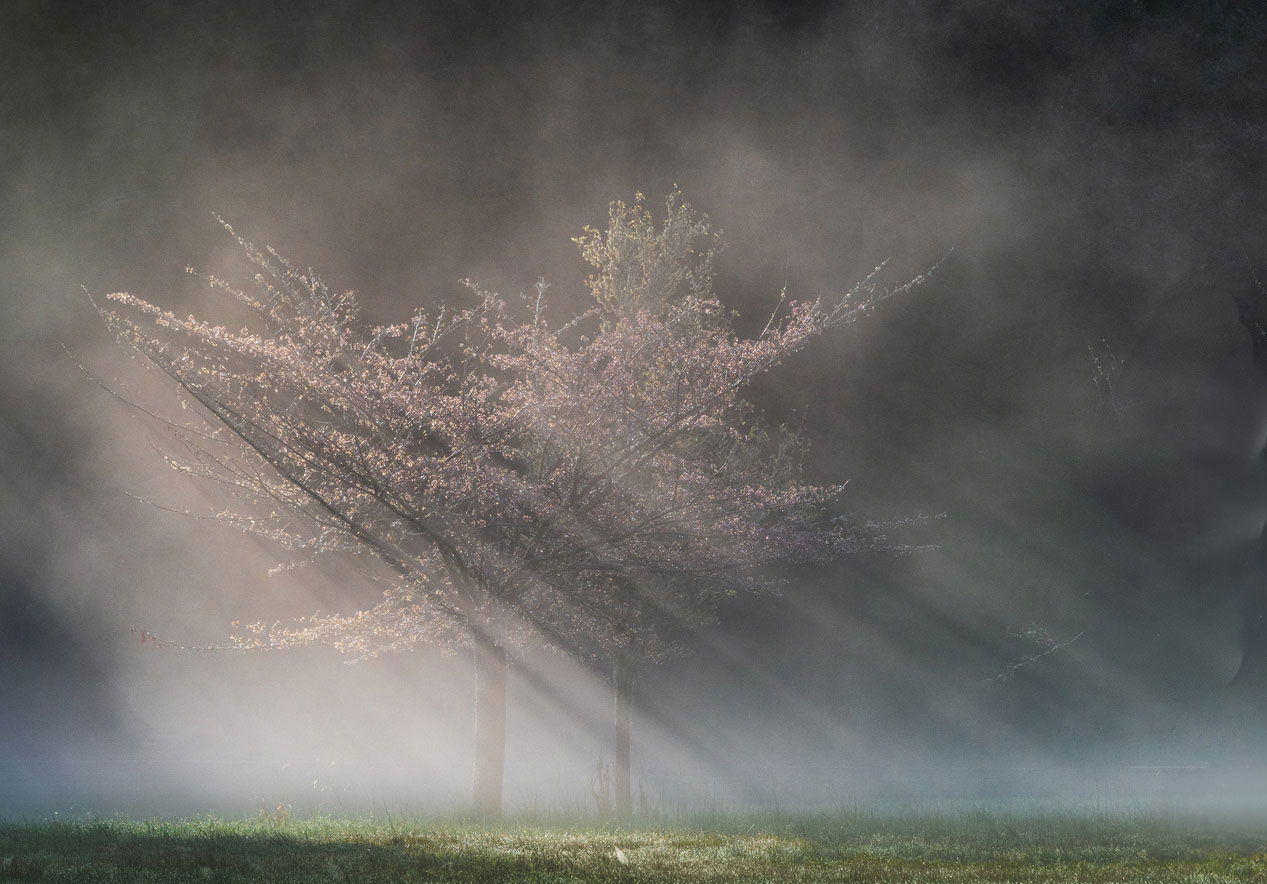
My thoughts for improvement would be to open that upper right corner some, just to add a touch more balance to the lighting., and to dull those blooms hanging near the right edge.
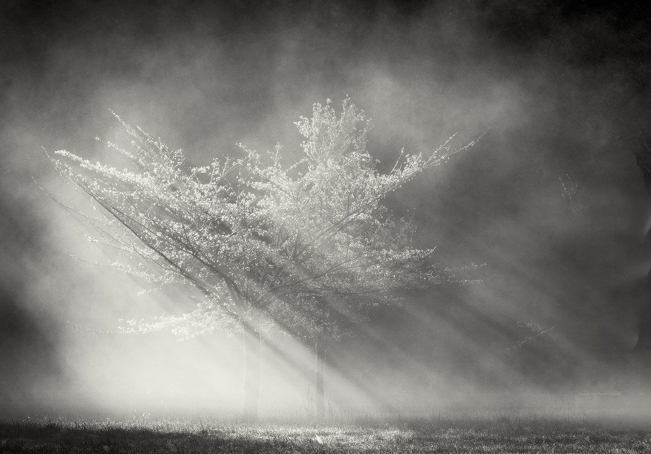
Thanks very much for taking the time to provide your valuable input. I agree with both of your suggestions especially the B&W version. I have gone back and forth on which one I prefer.
Nice shot, Pat. Would look very nice printed and framed with a few adjustments. Looks a little murky to me. If that’s the look you were going for, just ignore me. To me the image is all about luminosity, so I made a levels adjustment in PS. Don’t use LR. I assume there’s something similar. I’m not much on color adjustments. Perhaps a little red/ magenta saturation in LR? Looking at mr rework, it needds a crop on the right and maybe a little noise reduction.
What a find! Gorgeous image, and my thoughts are in line with @Michael_Lowe. I might be tempted to bring out even a bit more luminosity in the blooms, though. I bet it does look wonderful printed on matte paper. Great work!
Thanks Bret and Michael…this is just the kind of input that I am looking for. The suggestion of using a levels adjustment is prompting me to get my feet wet again in PS. I really appreciate your input!!
Hey Bret. For some reason my file did not transfer very well to NPN. It ias actually quite brighter. Whewn I opened it up here, I coulkdn’t tell much difference from the OG.
Pat: This really caught my eye on the thumbnail page; got a nice little -meter spike. What a beautiful scene very nicely captured. I like your original as posted and also the refinements offered by @John_Williams and @Michael_Lowe . Well seen, captured and presented. >=))>
This is wonderful! Immediately I think of my own response to situations like this - you’ve captured a “moment in time”, one you will never ever be able to duplicate.
The blossoms stand out beautifully in the light and mist. The streaks/beams of light/shadow really add an element that really makes this quite a dynamic composition and image overall.
My thoughts for improvement are similar to what has already been suggested. There’s a few odd anamolies along the right edge that can be dealt with using a comgination of a slight crop and some minor cloning. I would also agree with John’s suggestion about the UR. I’ve dodged a little and also “painted in” some mist (used the color picker to match fog. Not sure how to do painting in LR.
I also boosted the whites and highlights in Adobe Camera Raw, ACR, which is the same as LRC (which I don’t use) So I boosted the light values, and also dropped the shadows a few points just for the added contrast.
Then, it seemed to work better as a layer in PS with regards to the blossoms color. I was able to increase the saturation of the blossoms easier in PS for some reason. I used one of TK’s Lights masks to make the selection for the saturation tweak. I think cropped a little off the right and cloned/healed those things on the right edge.
I think this would look awesome in any print - matte, canvas, metal/acrylic… But certainly needs to be printed!
Can’t say mine is any better or if changes are even noticable. But here ya go.
Pat, you’ve caught an excellent set of crepuscular rays that are enhanced well by the subtle pink in the Cherry tree. You’ve got a number of good suggestions already. I would second using a light (say 20 - 30 %) clone to add some mist to the upper right corner. It also look like there’s a tree trunk along the right side that shows via three brighter bits in the fog. I’d be tempted to remove those also. I do like the hints of green and the bits of bloom towards the right.
Mark, thanks so much for takiing the time to view this image and provide valuable feedback. It seems like there is a consensus about the improvements that maximize the image.. …thank you again.