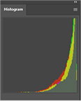
The photographer is looking for generalized feedback about the aesthetic and technical qualities of their image.
Description
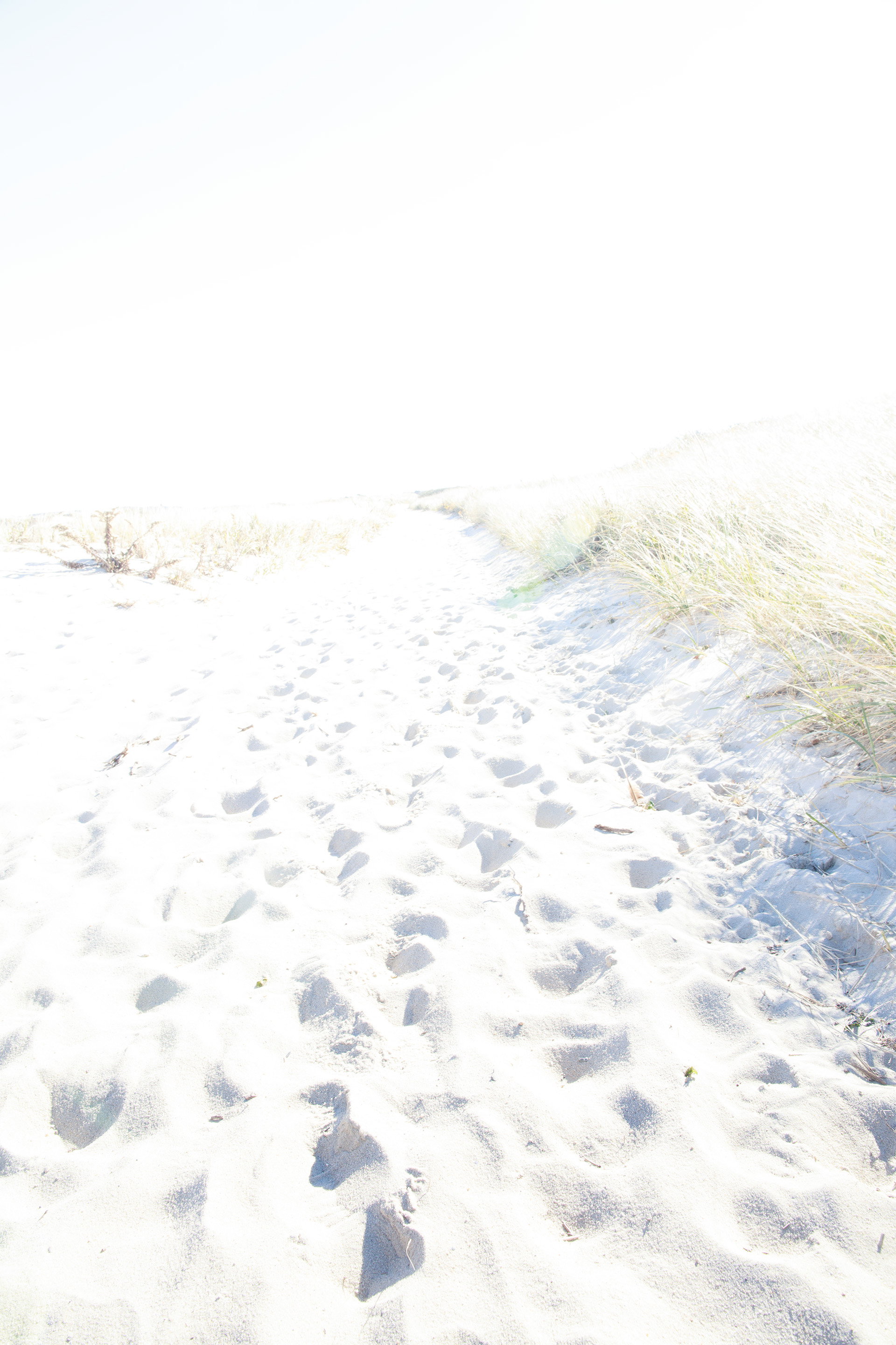
While watching Stefan’s webinar on minimalism, I thought those techniques might work well in the sand dunes. This is my first attempt. Bright sun mid-morning, probably not ideal lighting for this type of photo.
Specific Feedback
Did I got too far? Expect for the grass, there is no color left. The sand is light, but not pure white. Any general comments as this is my first intentional attempt at minimalism.
Technical Details
This is a blend of 2 images. The foreground is 2 stops over-exposed, the background 3 stops. Gradient masks on both for the blend.
Canon 5DSR 24mm 1.4 shot f11, 1/50 for foreground, 1/25 for background.
Critique Template
Use of the template is optional, but it can help spark ideas.
Vision and Purpose:
Conceptual:
Emotional Impact and Mood:
Composition:
Balance and Visual Weight:
Depth and Dimension:
Color:
Lighting:
Processing:
Technical:
Hi Glenn,
Did you watch the recent webinar on high key and minimalism? I did and found it very inspiring also. I’m not the best person to answer the question of whether the high key is too much. I asked a question about printing, and the Stefan indicated that what looks white to the naked eye is actually not pure white, at least that’s what I remember from his response. Perhaps you could share a screenshot of your histogram in PS or LR so we can see that.
Aside from the question of how bright is too bright, I like the grasses and the hint of a rising dune in the upper right. What detracts from the impact of the image, in my opinion, is the number of footprints. Maybe I’m a melancholy sort, but to me, footprints are almost always more interesting when there is a single line of them. It speaks to something more symbolic about the human condition and the experience of nature.
Now, it all depends on your intention. A bunch of footprints like this speaks to something quite different: popularity of the place, the impact we have on nature, or given the way the distance fades out at the top, perhaps a sense of people no longer here, a time that is fading.
I’ll be watching the thread to see what others say about the high key treatment. I’m playing with two images from my archives with this in mind, and I’m looking forward to shooting with that in mind.
One other thing, as an after-thought, is that so much high key photography seems to have a very specific and singular subject, rather than a scene with multiple elements. Not saying that’s the only way, and I’ll be sharing something soon that is more like what you have here. But subject selection seems key in high key (pun intended)>
ML
Marylynne,
Thanks for your detailed feedback. I don’t find the histogram particularly useful in my work, but using the info tool in PS, in LAB colorspace, the sunlit sand measures 100, 0, 0 which is the purest white possible. The shadows in the footprints have a slightly cool cast which seems reasonable. This was my first attempt at high key photography and I was looking more for exposure than composition. This was the only one from that day which had any potential as a finished photo.
Thanks for that info. Apologies if I gave more feedback than requested. I’ve never done high key either. Just now starting to play with it.
If the sunlit sand measures the purest white possible, I think it will not print quite right. Not sure what the answer is there, but if printing is not the objective, I don’t think it matters.
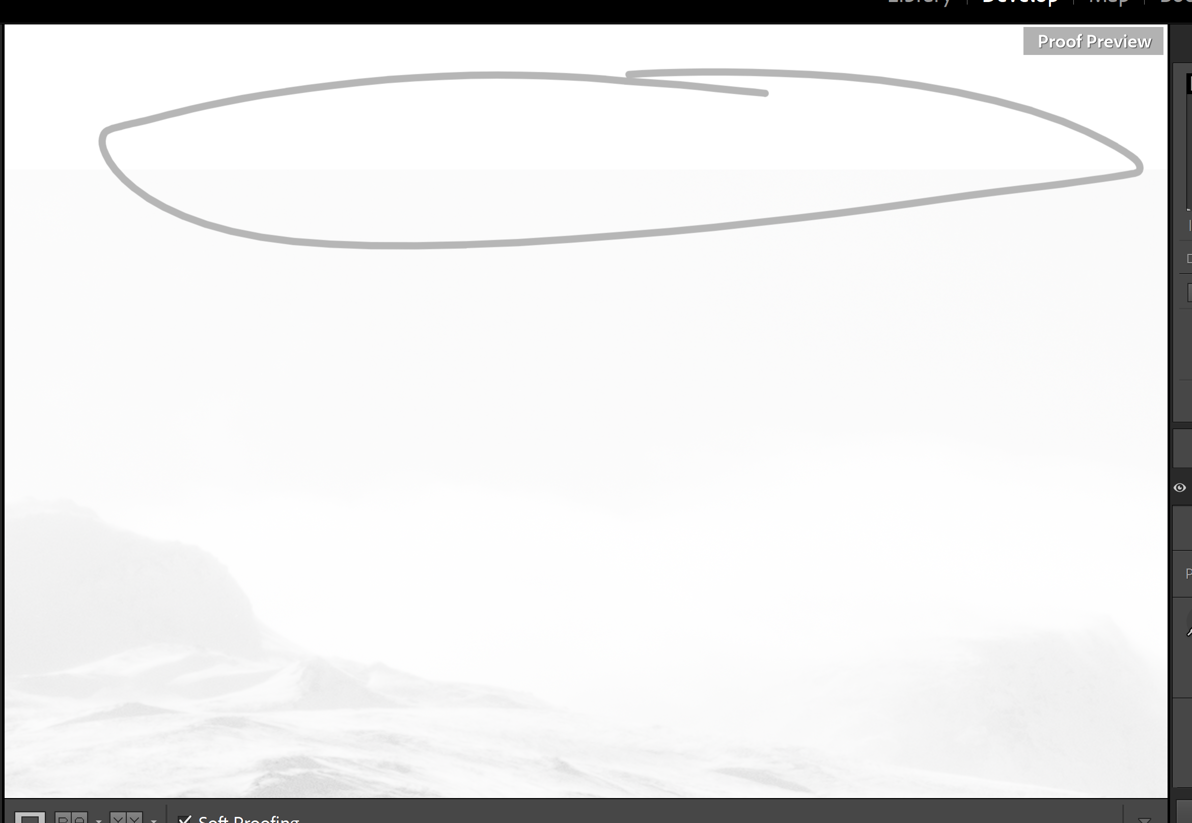
I might print some of mine eventually (you know, when I have processed them), and one thing that helped me was to look at the soft-proofing tool in LR (I don’t use PS as it has always confounded me, so my advice might not be as scientific as someone else’s), and zoom in on the brightest area to see how it compares to the white in the soft proof tool.
Here’s what I got for one of mine. It tells me my brightest areas might print okay. Remains to be seen, of course.
Welcome back, Glen. I like the idea behind your image and your attempt at something different. I do feel the image is too high key. I feel like I’m being blinded by the sun. I agree with @Marylynne_Diggs about the footprints. There are just way too many of them. Too cluttered IOW, which I feel goes against the spirit of simplicity and cleanness of minimalist photography. JMHO
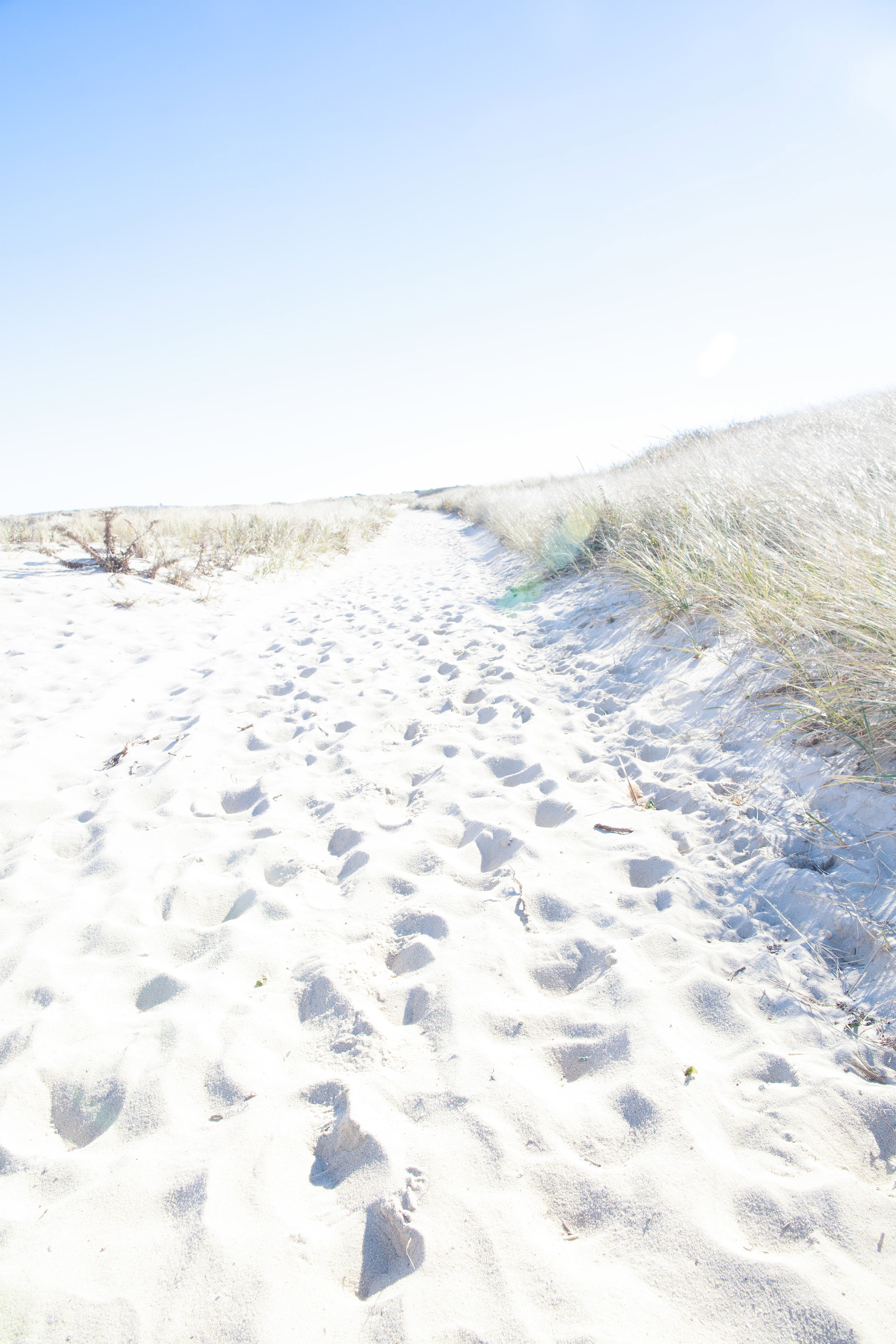
I shot a series at 1 stop increments. This is a similar blend with the foreground 1 stop overexposed and the background 2 stops, blended as before. This doesn’t really seem high key. As I said earlier, it was bright sun, it would probably work better on a cloudy day. As for the footprints, perhaps I can bring a rake next time!
Ah yes, the public service first, photography second method .
To me, this still feels high key. I’m not sure what the technical or artistic definition is. I did a quick search and read from Fstoppers and a few other sites that I trust relative to an AI definition.
From what I’ve read, if all or nearly all of the pixels are in the right half of the histogram, it is likely high key. The image can contain some significantly dark elements, especially the subject of the composition, and still be high key. You can have high key black and white and high key color images. One characteristic I read was a lack of shadows, or at least greatly reduced shadows, but I think that is expected more when using high key in portraiture: no shadows on a face and the background almost completely white giving the model a kind of floating, ethereal vibe.
In your case, I think the image is definitely high key in both presentations here. The sky, while clearly blue, is still very bright. Hopefully, someone will correct me any and everywhere I’m wrong here.
Hi, Glenn. I read Marylynne’s comment and my own echo hers. Art is subjective, of course, and what I’m about to say is just my opinion but for me, the composition as a whole isn’t working. I agree with her and John in that there are too many footprints which I find distracting, and my eye just kind of darts about the image. I do think the diminishing perspective is nice as it helps to provide some visual interest to guide me through the photo. If we’re talking strictly about brightness, I prefer image #2. The original post is too bright, IMO. I hope you’ll continue to experiment with this type of photography and processing as it’ll be interesting and fun to watch your evolution.
Yeah, I think the histogram is certainly high key. And I actually like the colors. They make it more of an “end of summer, feet beating the sand to the ocean” kind of vibe.
Keep looking for good subjects for this kind of treatment. I think it’s really refreshing to play in a new sandbox.
ML
 .
.