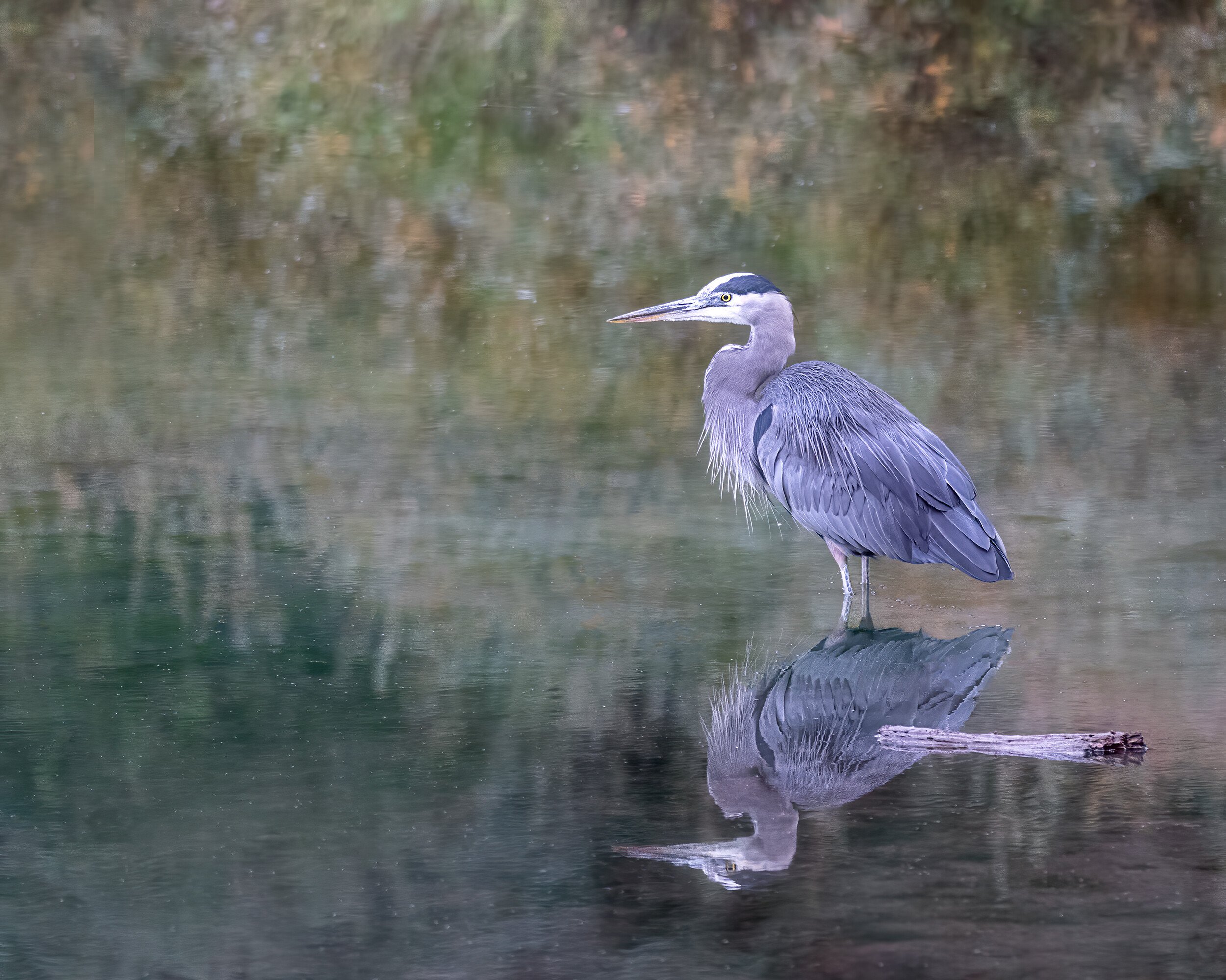
I liked this one for the setting. The background has a painterly feel, like something from Monet.
Specific Feedback Requested: Any
Pertinent technical details or techniques:
Canon 7DII; Sigma 150-600 at 150 mm; 1/1000@f5.0; ISO 3200
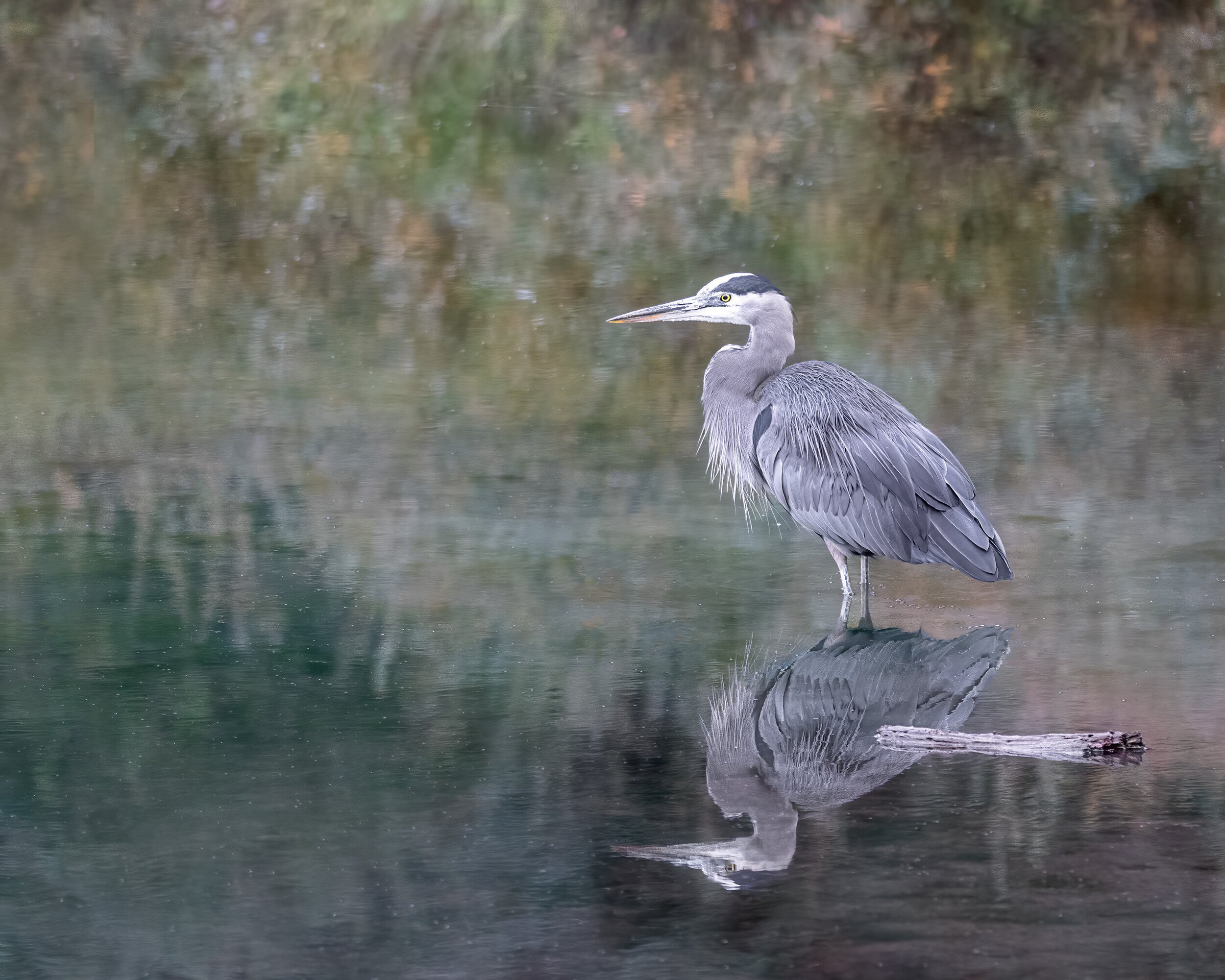
I liked this one for the setting. The background has a painterly feel, like something from Monet.
Canon 7DII; Sigma 150-600 at 150 mm; 1/1000@f5.0; ISO 3200
Great image. Yes, I like this one for the reason you describe.
Nice one, Allen. I like the perfect reflection too. And the background is very Monet like. Well done.
This is a well composed image with a beautiful background. Good job on the reflection. I do think there could be a bit more contrast on the heron itself which would make the image pop even more without affecting the painterly background.
Hi Allen
The background is vary nice and it does place the Heron in dream-like setting. I think the blue may stand out a little better is you lowered the exposure on it. Nice photograph.
Peter
Beautifully done, Allen. A very impressionistic background for sure it works really well contrasting with sharp detail of the Heron and I like the piece of driftwood. (Too bad it intersects with the reflection.) With that great background working here, I am not that big a a fan of the square crop but that is pretty minor.
Very nice detail and sharpness in the bird and a great BG! I would crop, clone or re-color the warmer area in the UL. I think contrast could be increased on the bird and I’m curious about the look if you could lower the blue cast on it, but that’s purely a matter of artist’s choice.
Thanks for the comments and suggestions. Here’s a re-post based on those suggestions. Does it work? Thanks.
Much better with your adjustment.
The UL corner is fixed, but you still have a blue-maroon bird – but your choice, of course.
Thanks, @Diane_Miller , for your input. Here’s a third attempt. I desaturated the blue quite a bit; too much and it didn’t look quite right. I think sometimes I do too much processing (it’s fun) and can’t see the forest for the trees. That’s what’s great about NPN: another set of eyes.
Desaturation can kill things. Compare the Heron’s colors to Chris Cahohan’s post:
Try a Selective Color adjustment layer and go to the blues and maybe neutrals and play with tweaking the colors. If it messes up the BG, try Select > Subject and mask, maybe at partial opacity.
Or go back to the raw file and optimize for the bird’s more natural color then deal with the BG in PS if its not right.
Lovely image to start with, and all versions show some other perspective. What stays throughout all the images is the dreamy-like feel of the image, which is the main attraction to me. The rest is a matter of personal taste and preference. Nice work. Hans