Critique Style: Standard
The photographer is looking for thoughtful feedback on the image as a whole, especially around the areas noted below.
Feedback Focus: Artistic + Technical
About This Image
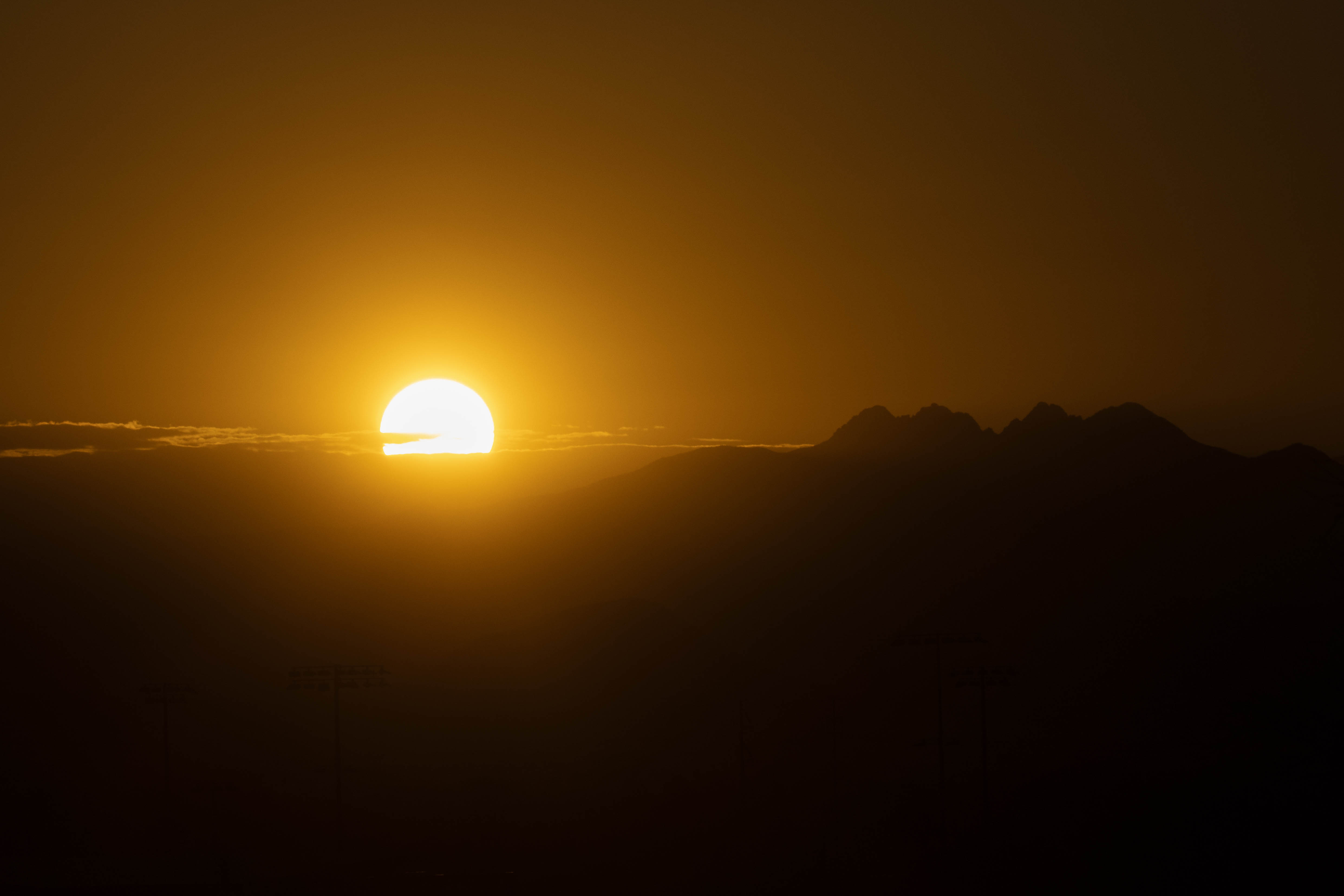
This is yesterday’s sunrise. The mountains to the right of the sun are Four Peaks, which are substantial mountains.
Feedback Requested
I’m somewhat torn between color and black and white. Color has a lot more impact but, combined with the contrast, it’s almost too much. I wouldn’t want it on a wall.
I’m curious about how others take and process such shots. I bracketed the exposure and combined two of the darker exposures in Photoshop, using a luminosity mask. Beyond that I did little more than tweak the tones until I liked them.
Technical Details
Camera: Canon EOS 90D
Lens: EF100-400mm f/4.5-5.6L IS II USM +1.4x III
Focal length: 140mm
Shutter speed: 1/2000s
Aperture: f/11
ISO: 100
Hi Don,
I like the simplicity of these. They have such different impacts. To me, the color version feels a little apocalyptic. Maybe it’s my experiences with smokey sunrises and sunsets. In contrast, the black and white version feels very serene and quiet.
Im not the one to ask regarding shooting and processing for a scene like this. I struggle to get anything that works when the sun or moon are in the frame with a dark landscape.
ML
This reminds me of an image I took on the southern Oregon Coast a long time ago. We have a large print of it hanging in our “Comfort Room,” which is where we do euthanasia when necessary. For me, there is great symbolism in the setting sun and how it relates to to having to say goodbye to a beloved pet. This image speaks to me in the same way.
I strongly prefer the color version; it feels more alive to me.
Marylynne, John, thank you both for commenting.
Don,
Simple is often most effective and impactful - and I’d say that’s certainly the case here.
I’m torn on versions as they both give off different vibes - and different even between viewers.
With the color version, the “glory of the sunrise” brings me to the many times I’ve watched the sun come up. Given the extreme exposure challenge, the colors portrayed look pretty real to me, and not apocolyptic - like fire, etc. But that’s me.
The b&w however, it’s graphic nature does bring more drama and/or imagination to me as the viewer.
Simple, but effective.
I’m not sure if it’s me, and likely the downsizing, but I see some pretty serious banding in a circular pattern as you move away from the sun? Is that processed this way? or some jpg resolution thing? It’s kinda a cool effect actually.
Thanks, Lon. This one has the kind of gradient that can easily result in banding. I don’t see banding in the uncompressed version so I suspect that compression is the cause. I used a luminosity mask and I can see how that could lead to banding but I didn’t make any major tonal changes, so I don’t think that’s the culprit.