The photographer is looking for generalized feedback about the aesthetic and technical qualities of their image.
Description
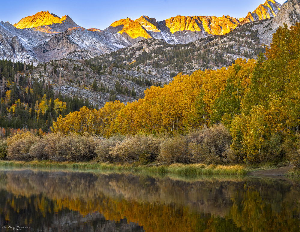
I took this picture at North Lake, located near Bishop, Calif., in the High Sierra. This was part of my first “fall color tour” which went along the Eastern Sierra. My goal for the trip was to capture the color but also the alpine scenery. What inspires me about autumn in the High Sierra is the addition of the color, not the trees themselves.
Specific Feedback
Any feedback on composition and technical choices is appreciated.
Technical Details
1.6 sec at f/16 200 iso, Sony 70-200 f4
Critique Template
Use of the template is optional, but it can help spark ideas.
Vision and Purpose:
Conceptual:
Emotional Impact and Mood:
Composition:
Balance and Visual Weight:
Depth and Dimension:
Color:
Lighting:
Processing:
Technical:
Nice colors and layers, Brad. It’s truly a lovely scene. For me, two things detract significantly: 1) the peak cut off top right and 2) the grass/water line. My brain knows that the shoreline is angled, but my instincts want a counter-clockwise rotation to straighten the horizon. I know that’s not right, but it’s an impression.
I can imagine this with the yellows in the peaks toned down a tish, but I can also imagine a more abstracted scene, just the reflections and the foliage adorned hills.
Boy, do I love North Lake in the Sierra! Looks like you hit the area during peak Fall colors as well. I have to congratulate you on a unique composition. Most simply take the short walk from the parking lot and set up behind the reeds in the lake near the outflowing stream but it looks like you took a walk around to the right side in order to catch the morning Alpine glow on the background peaks.
I have to say that I agree with the two things that @Marylynne_Diggs brought up that detract from this image. Cutting the right most peak off really hampers the composition creating a lot of tension up in that corner. In looking at you settings I don’t see what lens you were using and it’s possible that you didn’t have a wide enough lens to capture more sky and of course that chopped off peak. The second thing I notice is that I feel like the Alpine Glow is just too yellow and maybe a touch bright. If you could tone that down and maybe desaturate a little bit it would help. To make the composition a little bit better you could crop off the right side right about where the grass on the shoreline turns to dirt removing that dirt section and also eliminating the peak jutting out of the frame.
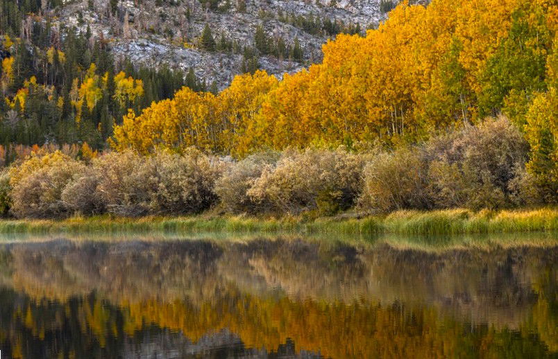
Now, for a tighter view of just the Fall colors you could crop down eliminating the mountain peaks and just focus on the trees and the reflections. In any case, you were witness to a stunning sunrise at North Lake.
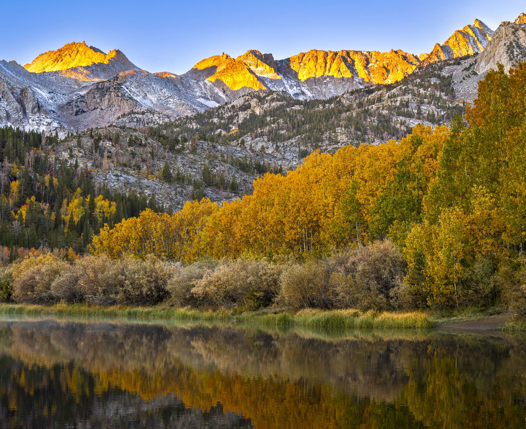
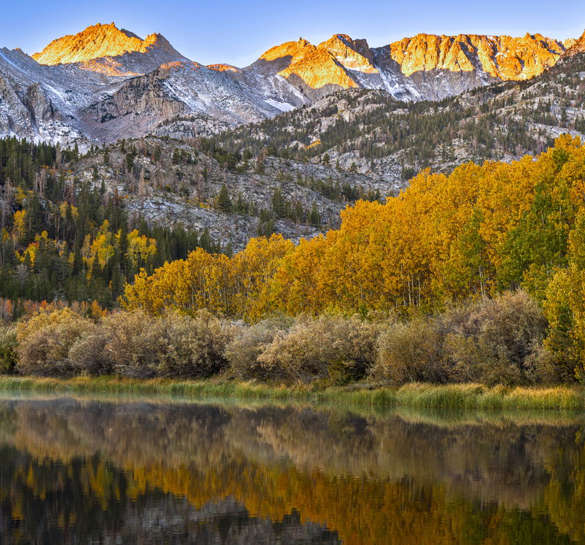
Good points, David and @Marylynne_Diggs. I considered both options. I wanted the peaks in the picture because I liked how the glow was similar to the aspen leaves. I realized a clipped the one peak. I should have put on another lens. I used generative AI in Photoshop to see what it would look like with the wider view. It does look better.
You certainly saw some very nice color in both the trees and the peaks.
I will echo the comments regarding the morning sunlight on the peaks. It is oversaturated and a touch too bright.
I agree with the suggestion to crop from the right in order to eliminate the large peaks in the URC. To my mind, they skew the balance to the right and away from the nice trees.
The last time I was there many years ago there were at least three workshops spread out along the shore. It had all the elements of a well-developed cluster function. I left.
-P
I like the repeating “bands” of warm colour - on the mountain peaks, the band of poplars in the middle and finally the (more muted) reflection of the poplars in the water. It’s a bit unfortunate that the peak on the right is cut off but your second version where you used generative AI in PS fixes that. While you’re at using that tool, how would you feel about filling in that brown, dirt area near the water’s edge on the right? Maybe will it in with similar grasses like the ones beside it. Other than that, for my tastes, I would move the colour balance away from yellow and a bit more towards blue. Otherwise, I like this very much!
Same exact thing happened to me, Preston. I literally left because there wasn’t a square inch to put my tripod legs. None of them had permits either. I have never been back.
Hi Brad,
This is certainly a beautiful autumn scene with what looks to be peak color and you have received some wonderful suggestions to elevate it another notch. I too am loving those three bands of yellow fall colors. For my tastes I think your last rework with those tweaks pretty much nailed it. @Preston_Birdwell; I love the cluster function analogy as I have been there and done that in Acadia NP.
Great color, wonderful clarity, its almost like being there. I don’t have much more to say that the others have not already mentioned. Great work though.
Lovely image that very much reminds me of what I’d see on Velvia film back in the day. Nice bands of color, some great texture in the foliage and of course, wonderful light on the mountains. The version that includes the top of the peak (thanks, Photoshop!) is absolutely an improvement. Things like primary elements being cutoff or too close to the edge of the frame always bother me. You were wise to focus more on the landscape and less on the empty blue sky, although that blue does offer a nice contrast to the mostly warm colors of the image. Nice one!