The photographer is looking for generalized feedback about the aesthetic and technical qualities of their image.
Description
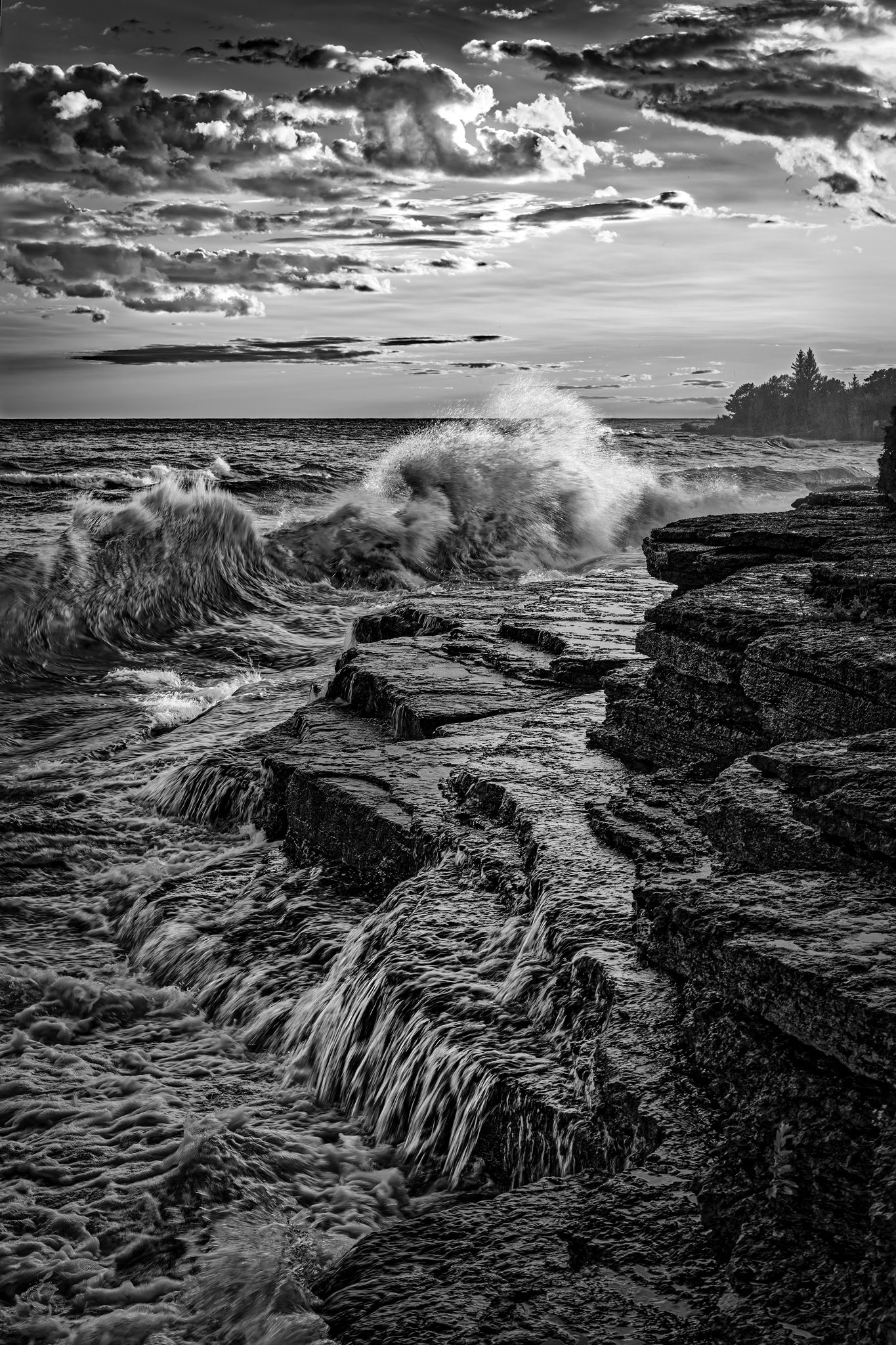
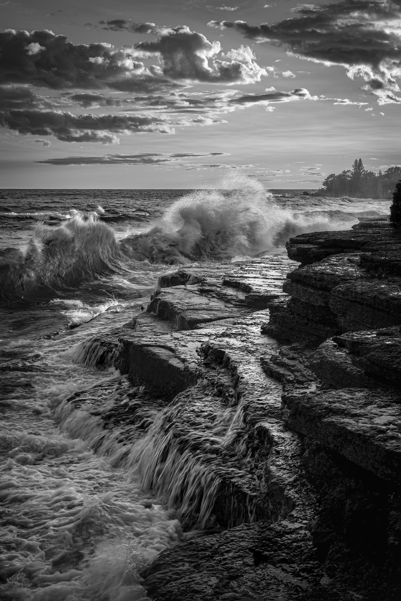
We had been traveling for two weeks from upstate New York (way upstate) to Nova Scotia and New England. It was August, 2013. We traveled back to my wife’s sister’s house on the shore of Lake Ontario. No one was there but when we arrived a storm had just passed on the lake and the waves were crashing onto the rocky beach. The tough part was using a slow enough shutter speed to get motion in the water without having a lot of motion blur on the other areas.
Specific Feedback
Looking for a bit of guidance on the sky. It was good but not as good as the lower scene.
Technical Details
Canon 5D Mark III, EF 24-105 f/4 @ 47mm, f/11 @ 1/40, ISO 100, handheld. Processed in Dx0 PL9, ACR, and Photoshop CC. The colors were rather bizarre. The water there is bright green and the rocks are dark red in places so I elected to go with monochrome.
Critique Template
Use of the template is optional, but it can help spark ideas.
Vision and Purpose:
Conceptual:
Emotional Impact and Mood:
Composition:
Balance and Visual Weight:
Depth and Dimension:
Color:
Lighting:
Processing:
Technical:
Hi Fred,
My what a dramatic scene. I always forget that the Great Lakes are practically small oceans, albeit without the salinity.
I think the biggest issue with the sky is the highlights. They are dramatic in the thumbnail, but in the full view, the highlights are close to being blown out. I once tried to print an image with highlights like that, and it did not go well.
I would try to bring down the highlights.
The only other thing I’m wondering is about the overall processing. I like the monochrome plan, but there is an HDR software crunchiness here that detracts from my enjoyment of it. Now, that’s a matter of taste, and if you wanted the grainy, crunchy quality, you achieved it. If you wanted a more natural looking black and white conversion, choosing a different setting (texture, clarity, or perhaps micro-contrast) would tame that effect.
Again, no need to tame the effect if it was what you were going for. But if not, that’s where I would start.
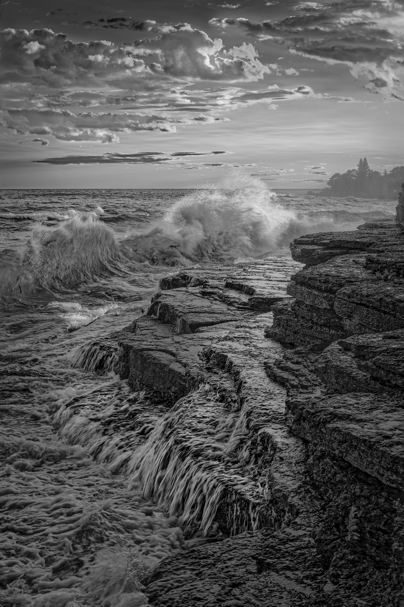
@Marylynne_Diggs I went back to the photograph and fiddled a bit. It became more soft overall and less contrasty with some additional detail work. I should have spent more time on it initially but I had been caught up in the memories of the roughness of the rocks on the beach. We spent many summer days swimming and trying to relax on them at family reunions over the years.
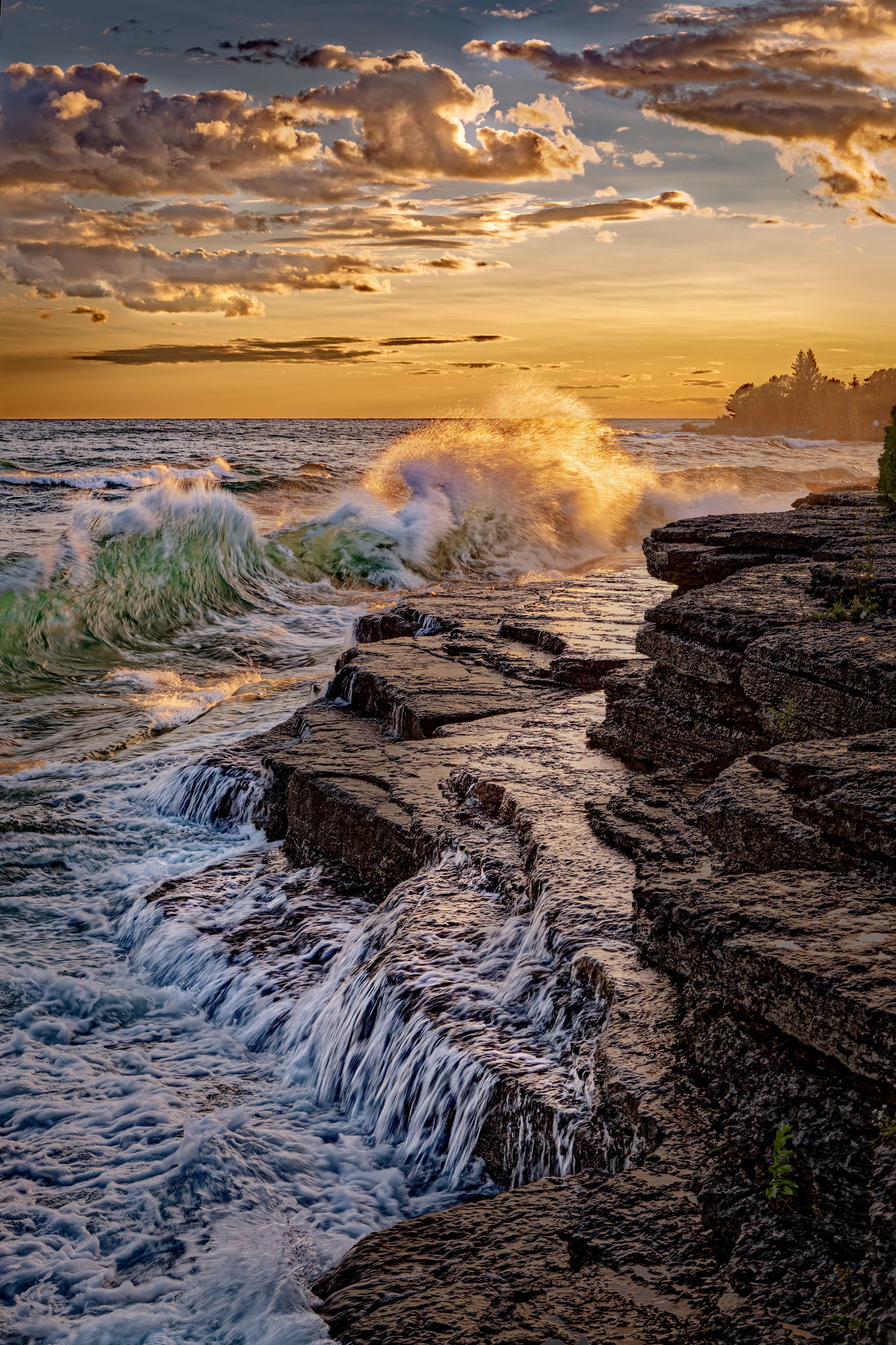
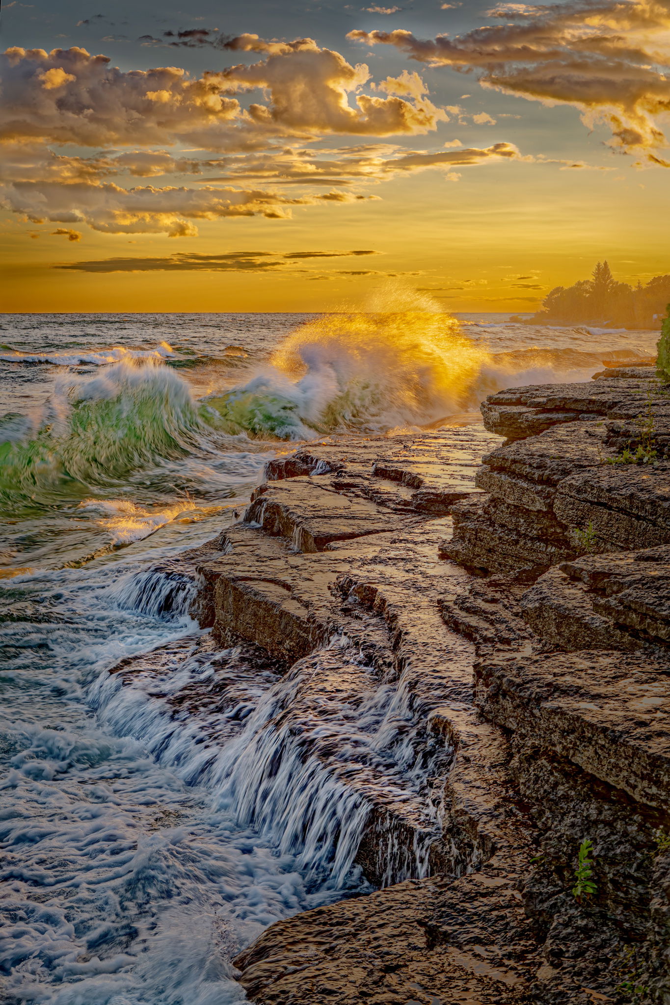
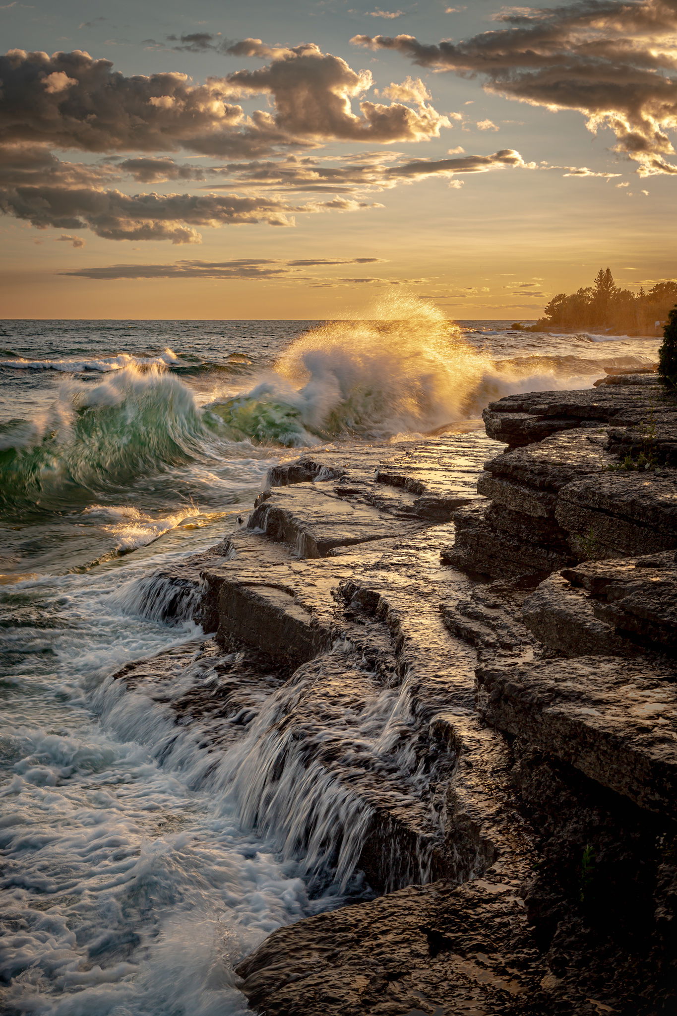
I have attached both a color and a monochrome version this time as the color version became more palatable with the work done. The water really is that green there.
Both of these look better than the original to my eye, Fred. I’m curious about other folks’ reactions. The foreground still feels a bit over-sharp, but I’m not entirely sure it’s unnaturally so. Given the water flow and the contrast, it might be the nature of the scene. The more I look at this, the more I see the crazy texture of the rock and water, and you captured that nicely.
I really like this, Fred. I was drawn into looking at this further from the thumbnail. I, too, like Marylynne, noted the “crunchiness”. I prefer the reposted black and white. The black and white emphasizes the dramatic nature of the scene, but the colors and the light you captured in the color version makes it my favorite.
Compositionally I like this photo. The lines lead the eye into the scene nicely. The action in the water gives it a dynamic feel as well. What I can’t seem to get past is the high contrast nature of both the original color and the B&W. The B&W almost looks like a pencil drawing, which is cool, but the color version just seems like it was over cooked in processing.
Fred … So Cool in B&W. I like the second edit the best. I like the contrast in your image. The Tone really speaks to me !!! This image has a real unique vibe to it and really caught my interest.
Thank you to all for your comments. I think the contrast in this image is a product of my memories of this particular location. We spent many years visiting my wife’s family at this spot and it left an impression of nature’s roughness on me. The sedimentary rock surface of the shore has worn down mostly but still retains the appearance of extreme abrasiveness. I’ll let it settle for a time and go back and see what it does for me in a few days.
My thoughts echo those of Youssef. Composition is spot on and the conditions you caught are spectacular; the wave, clouds and water draining off the rocks. It does appear a bit like a pencil drawing. I can’t quite identify what it is that isn’t working for me, though. Too much contrast and sharpening have been mentioned and it could be a combination of those two things, or something else, but I do feel a softer version would feel better to me. It’s crazy how big the waves can get on the Great Lakes!
Yes, a wild capture, and this sort of high local contrast enhancement processing was more in vogue at that time. I think the scene’s drama would come through equally well with a more restrained approach – would be interesting to see a comparison.
Okay. One more step. I may have gone too far though. I think it’s time to stop fiddling with this one. It’s just the nature of the water and rock textures to look crunchy.
It is difficult to critique subtle details in the highlights using the versions my laptop downloads, but each iteration in this discussion shows a softening and increase in subtlety which adds interest to the enlarged versions I can see, except I find the third color version has some medium-dark tones that seem too lifted. I prefer the darker rocks of the second version. (It’s wonderful to have the freedom to adjust any part of the image to meet your vision at little cost. )
At the scale I can view the monochrome version each has appeal in different ways. I think print size/image size would influence my response to each version. A larger image will demand more subtle tones in the darks and the lights. Smaller images benefit from a graphic, simpler treatment.
I am not disturbed by the micro contrasts/“crunchiness” in the monochromes, although it is a big part of the image’s effect, but I want more of that wonderful green in the water in the distance and maybe parts of the foreground water in shade to contrast with the sunset colors in the polychrome version. I might intensify that green, sample it and paint it a little further into the waves. I might even paint some sunset colors into the reflections from the rocks using a mask to select for the luminance of the reflections. Would that be wrong?
I might also experiment with a version with negative “Dehaze” in Camera Raw/Lightroom, or “microcontrast/finecontrast” in DxO, just to see how dialing back the punchiness some works. If the image has layers I might reduce the opacity of some of them.
That green and that level of texture in the landscape is something I’ve noticed in 19th images, paintings, and engravings of shipwrecks on rocky coastlines. I’ve saved screenshots some of them from websites just so I have samples of the color palettes I admire!
I’ll throw my 2 cents in here. First off, I love the composition and the timing of the wave with the cascading water on the rocks. I wish I could help with your actual request about the sky but processing is not my strong suit. IMHO the original post is the best. Or maybe the second B&W.Some of the others look too hdr Regarding the “crunchiness” I think it’s a combo of lack of a polarizer and too fast a shutter speed.It leaves the cascades of water looking too bright from the sky reflecting above and the faster ss leaves the water stuck in between the silky look and the frozen look. I often have this problem. That’s why I shoot myriad different shutter speeds.
I’ll echo much of what has been said regarding these images and that is that the composition is terrific, the subject is engaging, the colors that you captured in the sunset/sunrise are beautiful but I can’t get past the structure of everything in the lower portion of the image. It looks like some sort of fractal filter was used to create a watercolor/painting or a pencil drawing. For me, the original black and white is the best of the bunch as it retains some darker shadows and blacks and I think original color is the second best.
I would love to see what these looked like before processing as I think you have a terrific scene with an exceptional composition and a great sky. I love the wave that’s catching great color from the sunset. With all this being said, if this is the way you remember the scene and you’re happy with the story it’s telling then I’d say that’s all that matters Fred.
Thank you all again for your comments and suggestions.
Sometimes it’s best to just start over again and go back through the steps taken to see where the influences originated. As was pointed out, it was a bit too crunchy. Even though I didn’t actually use HDR software on the image, I did use Dx0 PL9 which was the source of the effect. This time, I used ACR only and processed more carefully in the hopes I could avoid the adverse effect. I’m sure it’s not finished yet but here are the next versions for inspection.
I really like these last renditions. Having grown up near Lake Michigan in Chicago and its sandy beaches and dunes I appreciate the totally different rockiness and cragginess Lake Ontario. It brings back memories of why it is so important to mind the waves and riptides that can be incredibly dangerous. I think you’ve captured these feelings and past warnings for me!
Hi Fred,
I’m impressed that you’re still playing with this. I like the latest, least processed versions the best, though a bit of the drama in the top half of earlier versions would knock it out of the park.
Still fantastic composition, and everything is there for a stellar image.
ML
@Marylynne_Diggs I have been accused of gluttony in regards to punishment, photo processing punishment that is. I’ll certainly take a look at mixing the high drama with the low drama. Why not?
Hi Fred,
You are getting real close with your last reworks as they look very much natural; at least to me. I only had one other tiny suggestion and that would be to remove the tree about 2/3rd’s of the way up along the right edge. You definitely captured some wonderful drama with this scene. Very nicely done.