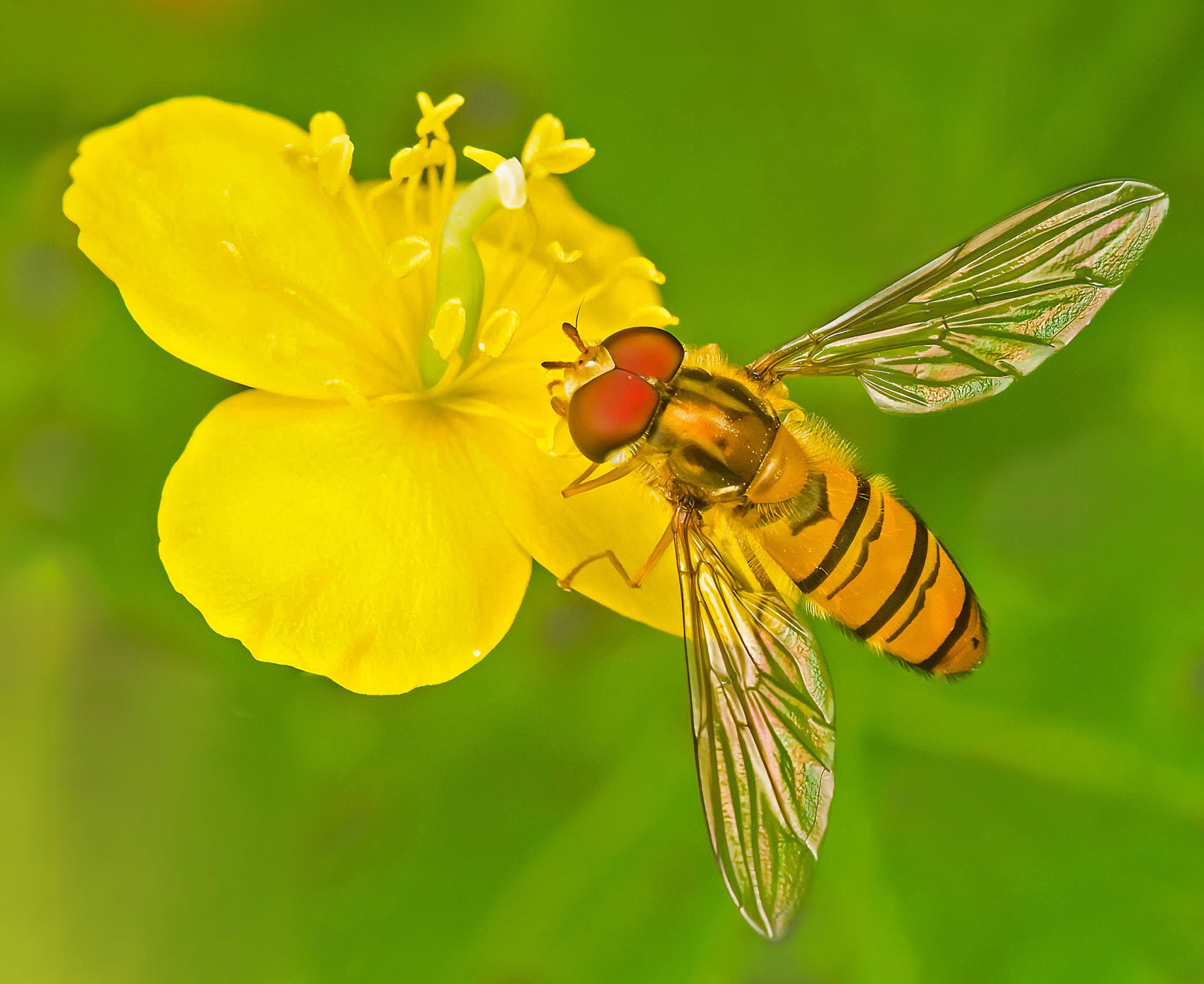
Oh, this is nice! You have handled the yellows really well. I like seeing the colour of the flower and the gorgeous shine in the insects wings. The red eyes really pop. Insects are just so well put together. Every detail in place.
This is almost unreal looking, Mike, with everything so crisp and shiny and the yellows so close to full saturation. While I know the flower needs support, in this case, I think it could do without the stem. Also, with all the energy pushing toward the upper left, I think just a bit more canvas in those two directions would be helpful.
A feast of colour, indeed.
I might tone it down a little but its only personal taste. Possibly over sharpened/NR too strong?
I pulled out one of mine from earlier this year by way of comparison - quite similar I think
Hi Mike, Your fly is amazing, every hair in place, capturing the iridescence with the sharp black lines of the wings is beautiful. I haven’t made up my mind yet about the brightness of the flower or the background. I wonder what it would look like if you backed off the saturation of both?
Mike: i got an immediate -meter spike with this one. My thoughts echo @Dennis_Plank almost to a T so played with some adjustments. BTW, how much of a crop is this. Looks like your were pretty close. The iridescence is icing on a very fine cake. >=))>
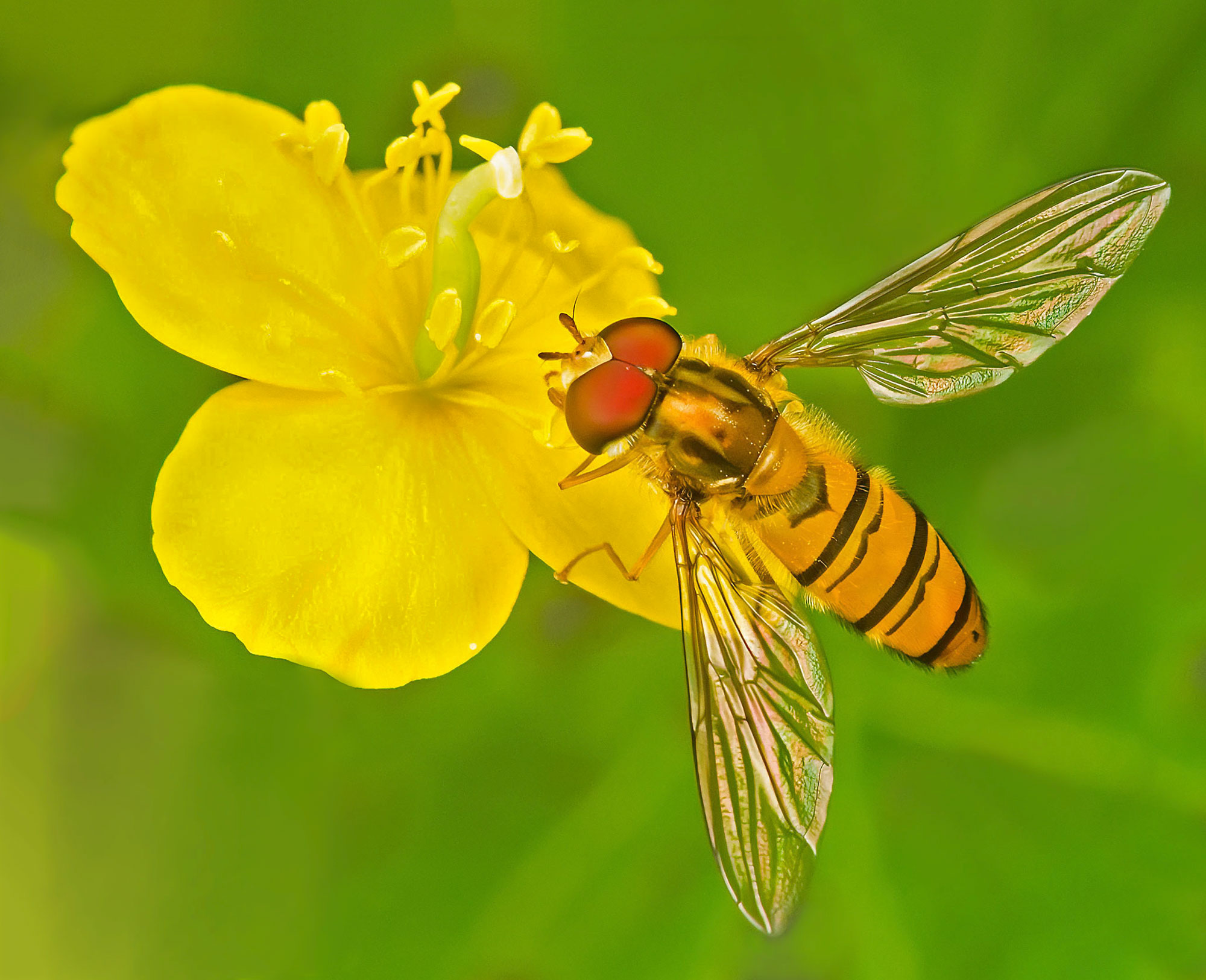
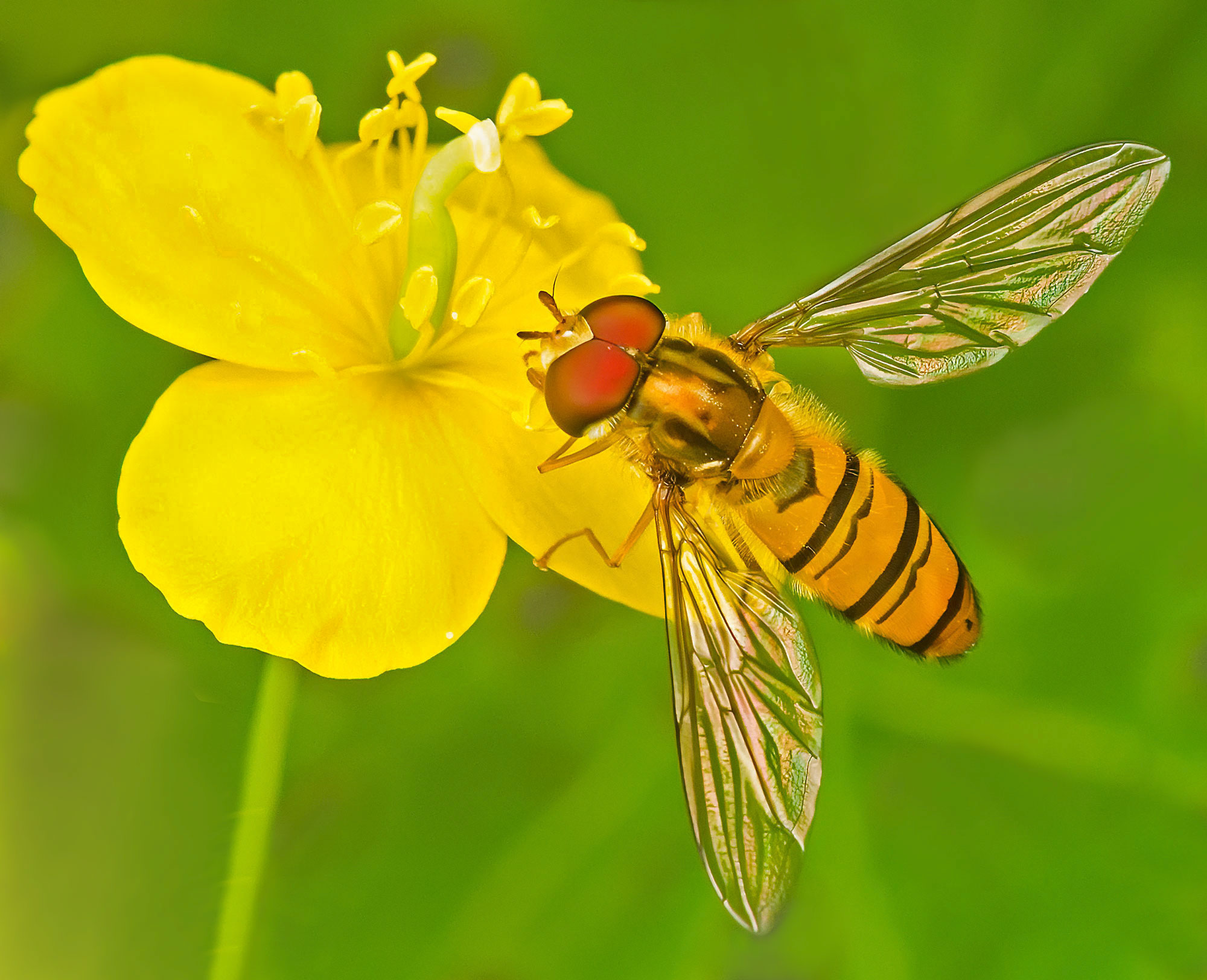
Thanks @Glenys_Passier@Bill_Fach@Dennis_Plank@alice@Huw_Thomas. I’ve posted a revision. Yellows tamed a bit more, stem removed and a bit of canvas added. Bill, I wasn’t that near, it’s about a 50% crop; there was a second yellow bloom to the left which was just too much!
Mike, you’ve got great details in both the flower and the fly, especially the subtle iridescence and glow in it’s wings. The extra blurring (background and flower) and stem removal in the revision make it seem unreal to me, although it does show off the fly a bit more. Given that, a bit more space between the fly and the frame would be nice.
Looks pretty good, but drop your noise suppression by 10-20%. Lightroom gives you a start at 50%, and you can reduce it before exporting to another program for further edits. Some of the features on the body look slightly smeared in spots and that will be takwn care of with less aggressive noise suppression. Sharpness looks good and wings are fantastic. Well done…Jim
How cool!! I’m in agreement about adding the bit of extra room but can’t decide about the stem removal – maybe just darken it a bit? I also think the NR went just a bit too far, but I don’t know what you had to work with. The yellow looks OK but I wonder if there is a bit more detail in it. (I see a touch more in the RP.) My feeling is that there is a bit of a yellow cast overall – I wonder if the initial WB is worth a tweak just for comparison?
 -meter spike with this one. My thoughts echo