The photographer is looking for generalized feedback about the aesthetic and technical qualities of their image.
Description
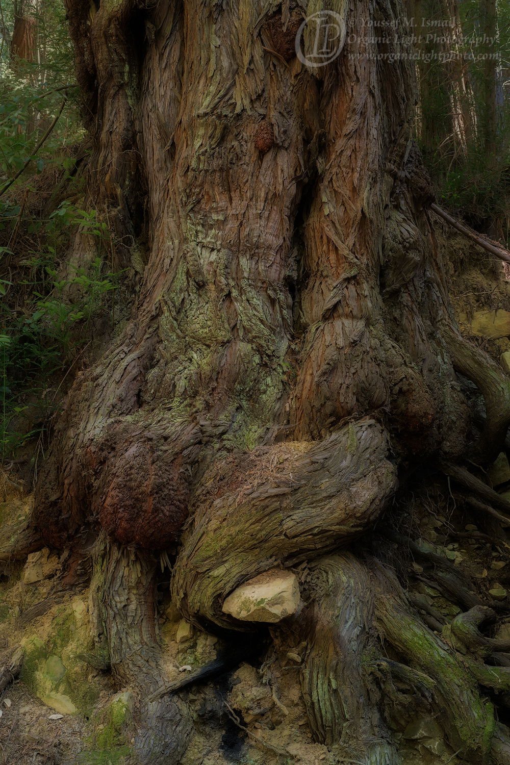
I took a hike down Purisima Creek Trail in the Santa Cruz mountains that I have not visited in over thirty years. I came across this tree trail side, on the uphill side of the trail, and I was enamored by how its roots were exposed, twisted and coiling their way into the ground, but also how that one root has hugged that sandstone boulder. It was the only photo I made on my hike.
Specific Feedback
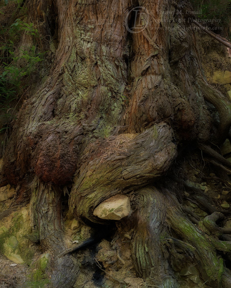
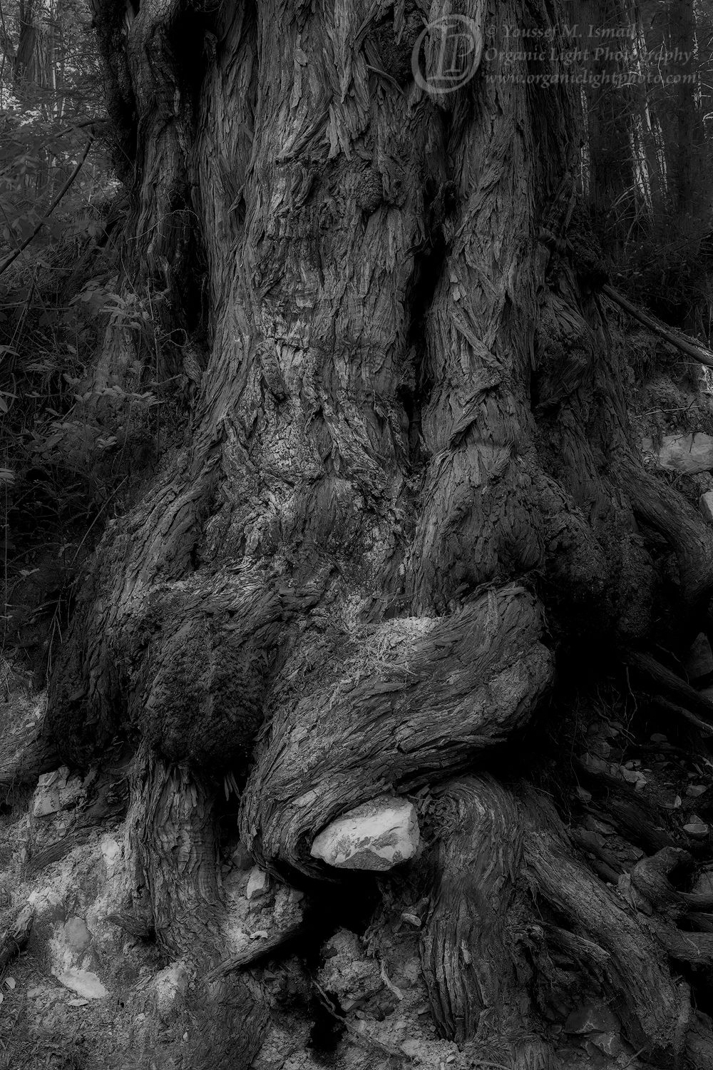
As I started to edit the RAW file, I thought there was too much going on in the top of the frame, so I cropped it to a 4x5 aspect and focused on the roots. Then as I continued, using TK masks, I found a mask that appealed to me as a B&W, so then I did some more processing into a B&W of the full frame. Now I am not sure which of the three is best, or maybe there is another possibility.
Yor feedback on which of the three is most appealing would be most appreciated. In fact is there any appeal with this photo at all?
Technical Details
Nikon D850, Nikon 50 mm f/1.8 MF set at f11, and 1.3 seconds at ISO 200.
Edited in ACR for Raw conversion then into PS for final edit. Basically adjusted the contrast and darkened it a bit. I also burned in the highlights in the top two corners and desaturated the redwood saplings on the left of the tree as they seemed to grab my eye from the roots.
Critique Template
Use of the template is optional, but it can help spark ideas.
This has a fantasy-like vibe to it for me Youssef. It feels like a hobbit might peek from around the tree. The overall low luminosity and the twisted appearance lend to that.
I really like the added layers of contrast that the color versions have, so I prefer them over the black and white. Of the two color, I prefer your original because the context of the forest is lost in the crop and the original has more depth for me.
The central twisting and rock at the bottom are the stars here, and I’d play with darkening both the lower left corner and the more distant forest to enhance that (a vignette, of sorts, that is masked out of the lower right corner). You might even brighten the twists and rock a little to add to that effect.
If you do run with the cropped version, I’d clip even a little more on the right edge to get rid of the small bright area.
Overall an image with a lot of moody character, and yes I do find it appealing.
I love images like this that show the texture of trunks and yet are not abstracts of the wood itself. I do think a crop was appropriate because of the light rock near the bottom pulling you down. However, I would vote for a less drastic crop. One that starts right at the bottom of your logo. The subject is pretty much vertical so a 3 by 4 vertical should work well. Of the three I prefer the original for the reasons John gives.
Lovely. I prefer the taller version, but with an intermediate crop as Igor suggested. There’s a certain grace in the taller version which is lost with the 4x5 crop. Also, I agree with John on burning the LLC just a tad.
What a wonderful find! I’m late here but I prefer the taller version. I’m 50-50 on the proposed compromise crop – I like the repeating tree in the UL. I do like darkening the LL corner.
The B/W is very interesting and an excellent twofer, but for me the color version puts me there better. There is something special about the colors in a redwood foreat.
Hi Youssef,
All three versions work well for me, but I am partial to the first one as that extra bit of forest in the BG just seems to put me there and let me soak up the serenity of the scene. The large version is a real treat and lets me savor all the textures and details of the tree bark while enjoying all of the twists and turns of the roots. I particularly enjoy that one root embracing the stone. My only suggestion; and this is being really nit-picky; would be to slightly burn down the LLC . I only mention it because everything is just magical in this image.
Thank you all for your feedback. I have implemented your suggestions and yes, I think it has made the photo better.
NPN is a wonderful place where honest feedback helps make a good photo great. I have posted what I think will be the final version of this photograph. However, if anyone has any other suggestions, I am all ears.
Love the soft contrast definition in your beautifully textured softly lit tree. I find the second squarer cropped colour version to be my favourite leaving my eyes free to roam around the whole composition without my eyes being pulled to any specific area. That said I can see why you have cropped it to the final version. Very enjoyable.
Before I get to the crop debate… I gotta say this is just gorgeous. John immediately uses the word “fantasy” and then “Hobgit” gets invoked too. I think the colors are deeply rich and almost subtle. And for that, IMHO the b&w loses that; and I’m not sure the graphic design of this is strong enough to carry with the b&w. The processing for color/saturation is just wonderful.
For me at least, the gnarly roots are just a subset of the overall impression with the main attention being the rock-hugging primary root. The tree as a whole and in context is story/impression I’m getting.
As far as a crop, your original crop cuts too far IMO and again, I don’t think the roots carry things enough in the cropped version. I liked Igor’s suggestion of a crop near the bottom of your logo, and so that’s what I’ve done here. Plus a little border cleanup, a vignette and a low opacity Orton layer. In fact, your presentation has that very cool glow already that made me think of the Orton technique (yours speaks for itself and doesn’t need that , but applied a little anyway. My edits may or may not fit your vision for this one. Regardless, this is a wonderful image you’ve seen, captured and presented. Love it.