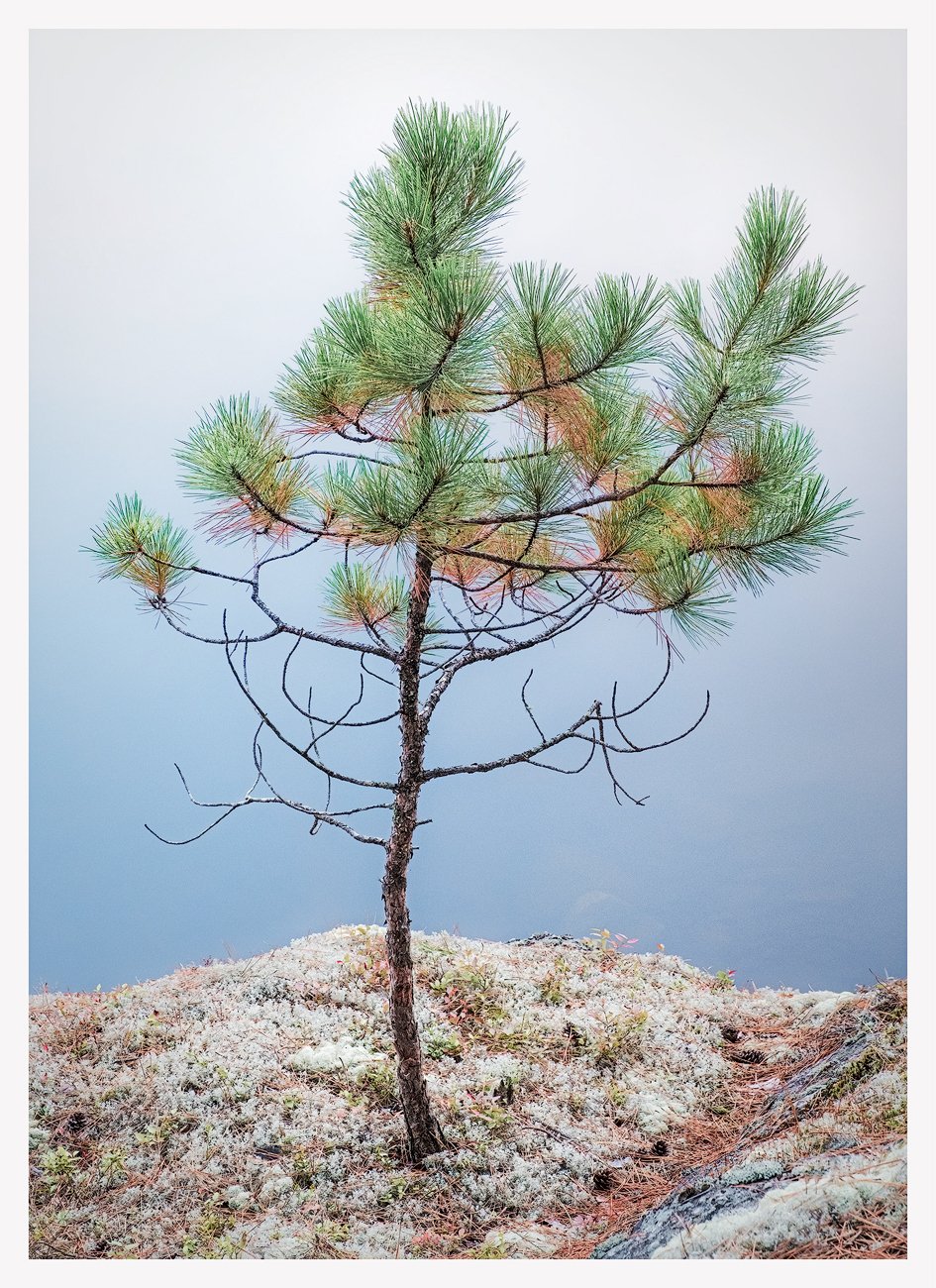
A pretty obvious shot, perhaps too obvious. But how could I resist? The stage was set – a tiny, perfect outcropping off the edge of a cliff and this tenacious little fellow, the only thing above three inches, standing on it. “I’m ready for my close-up Mr. DeMille.” Always interested in your thoughts, feelings or critique.

1 Like
I like this a lot Kerry. Not only the placement of the tree in the frame but also the smooth gradient of color in the sky which highlights the crown of the tree…
Kerry, it is interesting to observe your creative efforts as you add more tree images to your collection. While this image is minimalist, I don’t know if it qualifies as obvious. There are some subtle nuances in the image that take it beyond obvious for me. I love how the dead brown needles mix in with the green ones, creating a more unusual look. I also like the moss at the bottom, it tells a story about the environment that the tree is trying to survive in.
This is a matter of personal taste, but I’m concerned by the gradient from white to blue in the background. I think the tree separates better against the blue than the white. Here is a rework where I made a luminosity mask selection of the lightest sky tones, and then used it to paint in a light blue color selected from the middle of the gradient. I think it helps focus more attention on the tree.

I disagree that this is an obvious shot, Kerry. The process may have been straight forward but enjoying the image has been a very pleasing experience for me. From the size of the tree, the snow on the ground, and finally the color arrangements in the image. I have an opposite reaction to the gradient from @Ed_McGuirk. Immediately, I find the gradient the best feature of the image. It creates a feeling of being at a high altitude and that is such a pleasant feeling to me.
@Eva_McDermott, @Ed_McGuirk, @Adhika_Lie. As always, thanks for your support and taking the time to take a look. Ed, you always go the extra mile and I appreciate your rework. It is nice but, in this case, I agree with both Eva and Adhika that the gradation of blue to white adds to the image rather than detracting from it. Well, as I’m fond of saying - that’s why there’s chocolate and vanilla. Adhika, I don’t want to undermine your very positive response to this image but it actually wasn’t taken at high altitude and the white you are seeing on the ground isn’t snow, its a kind of moss. But maybe I should just keep that to myself ![]()