The photographer is looking for generalized feedback about the aesthetic and technical qualities of their image.
Description
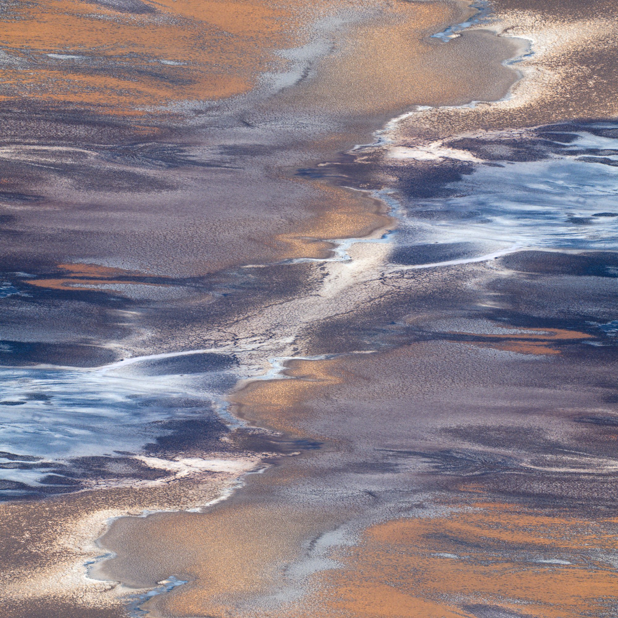
This was shot from a high vantage point within Death Valley. I was really shocked when I got there by the variety of shapes, colors, textures, and patterns. As soon as I started processing this image I knew I wanted it to be a square, it just seemed to work far better than the full 2x3. As I was processing it I was also reminded of a pair of photographers who, through their work, have encouraged me to look at things in a different way. One of those being Alfredo, the other by the name of Eric Erlenbusch. On one hand, I like the original for the “fade” from calm to chaotic, on the other I enjoyed the creative process and envisioning what it would look like mirrored and combined. I knew I really liked the curl in the bottom left and top right corners so I wanted to keep those which gave me only one real option for how to blend the images.
Hi David, thank you for the mention! I’m happy I could play a small part in your creative process.
This is quite the engaging image. At first glance, I did not realize the mirrored effect. I really like the duality in the scene as well as the color contrast. The “aerial” perspective is also great. Good call on a square format. The original also works well. I like the message of calm to chaotic. Well seen and well executed on both versions!
Oooh, beautiful. And creative! The colors are gorgeous. My first thought was that this would be a cool painting. Would you mind if I used it as inspiration for painting?
OMG – this is wonderful!! I’m so glad you included the original because I just can’t stop clicking between the two versions. I love the structures and textures and the way they are arranged! Whatever caused you to be able to see the final result is beyond my comprehension.
Oh my goodness! Consider me flattered! Also don’t know the last time I said oh my goodness in a conversation not involving a 3 year old . Yes yes yes! That would be amazing. Let’s chat about it in private messages as I may have some ideas! Thank you!
@Diane_Miller I can’t really say where exactly the idea came from. I know I’ve been keeping my eye out for opportunities like this (in post, it’s not like I had this idea in the field like some do, maybe that will come with time). Like I said before I’m taking some inspiration and looking for ways to take one thing (or two) and turn them into something else, like Alfredo is such a master of. I saw the string diagonal line and just loved the curl in the bottom left corner. At one point I remember thinking, it be great if there were more of those! Then I started playing. The lines just really flowed toward that division along the diagonal so I thought why not split it there and let everything pull toward that line. It took me many tries with blending to get it where I thought it was solid.
Thank you!
A bit late to the party, but had to chime in and comment how wonderful this is! Great eye to spy and photograph this. I too think both versions are excellent! I especially like the warm/cool combo of colors in both. Quite a natural abstract with no reference to scale.
Can’t say I would change anything. Beautifully seen and captured.