Image Description
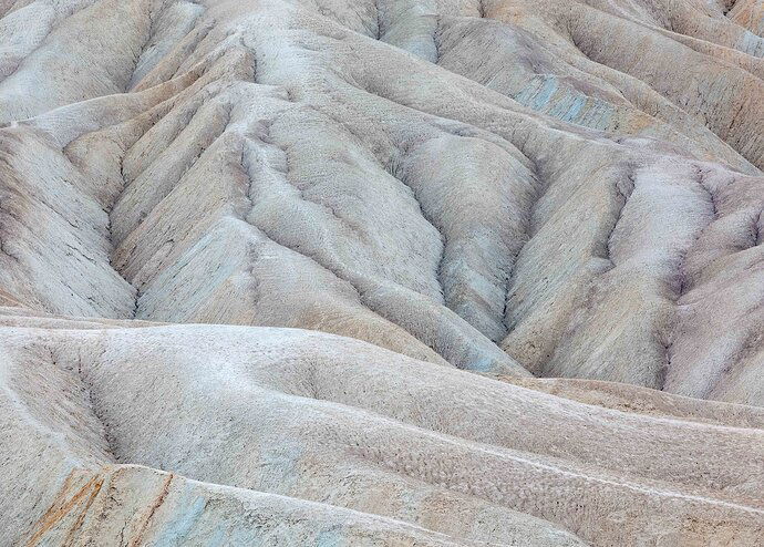
After many trips wandering and searching for grand landscapes in Death Valley, the last several visits I have spent much more time searching for photos like these. The light was constantly changing from bright to cloudy and subdued, and by time of day from shadow to full overhead light. I had enough time there that I could return over and over again to spots I saw possibilities for. I visited both of these spots at least three or four times and got to photograph them in very different conditions. These are two favorites.
Type of Critique Requested
-
Aesthetic: Feedback on the overall visual appeal of the image, including its color, lighting, cropping, and composition.
-
Emotional: Feedback on the emotional impact and artistic value of the image.
-
Technical: Feedback on the technical aspects of the image, such as exposure, color, focus and reproduction of colors and details, post-processing, and print quality.
Specific Feedback and Self-Critique
As with all close up abstracts, the crop is very important. I have edited and re edited the crop on these two photos many times. I’d love some feedback on the crop and which of the two you prefer. And as usual, any other suggestions would be welcomed.
2 Likes
Tony, these are both magnificent photos. On the first one, I love that one hill is going perpendicular to the others. You did a great job of processing this. The colors and tones are spread out very even with nice highlights and shadows. The sharpness is good enough to see the texture in the sand, but not too crunchy. I like the crop too. The only thing I might point out, I think it’s just me because my eye caught it and now I can’t unsee it, is that dark crease in the URC.
The second image is just as beautiful as the first, but I think this one wins for me. I like that the scene is not perfect. It’s got splotchy colors (love the blues), the hills are more rugged looking and not smooth and I like that the veins on some of the sides of the hills look like trees. It’s not your typical DV photograph. I don’t think the first one is either. I like the crop on this one also.
Tony,
Both are wonderful, intimate images. Love them both. The first, I appreciate the muted pastels and like Igor’s recent image from near here (I assume) it’s nice to see such beautifully subtle colors. The erosion patterns, ridges and little valleys provide so much to explore here; the eye is able to move around and explore it all.
Cropping can so many things, one of which is removing elements or distractions. When you mention you’ve edited/cropped many times it makes me wonder what your were cropping from? In the top image, the dark pieces up top, and the rusty lines in the LLC are mildly distracting - and I’m guess you were cropping much more significant elements? I’d hate to crop out the lower left as that leaves some less than desirble results for the rest of the image. I haven’t done this much, but am remembering more and more as an option, but you could transform/warp that LL just enough to allow a crop that would allow cleaner LL and UR corners. Minor adjustments that I don’t think would alter or diminish the bigger picture.
The second image - wow! Love this one. Combination of the colors and all those lines and triangular shapes - and the square crop make this one really stand out. This is fantastic! Minor critique on this one - the LLC. I think a simple burn or selective color darkening to make it less of an attraction. But that’s pretty minor. Certainly any additional cropping wouldn’t work.
Excellent job with the colors and processing on both them! You should be proud of these.
Lon
Thanks for sharing these fine image Tony. Of the two, the second one feels more abstract to me. I love the repeating triangle shapes. That splash of blue against the mostly monochrome color of the image works so well. Awesome work!
Both are technically sound images and are aesthetically pleasing. The first one feels more like an intimate landscape with a recognizable landscape and subject. One suggestion to make it more abstract is to crop in on the wonderful lines. This will also help engage the viewer and prompt questions from the viewer.
@Alfredo_Mora @Lon_Overacker @Donna_Callais
Thank you for the feedback. I learn something everytime I post. Lon, both of these photos are are 1/4 or less of the original photo. I just moved the crop around trying to get some harmony and balance in the pattern of the lines.
2 Likes
I really like both of these images. Since the light is so even, the edges of the frame are just as bright as the center. I would recommend darkening the edges a bit like with a radial vignette.

