The photographer is looking for generalized feedback about the aesthetic and technical qualities of their image.
Description
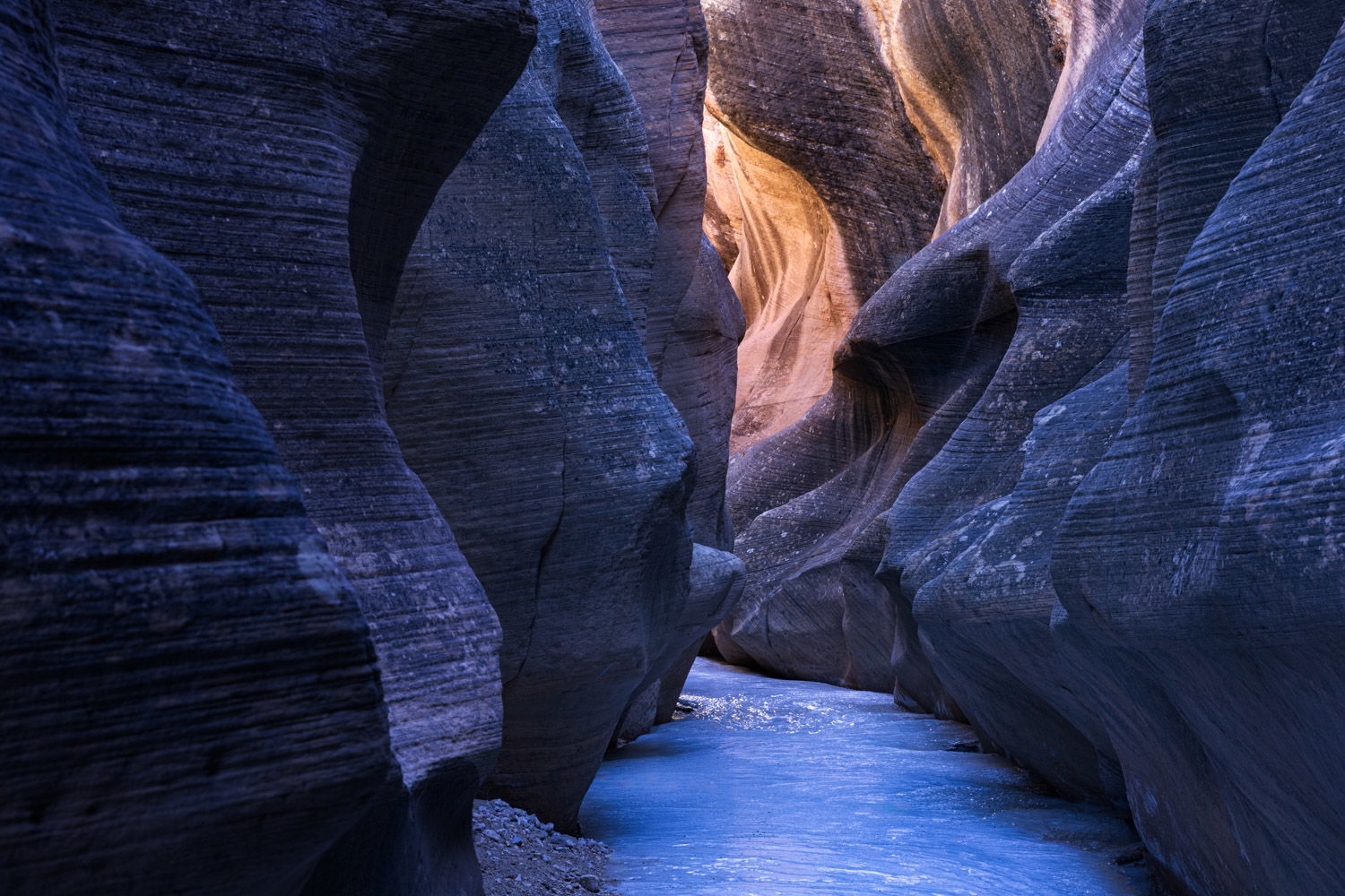
Hiking on the ice for an hour or so was kinda fun, though a bit treacherous carrying the tripod. But it got real shortly after I turned around and started back up the canyon. A mini flash flood, about 2" high, suddenly ran down, mostly on top of the ice. The hike back to the truck was type II fun.
Specific Feedback
Are the foreground rocks too blue?
All comments appreciated, thanks!
Yes - I think the immediate foreground is too cool. It might be interesting to keep the nearest walls as is, then warm up the the middle ground (purplish) and the distant section quite warm. But regardless, I think you need to do something.
It’s an interesting composition and I think it has a lot of potential. Sounds like yucky conditions. You are brave!
Hi Bill, thanks for your feedback! I’ll work on an edit to warm up the foreground rocks a tad. I was actually trying to acheive a subtle cool-warm gradient from front to back, so I’m glad you saw that too. I’ll see what I can do to make it more continuous and less blue to start.
Interesting and different image! I think you could play with the blues a little without losing the cool-to-warm vibe, which is very nice. I think you might have a look at a slight gradient darkening of the lightest tones exiting the top of the frame. Should be possible to target the lights more than the darks without resorting to masking to separate them.
Type II fun – I’d bet most of us here are familiar with it. Glad it didn’t turn into Type III.
Thanks Diane for your suggestions, especially for pointing out the bright stripes on the top. I tried to incorporate your and @Bill_Lathrop’s suggestions in the edited version.
Well that cracked me up. I’ve never heard of the Fun Scale and looked it up; I’m happy to have the new terminology to use!
Excellent shot of rich dark leading to great light; that works oh so well in landscape photography. I really like your edit, except for that larger central light area in the back. I think it looks better in the original, and provides a great place for the eye to look to and through.
I honestly like the blue to warm tones here, as-is. The first set of rocks might be slightly out of focus, not sure if you focus stacked or not… its a solid image either way.