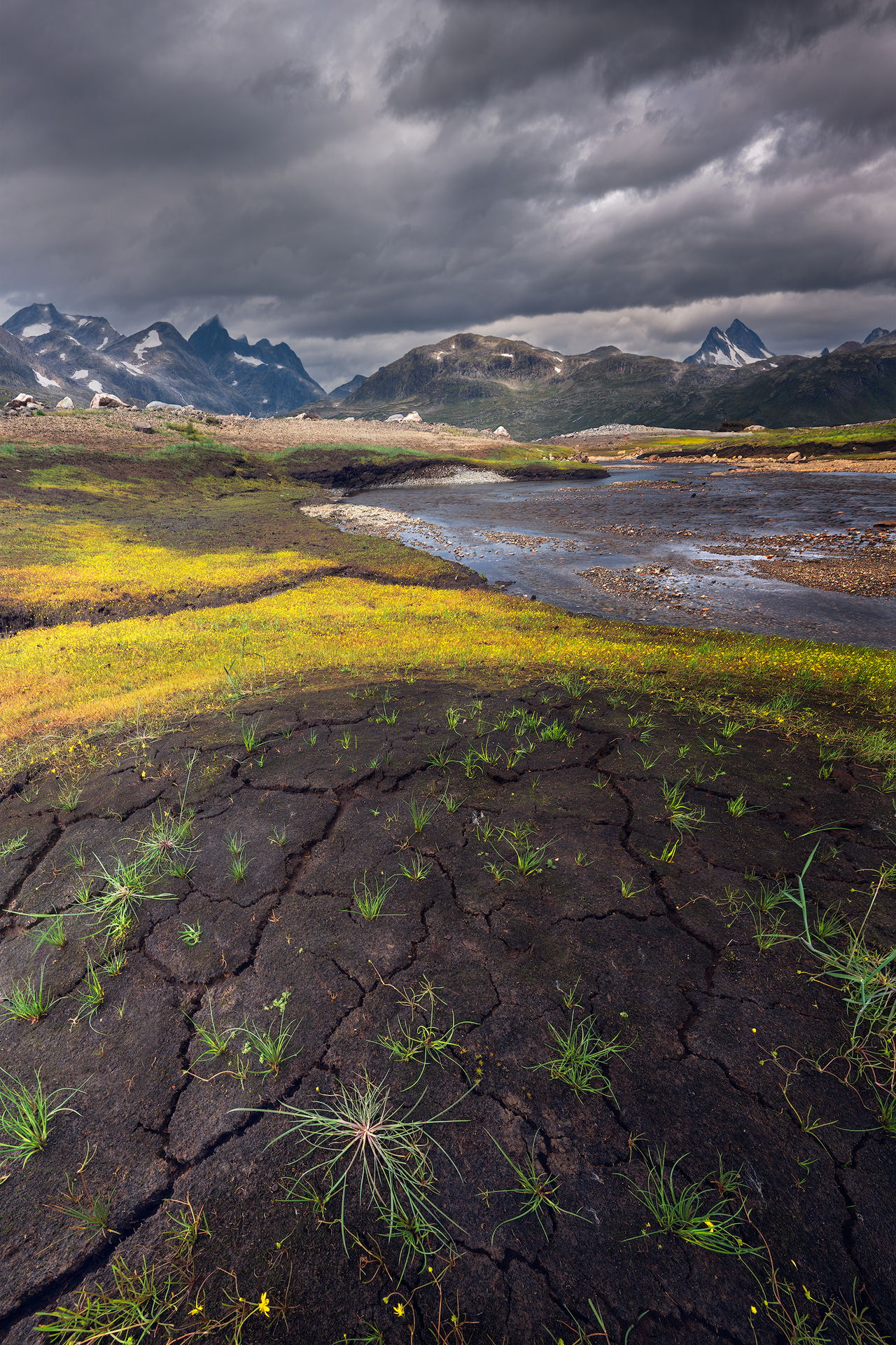
Hi all! Here is an image taken at the edge of the Jotunheimen NP in Norway from last summer that I’ve been working on and I would love to hear some thoughts.
There’s a focus stack of 2 images in the foreground. I used 14 mm on it to catch as many of the cracks in the soil as possible.
Since the wide angle compressed the background mountains too much, there is a focal-length blend for those.
What technical feedback would you like if any?
Any; thinking about composition, contrasts, color myself.
What artistic feedback would you like if any?
Any
Pertinent technical details or techniques:
foreground f/14, 1 s, ISO 64, 14 mm
background f/11, 1/15 s, ISO 64, 24 mm
welcome to npn @Ron_Jansen!!
i’ll be honest with you - i’m not a huge fan of the foreground you chose. particularly the bottom quarter is not really appealing to my eyes. maybe, less is more here. here’s a few quick thoughts: a more squarish crop could help?! what about the 24mm shot - maybe the foreground works better in it?!
other than that - processing looks solid. you worked out the dappled light quite nicely! the distant mountains are a tad bit on the (saturated) blue side.
sorry for my honesty - i hope i didn’t scare you away 
looking forward to seeing more from your work!
cheers,
joerg
Ron,
Welcome to NPN! And what a grand and wonderful first post. I think this is outstanding.
I hope get other opinions on the foreground, cause right now it’s split - I find the foreground to be fascinating and quite unique actually. I think you did a great job with the focus and focal blends. This is a wonderful near/far mountain landscape. Colors and processing spot on.
I do love that foreground; especially dark/wet soil, the cracks and the attempt at the vegetation to take hold. To be super picky, you might crop just a smidge off the bottom to remove the small yellow flowers. I think the flowers would be more important if they were repeated in the foreground, but alas, there’s just a few right near the bottom edge. I also find the foreground’s shape to be engaging as well - not sure if it’s because of the 14mm, but the foreground has a mound shape which I fine adds a nice element to the scene.
The only suggestion/wish I have would be to crop up to 1/2 of the clouds up top. I’m slightly biased against the tall, digital format. But beyond that, the near/far story is about the foreground, the midground leading the eye to the mountains. The clouds are great, but I think all of them not needed.
Just my thoughts. A wonderful first post. We look forward to more images and your participation.
Lon
Welcome Ron!
I’ll speak up on behalf of that interesting foreground. I’m a fan of low angle shooting, and for my eye this image amply explains why. It speaks well of intertidal or littoral areas, which also dubs me as a coastal resident and general shore lover. For me it’s wonderful to let my eyes follow the scene all the way back to the mountains. Your post work is exceptional in pulling that off. I agree a little with Lon that if you were to crop anywhere, the sky is the place for it. Playing with screen crops it’s easy to see how that strengthens the other elements.
Welcome aboard and great first post. Put me down for liking the foreground. Lots of nice shape, detail and contrast and adds to the great depth of the image. I would agree with the sky crop suggestion, but minor. It looks quite good as presented.
I love this foreground especially that starfish looking thing near the bottom. If you crop the clouds as suggested the round fg will be even more exaggerated, which is a good thing. The only problem with the fg is the large tuft on the right edge of the frame. It’s too dominant. It’s location is bad and it’s not particularly attractive. I would remove it or clip it as best as possible.
Welcome to NPN. I’m looking forward to seeing more of your work.
Welcome!
Interesting comments on the foreground above. I think it’s controversial because it looks so different from the rest of the image. It is a stark foreground, mixed with a bucolic background, with an angry sky above. It’s a weird effect, and I’m enjoying it for its uniqueness.
@Joerg_Bonner Thanks for your comment, no, not scared away! I posted this image because I had a few doubts, so honesty is appreciated! I was attracted to the fg due to the cracks in the soil, I don’t see this often here in Norway (last year was extremely dry, which probably explains these ones here) and wanted to use it. I’ll check some cropping and clean up the edges further as suggested in the other comments. Totally agree on the blues in the mountains and will fix that!
@Lon_Overacker @Hank_Pennington @Harley_Goldman @Igor_Doncov @John_Williams Thanks for your good thoughts! I will try cropping the sky some and see how that works out. I like the 2x3 format, if the frame is filled correctly. 4x5 can work beautifully too (if it’s not forced for instagram  ). I will clean up the fg edges a bit more, especially the little yellow flowers at the bottom like Lon said, and that larger piece of grass at the right edge that Igor mentioned. That one indeed is too big and I tried cropping it before but didn’t like that. I guess I’ll play with the clone stamp tool.
Lon, this was a small natural mound indeed, I guess it’s created by the creek in the mg. It caught the minimal sunlight beautifully and I wanted to emphasize that.