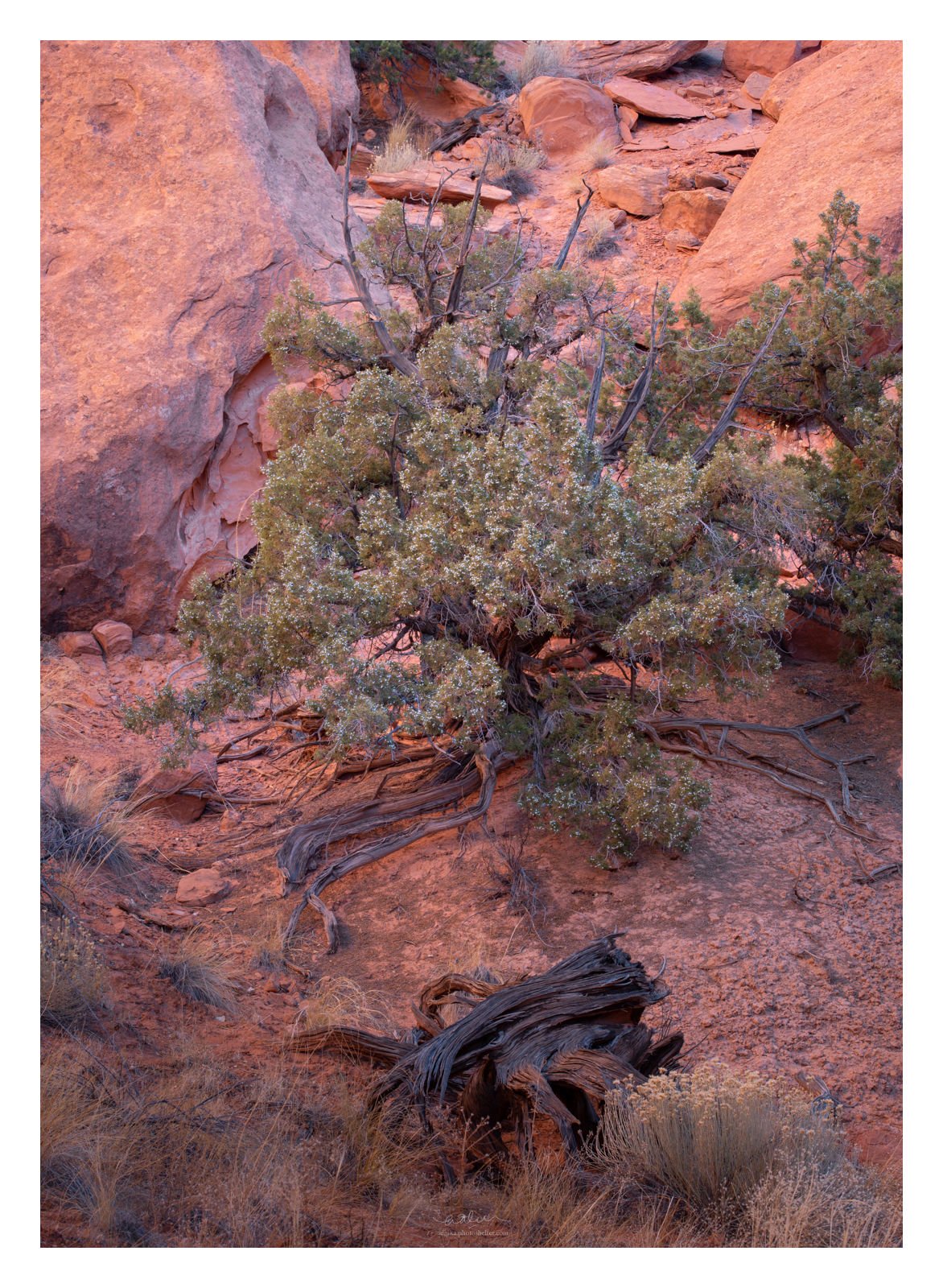
I found this juniper tree in a canyon in Capitol Reef last year and I immediately liked it. I had a hard time, however, to formulate (in words) the emotional response that I had when I was there and even as I was processing the image. I just know that I like it. This is a little bit different from the way I usually work on my image. Usually, I will work my processing around that feeling/emotion that I have. I will try to communicate that out with the processing. I hope the image doesn’t feel “scattered” as a result.
Any feedback/comments/critiques are very much welcome. Thank you in advance!
Having been to Capitol Reef and seen the place I can appreciate this image even more. My attempts came out much more orangish than this. I think you got the color of that sandstone just right. I’m debating if just a slightly tighter image would work. I find the spacing really good but you never know. That deadwood in the front works well.
I’ve often wondered what an image that emphasized those berries would look like. Some trees have tons of them. I’ve never been able to come up with a decent comp though.
Overall, I think the image is very well successful. You have a nicely balanced composition with a number of interesting elements and components that work well together. I have never been to Capital Reef, but I think your WB and color of the redrock does a good job of conveying the wonderful reflected light that I’ve seen in other places in the southwest. I always find reflected light on redrock to be something very neat to experience in person, and your processing communicates that feeling for me.
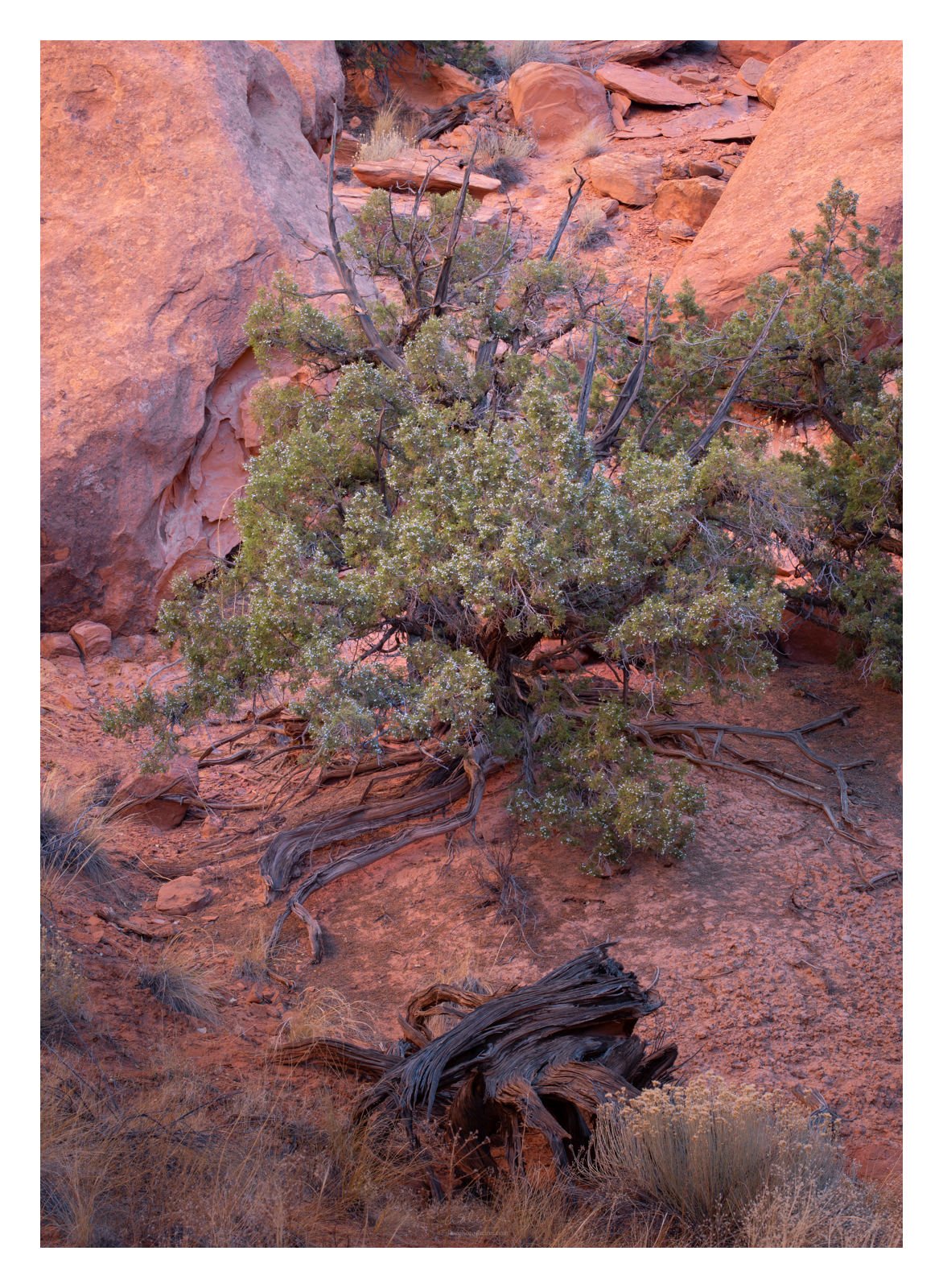
My only suggested tweak would be to create a bit more color contrast with adding more green in the juniper (even though it too is in warm light). Here is a rework where I used a PS Selective color layer to reduce magenta in both the green and yellow sliders. Also did a slight color balance to add green. And then masked that into just the Juniper. YMMV, but I prefer a color shift in this direction for the juniper.
Lovely image. The complementary colors of the rocks and juniper are great. Composition is good, the dead branch makes a nice foreground element. I agree with Ed’s suggestions on the color adjustment. Makes it pop a little more. Really nice work.
Adhika, this is how I feel most of the time when I am photographing and processing. Good to know I am not the only one. When I look at this I can feel the soft warm lighting against the soft green shrub. It feels like a very calm place to be. Don’t know if this helps you but I’m glad you shared this moment with us. Very nicely seen and captured.
I tried this, Igor, as you suggested. I really like it, too. Can go either way on my book; I have updated the original with the tighter crop and Ed’s suggestion below.
Thanks so much for this suggestion, Ed. It’s amazing what that small tweak does. I didn’t go as far as you go (feels a little too vibrant for a more desert-ey feel) but I have revised the image with this suggestion. I love it.
I hesitated in the field at first about this dead branch but I end up including it making sure that the lines are parallel (between the FG and the juniper’s root). Glad it is working really well.
I feel this from time to time, Linda. It could just be that feeling, “There is an image somewhere here!” or it could be something more shallow, “Look! A pretty sunset/sunrise/scene,” without anything else to it.
Thanks, Harley. This is my feeling about that area, too.
Indeed. I suck at a very tight scene like that (I am thinking images in the spirit of Sarah Marino’s work) so I share your frustration.