Thanks to all those who provided comment on the original, especially Kerry for the edit. I am posting my reworks - with and without the gravel (my pref is with but the tighter crop works too). I did spend quite a while on this and my colour sense when crossed-eyed! I’d appreciate any feedback on white balance and colour balance. Thanks!
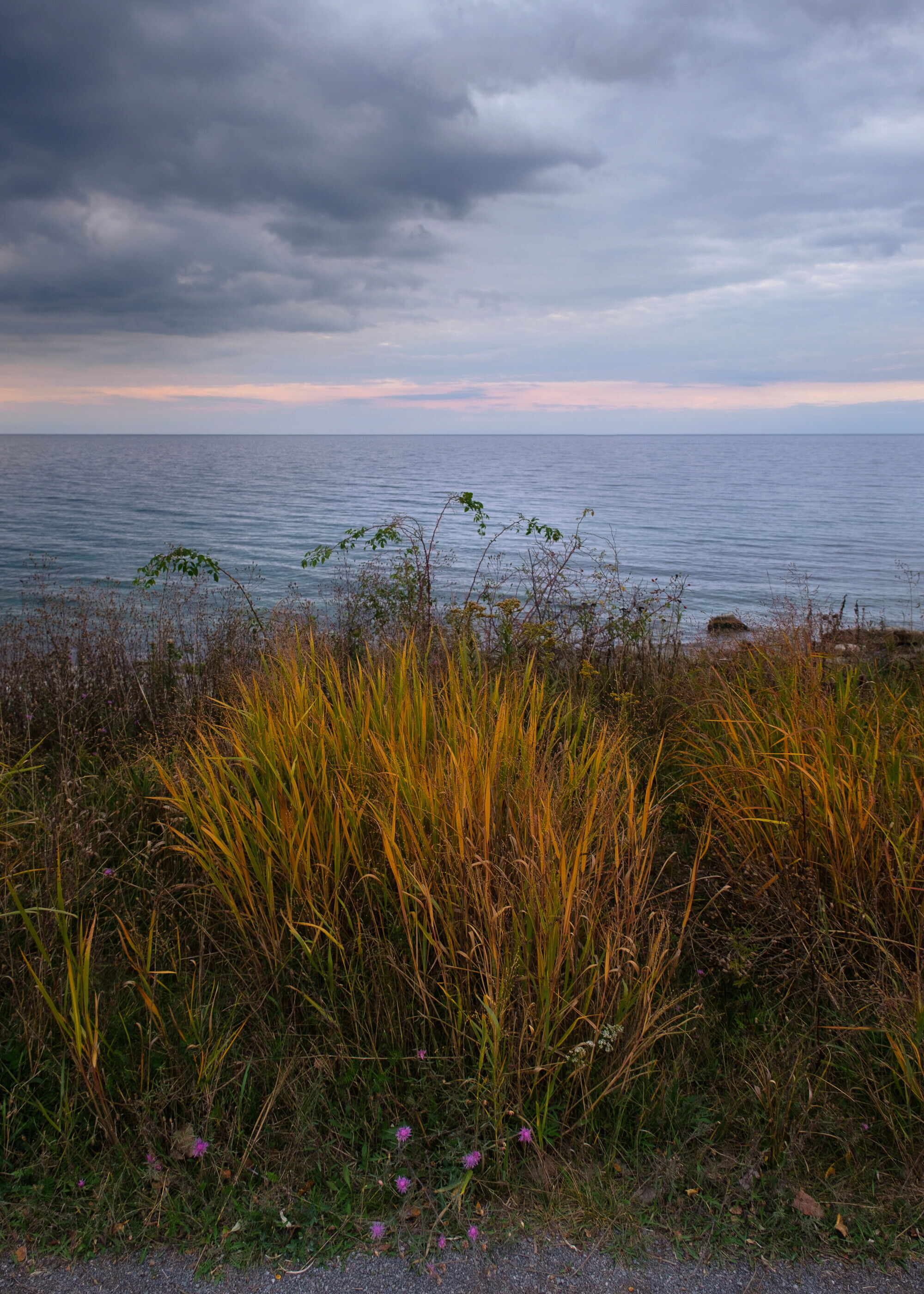
Original post: I was struck by the yellows in these fall grasses and the splash of purple of the flowers during the blue hour. Colours were rich and saturated and the sky had some subtle colour.
Type of Critique Requested
Specific Feedback and Self-Critique
I tried to pull out as many of the colours, even in the shadows, while keeping the overall subdued tone. All feedback welcome.
I have to say, Charles, I really love this picture. Of course this is home territory for me but that’s secondary to the spare composition, which I find very compelling. The light is hitting the grasses just perfectly and then the little purple flowers add just a touch of colour. Very elegant. That being said, I couldn’t resist taking it home with me and playing with it for a bit. I could have spent hours with this one but here’s what I did, down and dirty. First, to me, though the sky is very moody, it doesn’t deserve almost half the frame. This is really about the light on those gorgeous grasses for which the sky is a mere backdrop. Therefore, I cropped from the 2:3 you had to 5:7, removing it all from the top. Second, while we do call it the blue hour, you might not want to be quite so literal in choosing white balance. For me the blue, especially in the sky, is too strong and undoes some of the naturalness of the picture. And so using masks, I fiddled with the white balance temp (+23 in camera raw) but then applied it mostly to the sky. You could use a gradient filter but I just painted by hand - the most from the sky and the least from the grass. I added midtone contrast to the grasses and a bit of vignette. As I said, I could probably spend hours on this image because, I think its worth it. Beautifully seen and composed. For what it’s worth, you can see my version below. It is, as I said, down and dirty, but it might give you some ideas for taking this image a bit further … or not
Hi Charles,
that’s a really beautiful image. When I see this view, I would love to stand there and enjoy the sunset.
I completely agree with @Kerry_Gordon 's advice. And I like his edit very much.
Maybe I would additionally crop out the gravel area at the bottom edge because it distracts my eye.
A really nice image, like it a lot. In addition to the excellent rework by @Kerry_Gordon I think you could try to crop out the gravel at bottom to see how that turns out. Of course, there will a clash with showing the purple flowers, so maybe it will not work.
Beautiful scene; there’s a stillness and quiet that brings me there.
Love Kerry’s edit - I was thinking along the same lines to bring up the grasses a bit - and not too much as it could quickly become obvious. I like the subtle brightness Kerry brought.
I would also agree about cropping out the gravel. Yeah, makes the purple flowers feel a little cramped at the bottom and maybe there are some creative transformations you could do to mitigate that. But for me, including the gravel tells me one thing - that it was photographed on the side of a path, trail or roadway… nothing wrong with that per se, but I think some air of mystery, location, context is lost by having the gravel there. Just my .02 on that.
The only other suggestion might be cropping some from the top as well. I mention because while this isn’t visually a 50/50 composition, I think by “weight” the big dark cloud up top is grabbing almost as much attention as the grasses - thus giving the perception of a 50/50 comp. Not sure if that makes any sense. On the other hand… retaining the broader view has it’s benefits too in terms of an expansive landscape with depth, etc. etc. So I guess I could go either way on that.
Thank you @Kerry_Gordon@Jens_Ober@Ola_Jovall@Lon_Overacker for all the feedback and @Kerry_Gordon thanks very much for taking the time to edit - some really good ideas for sure. I am really glad others saw the beauty in this simple scene, thank you for kind words. It is testament to the power of light. I had played with the white balance and as Lon said I was trying to find that sweet spot where I didn’t overdo the colours. I leaned towards cooler but agree with Kerry it wasn’t quite right. Screen calibration is also tricky. Any tricks on seeing and balancing colours in an image would be welcomed - I tend to play with white balance and the colour sliders until it looks right but that seems a little random. I tried cropping - I think I wouldn’t go as far as Kerry did but agree it does need a top trim and that dark cloud is a problem that I just can’t totally fix in post! And finally the gravel path - it was in and out but finally was in. The nature that most draws me is always close to, and wrapped up with, human settlement and I like to leave little (and not so little) hints. Thanks again all for taking the time to look and provide this helpful feedback!
This is really nice. The contrasts between the grasses and the sky are wonderful. I tried cropping from the bottom to eliminate the bluish gravel (or whatever it is) and I think it strengthens the composition. I also like the subtle texture in the water. Really nice!
@Kerry_Gordon thanks again for the edits. I finally got the chance to download and view side by side with my original and I like what you did with the warming of the colours and the sky - nice to see you could get more red out of the sunset. Thanks again, very helpful.
You’re most welcome, Charles. I find critiquing the work of others here on NPN helps me to see and edit my own work with greater clarity. And by the way, I’m a dissenter when it comes to the gravel at the bottom of the image. I wouldn’t remove it, in fact, I kind of wish there was a little bit more. I see no reason to make this image look like it was taken in the wilderness. The image was found roadside, why should you try and hide that? Personally, I find the version without the gravel less interesting . In fact, since you’re playing with this image a bit, try cloning in twice or three times the gravel and take the equivalent off the sky, just to see what it might look like for future reference. This image reminds a little bit of the work of fellow Canadian, Newfoundland photographer, Ned Pratt. His most recent book, “One Wave” is quite excellent.