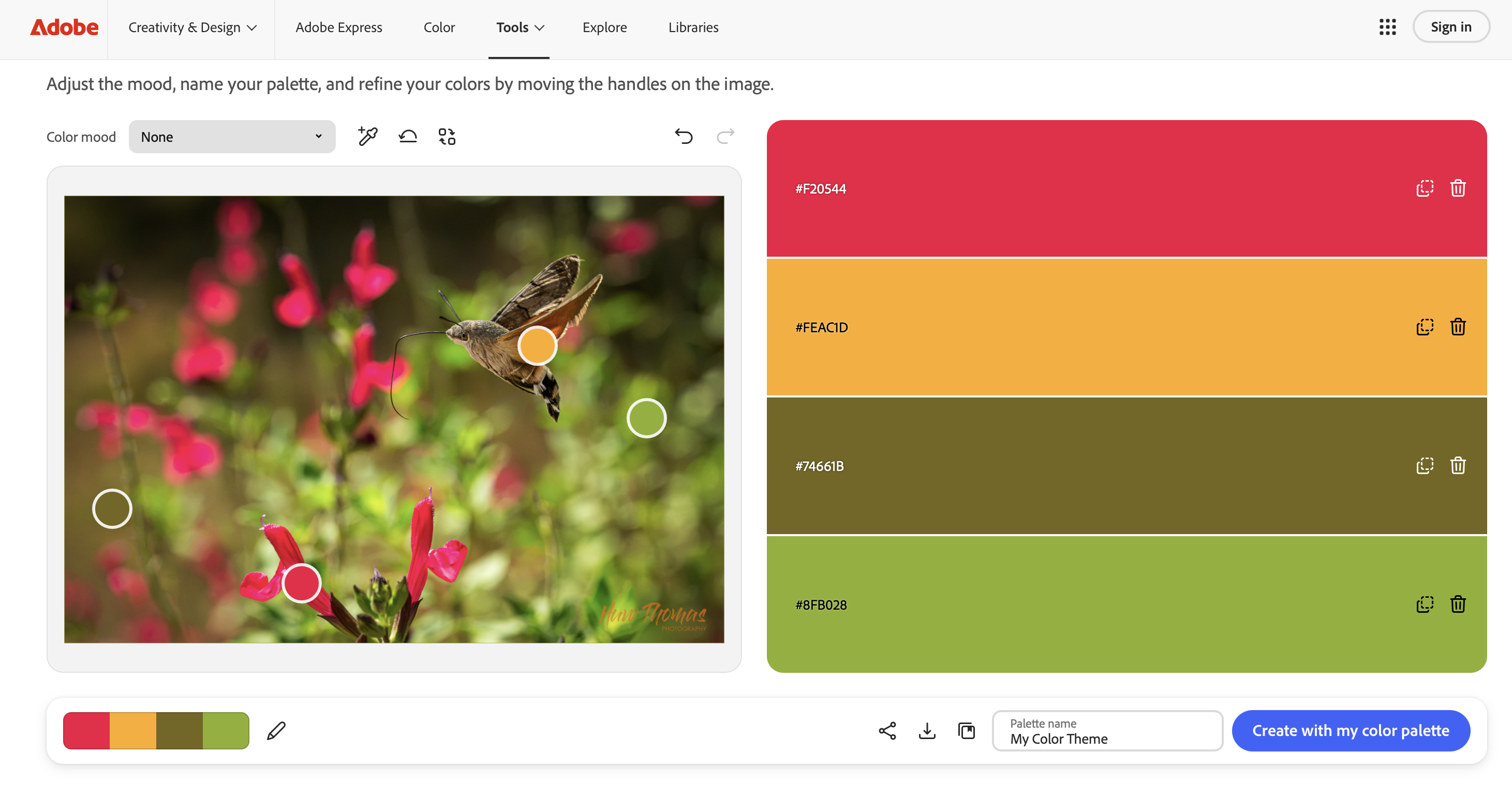
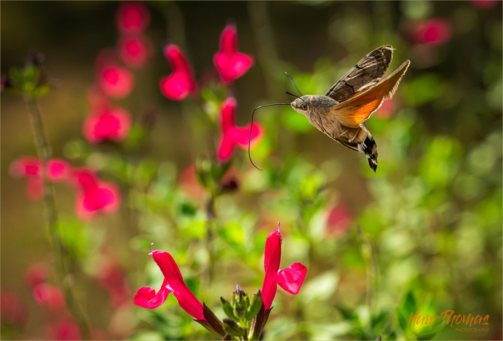
Great catch on the hawk moth, Huw. I’ve only seen one and wasn’t in photography mode at the time, so every time someone posts one of these it’s a treat. The focus is excellent but I’ll admit that all the red in the background tends to pull my eye away from the real subject and I’m not sure there’s anything that can really be done about that issue. If you have the pixels available, maybe a tighter crop, though that would almost certainly eliminate part or all of the two in-focus flowers.
Thanks Dennis - this image is entered in the “Late Summer Color” so whereas I would generally desaturate the salvia I have particularly left them as is so that the colour hits everyone straight between the eyes:
I composed the salvia to just be in front/left of the moth so as the moth doesn’t get lost in the red and green, and possibly unbelievably the background has been darkened somewhat The Salvia are that vibrant in the sunshine after a rainstorm this am
there is a nice intentional gradient from orange ->red from R to L, and the red salvia contrast the green as only complementary colours can. I have some violet salvia but these red ones work so much better with the orange of the moth and green background.
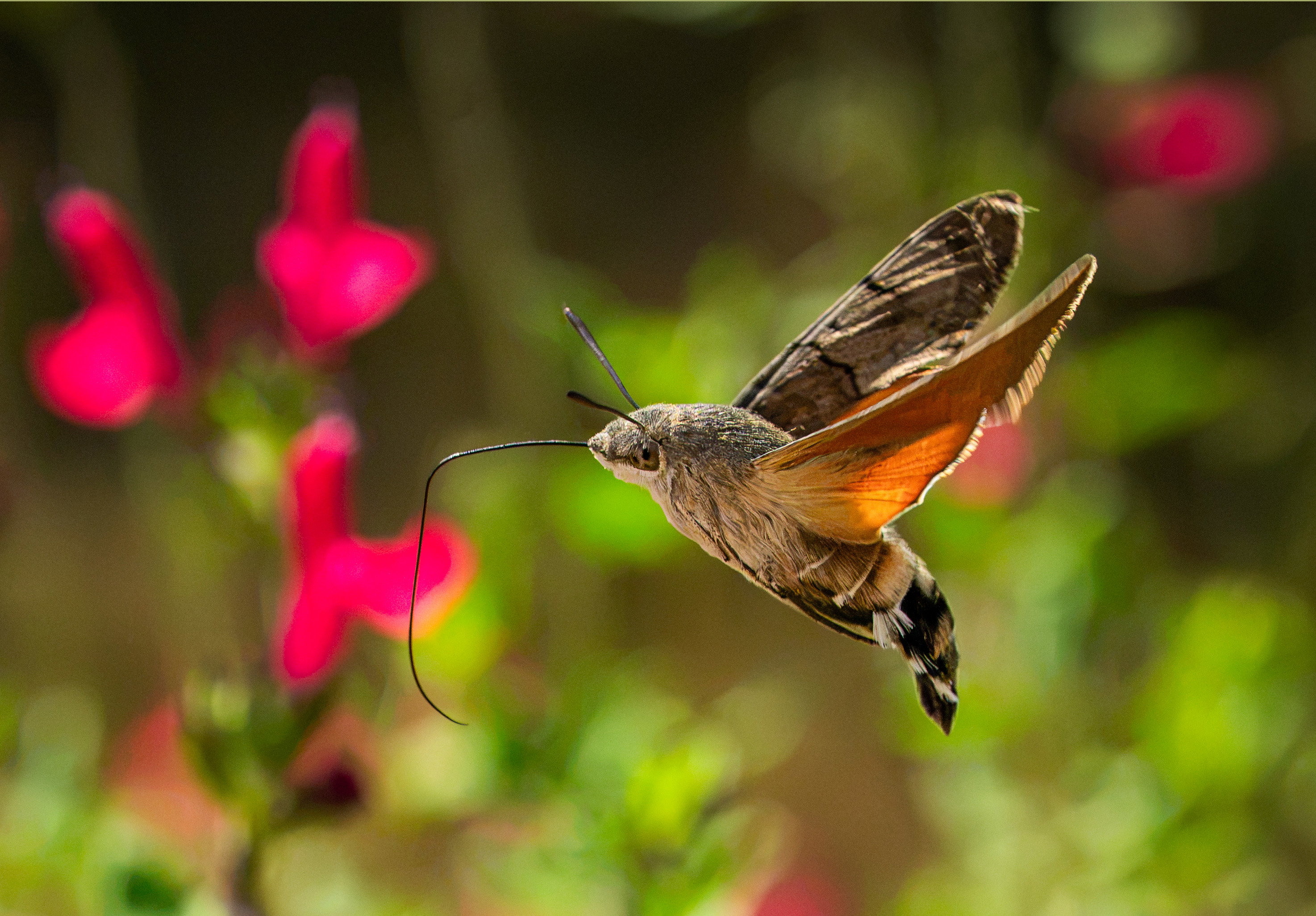
THANKS for the suggestions and I agree Tighter crop and slightly desaturated BG do definitely work…
One of my earliest childhood memories is of seeing these little guys at a fuchsia in the garden in Dublin. Before I read Dennis’s comment, I was thinking crop from the left, as I felt the green blob in the ULC was distracting a little. And the white bit at the tip of its right wing could also go (I’m a stickler). That said, I really like this catch, Huw, especially the riot of color.
There were more green blobs in the URC (flower stems without emerged flowers) and I included only one because I liked the textures c/w the open flowers.
The composition isn’t going to be anything other than, as you say, a riot of colour but it’s fun and a worthwhile effort to seek some kind of balance between the bits.
We don’t have this animal in Southern California, so he is exotic to me. Understood on the bright red flowers being part of what you want in the image. As strong as the animal is in the pic, I find myself with a split attention, going from animal to the two front flowers and back again. I think you should keep this version, but make another version where you zoom into just the moth and take out the reds and have just the green bokeh. He is a strong enough subject to keep the interest.
Huw: Sorry for the tardy reply but had to commend you on both versions, especially the tighter crop. You guys are killing me with thew flight shots. Top notch effort, top notch result.>=)>
I definitely prefer the cropped version as I find the bright green foliage a little distracting from the moth. I’d even lower the saturation of the flowers a tiny bit. The lighting on the moth wing is a nice detail. Great sharpness on a flying creature.
Thanks for your thoughts. There were a number of creative decisions taken for this image which have been explained in the critiques above. It is entered in the late summer colours challenge hence I went looking for strong colours and the image is primarily to convey that narrative. The orange winged moth is part of that message and the contrasting colours are designed to clash a bit without taking away from the beauty of the scene.
I try and craft my images to really match the title or theme.
As a hummingbird moth capture the crop is the better crafted image without the flaws you have identified.
Sometimes the narrative needs the greater emphasis
 The Salvia are that vibrant in the sunshine after a rainstorm this am
 Tighter crop and slightly desaturated BG do definitely work…