Liquid Flames (+revised)

Revised Version

Revision 1
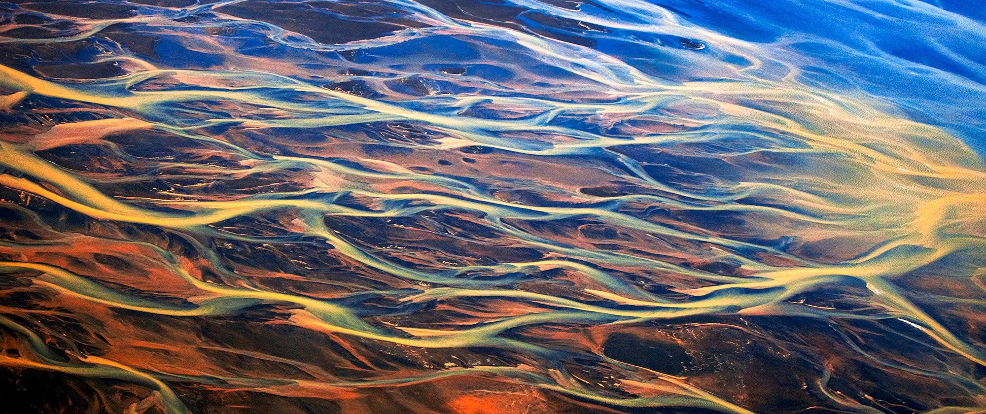
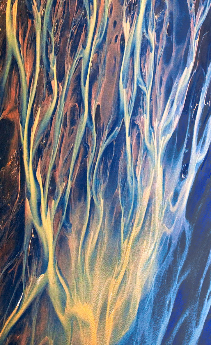
What changed: I did flip the image per Dennis’s suggestion, I did a slight clockwise rotation and a minor crop from the top and bottom. I also tried some noise reduction and some color adjustments . I didn’t have a lot of time to work on it, so I’ll post this and keep working on it.

Added after receiving feedback from the community.


Original Version
Critique Style: Standard

The photographer is looking for thoughtful feedback on the image as a whole, especially around the areas noted below.

Feedback Focus: Artistic / Expressive

About This Image

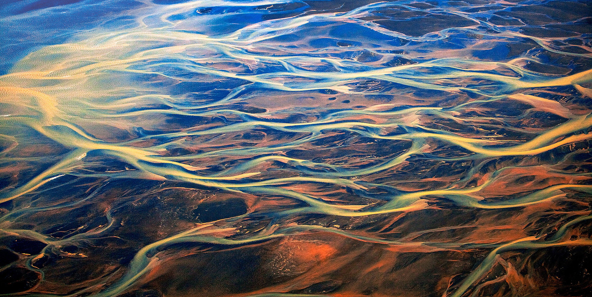
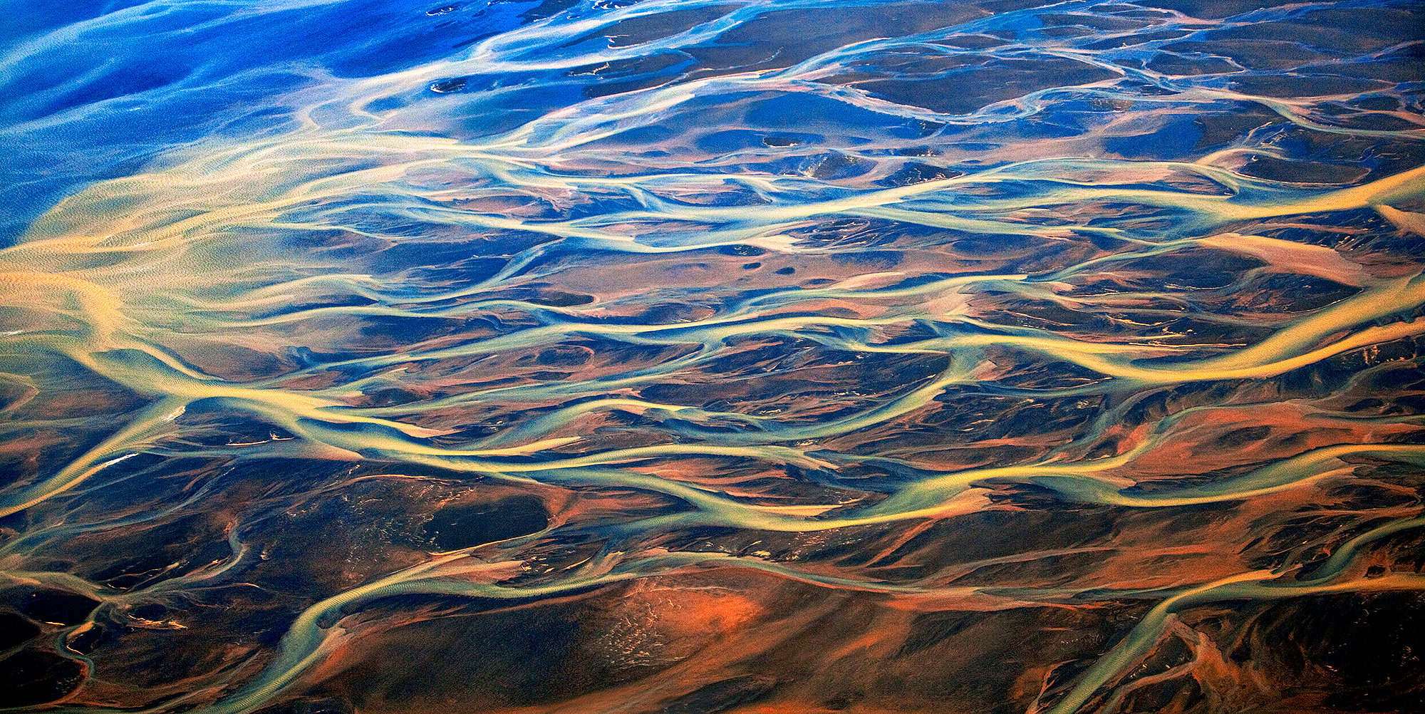
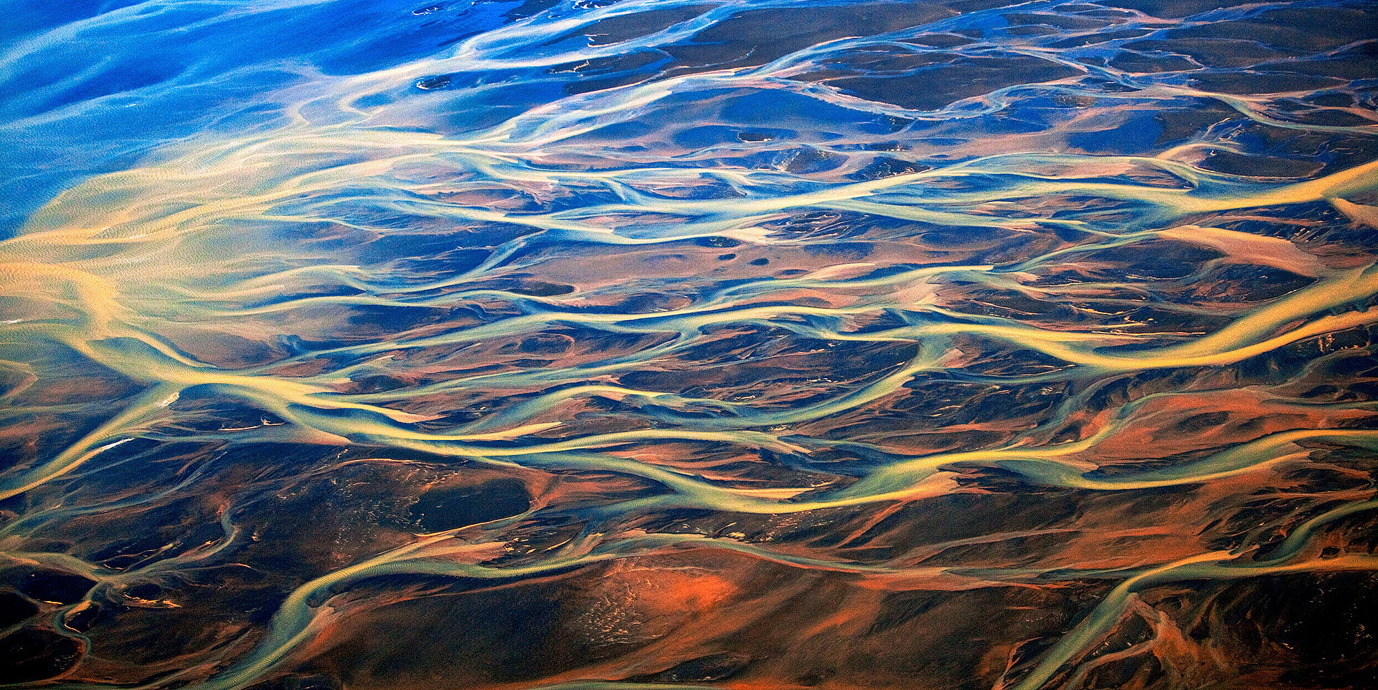
This is an aerial view of the Markarfljótsaurar outwash plain in Iceland. My brother and I took a 3 hour sightseeing trip one afternoon which turned out to be one of the highlights of the trip. I’ve always thought this looked like the flames that get painted on hot rods, hence the title. For scale, it is probably around 1/4 of a mile on the diagonal. The colors are a result of streams originating from different glaciers and geothermal areas that come together on the black sand plain before it reaches the ocean.

These are the origins of the various colors:

Blue: Glaciers grind rock into a fine powder called rock flour. When this dust floats in pure meltwater, it scatters blue light from the sun.

Yellow and Green: Sulfur from nearby volcanic areas and geothermal fields turns the water yellow or bright green.

Red and Brown: Iron oxide (rust) from the earth and volcanic ash colors the water red, brown, or dark grey.

Clear: Water running straight through old lava rock is filtered until it looks completely clear and bright blue.

Feedback Requested

I always appreciate comments on anything someone sees, but I specifically would like to hear thoughts on the composition. Every time I look at the image I want to crop off the top to eliminate the “empty” area in the upper right where there is no water, but doing so makes the image unbalanced vertically to my eye and I would welcome other opinions.

Technical Details

Canon 1DS Mark II, 70-200 lens @ 70mm, f2.8, 1/4000 sec, ISO 640 (Trying to get sharp images in a moving, vibrating plane!)
Scott: This is just drop dead gorgeous and has helped elevate Iceland on my bucket list. I didn’t notice the upper area you question but I did notice immediately the large blue area in the ULC. I would definitely not want to crop from the left as you would lose that wonderful source of the yellow emanating from that side. Something that could work would be a tight crop of just the center area where you would fill the frame with the braiding but I love this view as it is and commend your efforts to get it.>=))>

Hi Scott,
I didn’t feel an issue with the upper right either. To me, it balances the lower right, which doesn’t have the braided streams— though it is more interesting in its own right.

To be honest, I wouldn’t change a thing. This is wonderful. I had hoped to do an aerial shoot while in Iceland back in 2019, but the weather didn’t cooperate.

ML

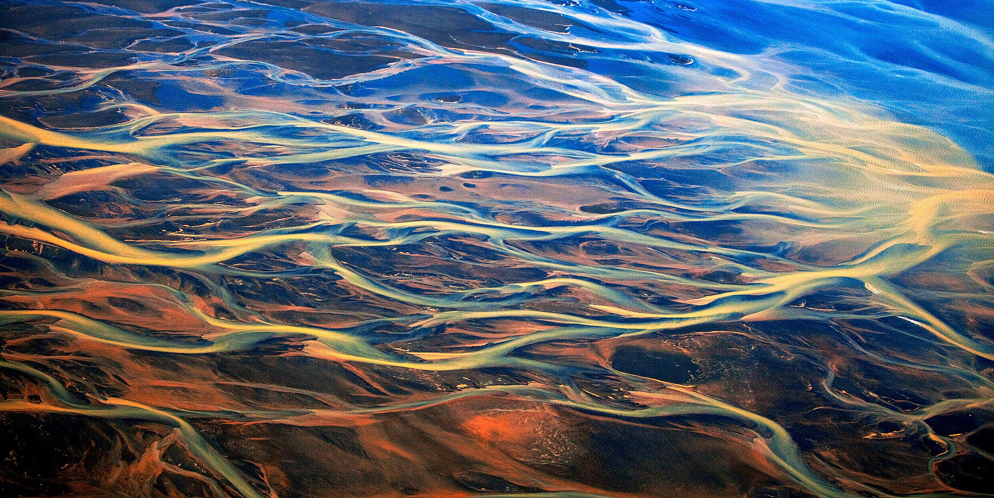
I love the colors and light in this image, Scott. When I look at it, for some reason I feel like the water is flowing up hill (maybe that old left to right occidental bias). I tried flipping it horizontally and it feels like the flow works better to my eye:

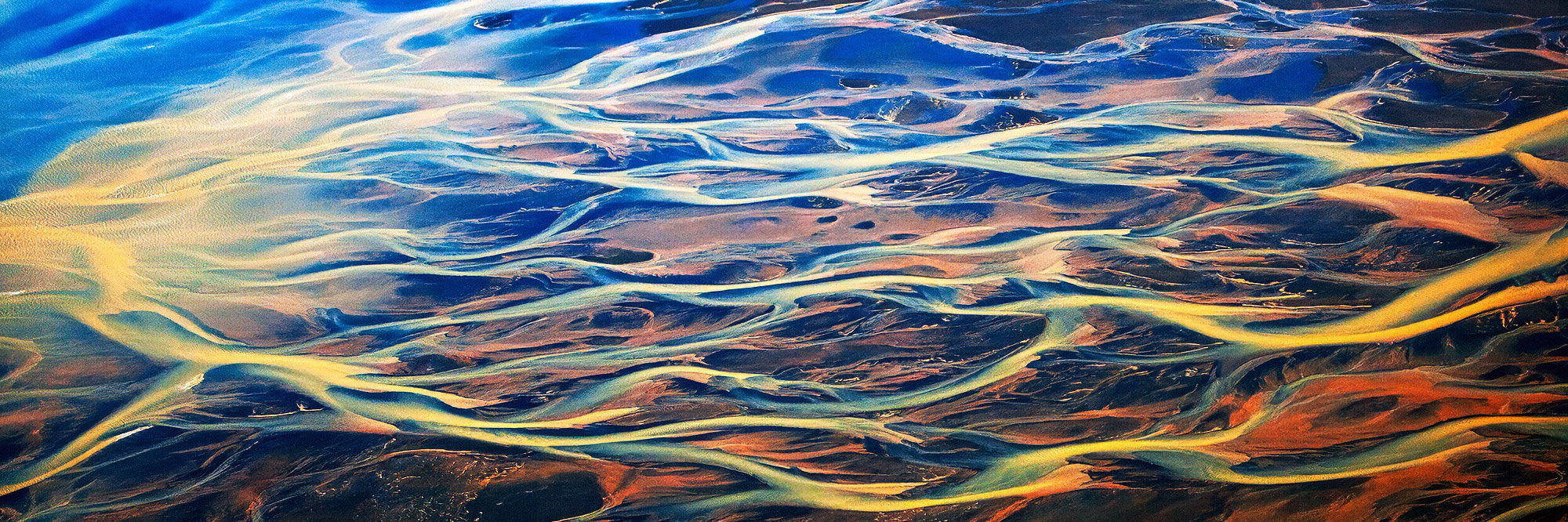
Hi Scott, overall, I really enjoy the image, with a few minor caveats. My first thoughts were that the image appears a little flat, most likely due to shooting through an airplane window, and slightly noisy. The blue in the upper left does draw my eye, and I personally think the image could be improved with a 1:3 crop, which would help with both flow and eye movement throughout the scene.

Here’s a quick edit with a simple (and minor) S curves adjustment (I definitely think you could play around with this to get it to look even better as well), slight modification of th

e colors using selective color, and a little noise reduction+sharpening in Topaz Photo.

Hope that helps!

Wonderful!! It does look like hot rod art, and it evokes autumn reflections in a stream. The UL corner does catch my eye a bit. I’d hate to crop much but I tried a distortion, just pulling that corner up a little, and toned down the cyan there a little to make it match the other blues better. Lots of leeway for this very unusual capture. Not many images can lay equal claim to Abstract and Grand Landscape!

A lot of interesting ideas. My thoughts are, I like your original crop because of the space around the water. Though the tighter crops are more dynamic. Do like the transition from the cool blues to the warm reds. Though, that big blue area in the ULC is a bit much. Maybe darken it down a bit to see if it keeps the feel, but better balances the darker areas through out the rest of the image. What a fun shot.

@Bill_Fach Thank you for your comments! Iceland is definitely worth the trip, I spent 3 weeks there with my brother and I it is my favorite travel destination of all time.

@Marylynne_Diggs Thank you Marylynne, I sympathize, the weather there doesn’t seem to cooperate a lot of the time.

@Dennis_Plank That is pretty amazing how different it looks! I have to agree with you, it looks better that way.

@zack1 I like what you did with the colors and I think I will have to look into Topaz photo. Thank you for your very helpful suggestions!

@Diane_Miller Thank you for your suggestions, the idea of warping the corner is interesting, certainly a good image to do it on given nothing is straight ! I’m hesitant on adjusting the color too much in the ULC, it was naturally a much different color than the rest, an area where that stream hadn’t yet merged with any of the other ones. I had to smile when I read your comment about it being labeled Abstract and grand landscape. I had a slightly different version oft this printed a while ago at 5 feet wide and not a single person who has seen it could identify what it was (no photographers familiar with the Iceland landscape).

@patrick6 That ULC seems to be the hotspot for comments, so I’ll definitely take another run at it and slightly tone it down. Thank for your thoughtful comments!

The original poster added a revised version of their image.

The original poster added a revised version of their image.

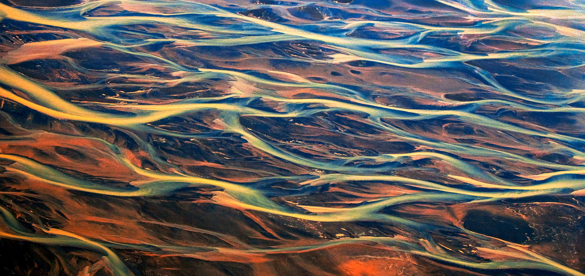
Bill, I did like your suggestion for a tighter crop, this is what I came up with

1 Like

Regarding Revision 2:

Scott,

Ok, a little late, but WOW! This is phenomenal and an outstanding abstract of nature.

You have received some great feedback and I think your revision is working towards a great finish. The only thing that I would echo from Zack and maybe others is the impression of noise; mostly i the blue area in the UL. I don’t know the source, but something that could be mitigated a little bit with some optional tools/adjustments. I also think in your revision the upper area could use some additional contrast.

But overall, you have a fantasitic scene and you should be quite happy you captured this! No doubt a great experience seeing and capturing this one.