The photographer has shared comprehensive information about their intent and creative vision for this image. Please examine the details and offer feedback on how they can most effectively realize their vision.
Self Critique
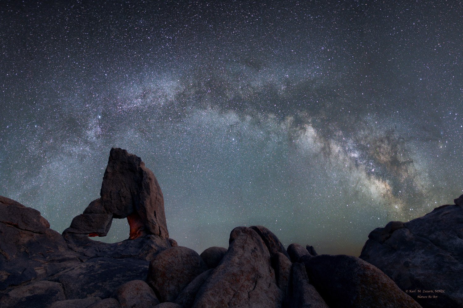
The challenge of putting this together!
The sky consists of 12 verticals ( each of these is stacked in SLS - 10 images at a time ). Then comes the blue hour blend
Is the blend - color balance , exposure realistic ?
Creative direction
To provide a pleasing astro landscape
Specific Feedback
color balance - sky / FG
exposure - sky / FG
Technical Details
Sky - 12 vertical stitched togeter
FG - blue hour
Description
I made this pano whilst my other camera was recording a TL
Hi Karl,
again an excellent nightscape shot. The composition is great. I like that the foreground rocks seem to lead the eye into the frame. And you aligned the milky way arch nicely over the scene.
And there is a slight warm glow in the inside of the rock formation that adds a nice color contrast to the cooler tones.
The question about the colors and whether it looks realistic is more a matter of taste.
The sky is a bit too greenish for my liking. And the foreground looks quite blue.
I would prefer an edit that looks like your last post: Lady Boot at Night
As I already mentioned above, it is a matter of taste. But when I edit night sky images, I try to dial in a white balance that provides the best color separation in the milky way core. I often drag the Vibrance and the Saturation slider all the way to the right. So I can see which colors occur in which areas of the sky. The picture will look terrible, of course, but I make the white balance adjustment in this state. When I drag the Temperatur or Tind slider, I pay close attention to the distribution of the colors. After I set the white balance, I reset the Vibrance and Saturation settings, of course.
Comparing your last post with this one, it seems that the foreground has been flipped horizontally. This was a good decision, as it improves the balance with the awesome rock formation on the left and the Milky Way Core on the other side.
May I ask how much overlap there is between your shots or what focal length you used?
I ask because I usually take 6-8 vertical shots for a Milky Way Panorama when I use my wide-angle lens.
How did the timelapse turn out?
Lone Pine looks like a fantastic location. I have to put it on the list for a potential USA trip.
Yes I did flip the foreground because of the arch / Core balance
WB is a tricky thing - partly personal - have to get used to that saturation process you mentioned
Re the verticals - recommended is 25 -30% overlap
I believe i di 11 -12. But each vertical consists of 10 shots processed in SLS and then these 11-12 SLS images are stitched
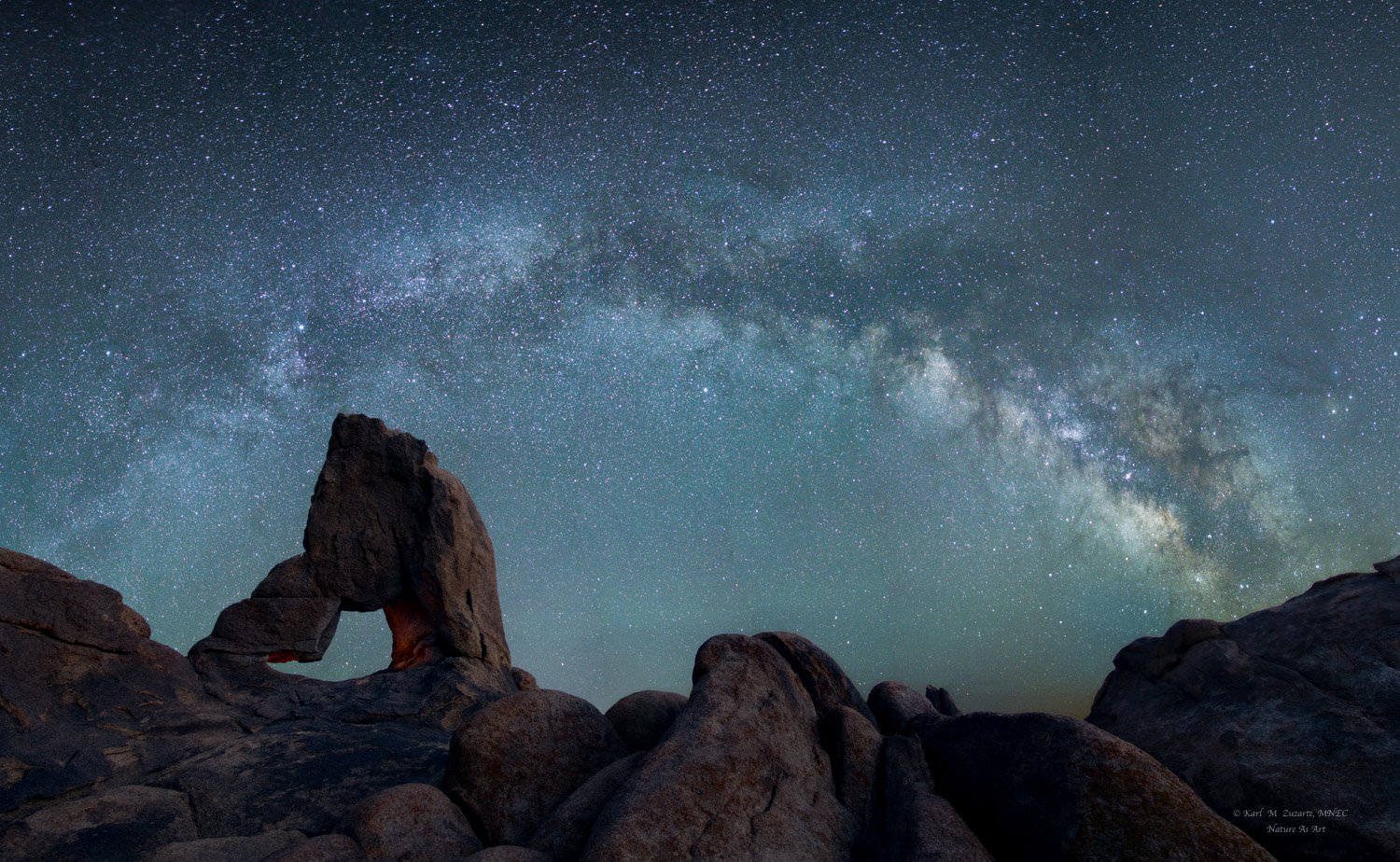
I’ve been traveling for a week and just now have a chance to comment on this one. I think it is very well done, both technically and in terms of composition. I like that the thickness of the atmosphere attenuates the stars near the horizon – that gives it a very realistic look.
I agree with @Jens_Ober about the color and definitely like the RP. We think of “blue hour” as a shift toward blues, which is poetic and can be lovely, but if the ambient light is moonlight, it is basically the same color temp as sunlight, just much dimmer. Our eyes don’t see nearly as much color in dim light, but the camera does. A long exposure of something like a rockscape, shot in daylight WB, will look basically the same as a daytime shot.
You can post a RP at the top of the original thread so it shows in the thumbnail, and just note that it is a new version.