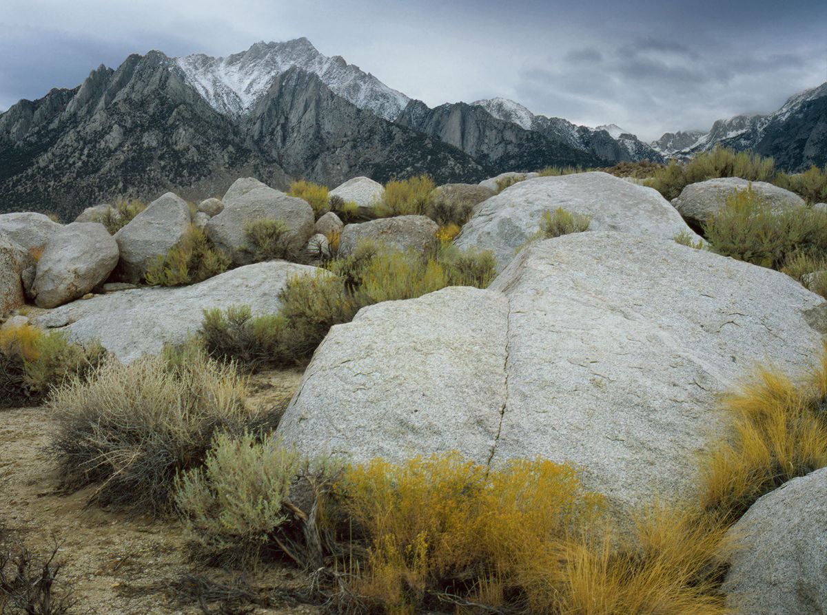
I found this image lurking in my archive from a Fall trip to the Sierra East Side from long ago. I do not recall when it was taken. I did clone out an offending dead bush.
I do remember heading out from Lone Pine the next morning hoping to beat the storm before it closed Sonora Pass. It was snowing lightly when I got there, and the pass closed an hour after I went over.
Mamiya 645E
Mamiya 55mm lens (I think)
Astia 100-F, if memory serves.
Microtek 1800f scan at 1800 dpi
Some minor tweaks to the color of the grasses and the clone in PSCC.
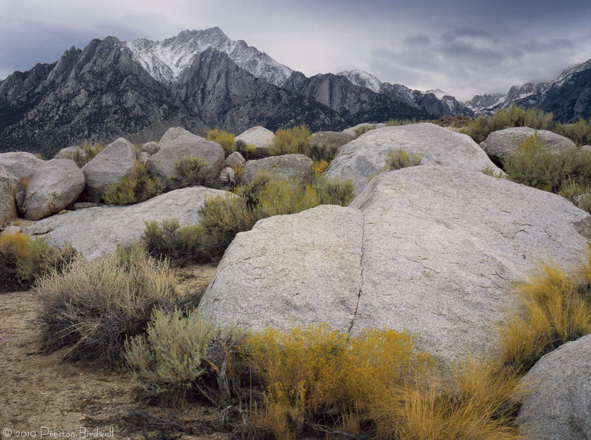
This composition and processing make me so happy, Preston. It makes me want to drive there right now. I agree with Harley about the color cast. One thing that really distracts me though is that small branches on the lower left corner. If it were mine, I would definitely clone that out.
Preston, a fine look at this iconic area. Truly a wonderful setting to view the sierras from this location here. I too like the adjustment you’ve made. Scrolling back and forth the stronger yellow in the first image is apparent…
I will say the Astia always brought out the best in the greens and yellows, as I recall. Seems like a life time ago now since that was removed from the market…too bad…
Preston, the re-work looks significantly better, it has a lot more vitality now.While the sky is not that interesting, I think this image works because the arrangement of the various rocks and brush in the comp is very pleasing.
My initial reaction was that I thought the comp might be more pleasing if the image was flipped horizontally, such that the large rock was in the LLC instead. But I’ve changed my mind, and prefer it as presented. First I got called out recently for suggesting a horizontal flip on a Norway image that had a mountain which is supposed to be recognizable. And since I have never been to the Sierra’s, I don’t want to get bagged again with another famous mountain I’ve never seen before. And I also actually downloaded and flipped this, but much prefer your original presentation.
One of your best in recent memory. It’s well seen and artistically composed. The way the boulders build up to the distant mountains. I suppose that that’s the idea behind the Alabama Hills compositions but they seldom integrate the two as has been done here. The composition is so strong that the small tweaks in color don’t seem very significant to me, at least. Great work.
This also lacks the scream factor that’s popular. There’s plenty of drama here. Why add more.
On my monitor this lacks a certain sharpness. Would love to see more detail on the face of that rock and in all that brush around it. It’s what you’d expect from a 4x5.
@Igor_Doncov This was made on 6X4.5 cm chrome film (medium format), and my scanner, which is maxed at 1,800 dpi, just doesn’t do the quality of the transparency the justice it deserves. I do agree with you that this could be sharper, but I would risk artifacts if I push the web sharpening too far. I appreciate your comment!
–P
Beautiful take on Lone Pine Peak, Preston. The tonality in the repost is a vast improvement. Processing looks good, although I suggest to slightly burn down the bare area in the LRC.
Excellent! A fabulous near/far composition - with a not to shabby subject matter - both in the rock and the range and Lone Pine Peak.
The repost is excellent as well. What is fascinating and different here is how the foreground boulders appear more imposing than the Sierra range! Of course just an illusion, considering distance, proximity, etc., but I think your comp really helps pull off that visual between the two main elements.
The clouds/sky work well and of course dictate the light and colors in the scene.