Gentle Sierra Sunrise + RePost

Image(s)

Original

Rework

Image Description

I found this spot among granite boulders just off the road to Whitney Portal the evening before I made this photo.

It was a rather chilly October morning setting up my 4x5 and waiting for the sunlight to touch Lone Pine Peak, Mount Whitney, and Mount Russell.

It worked out rather nicely even with the clear sky and using a graduated neutral density filter.
-P

Feedback Requests

How does the color balance look to you? Astia film tends to favor yellows, which is why I ask. Any other thoughts you may have will be appreciated.
-p

Pertinent Technical Details

Tachihara 4x5
Fujinon 135mm lens and 81-b + 3-stop Singh-Ray ND Grad
Exposure not recorded
1800 dpi scan processed in PSCC

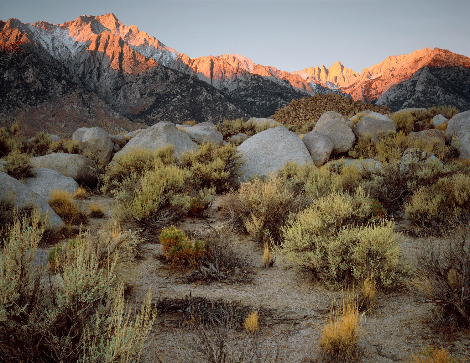
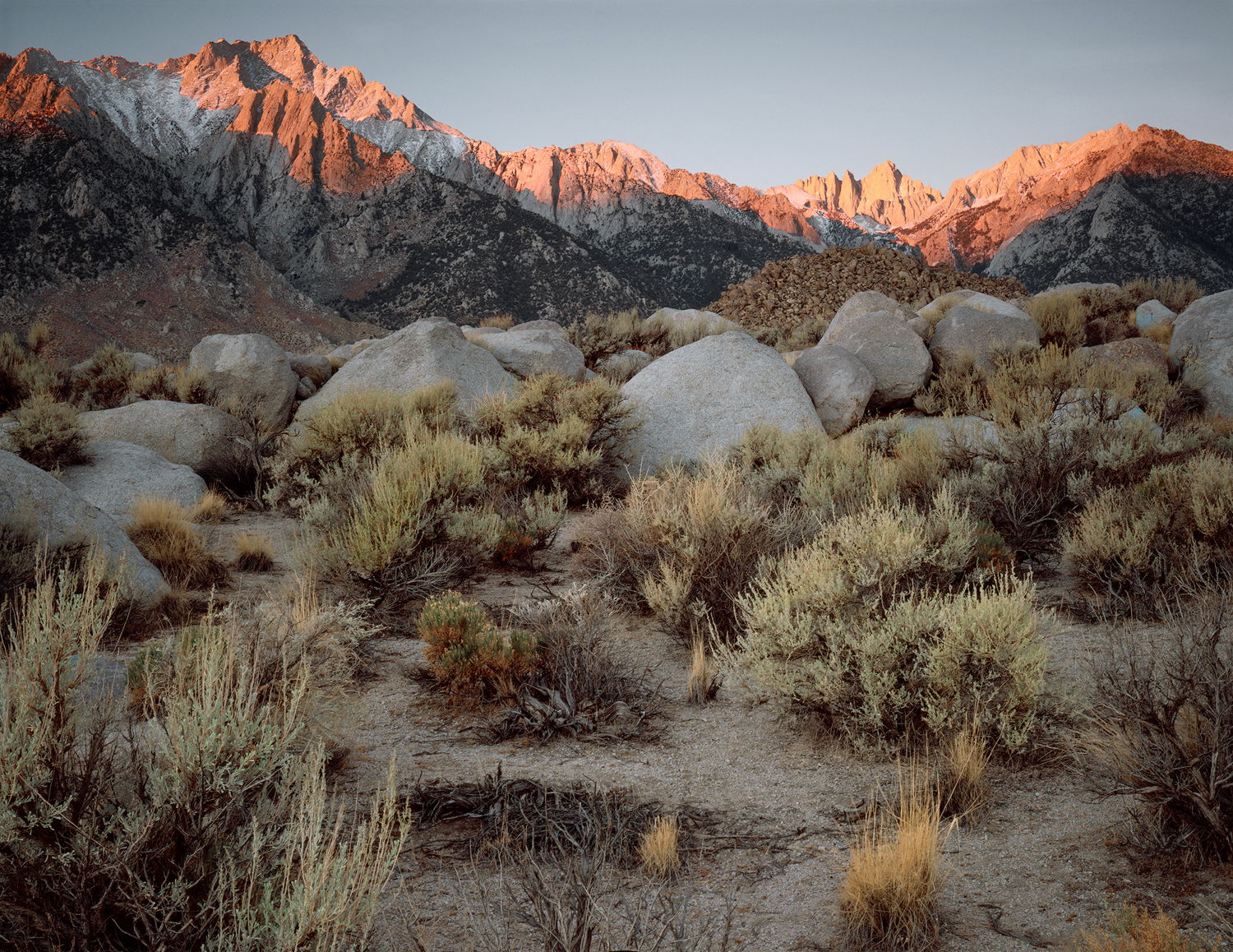
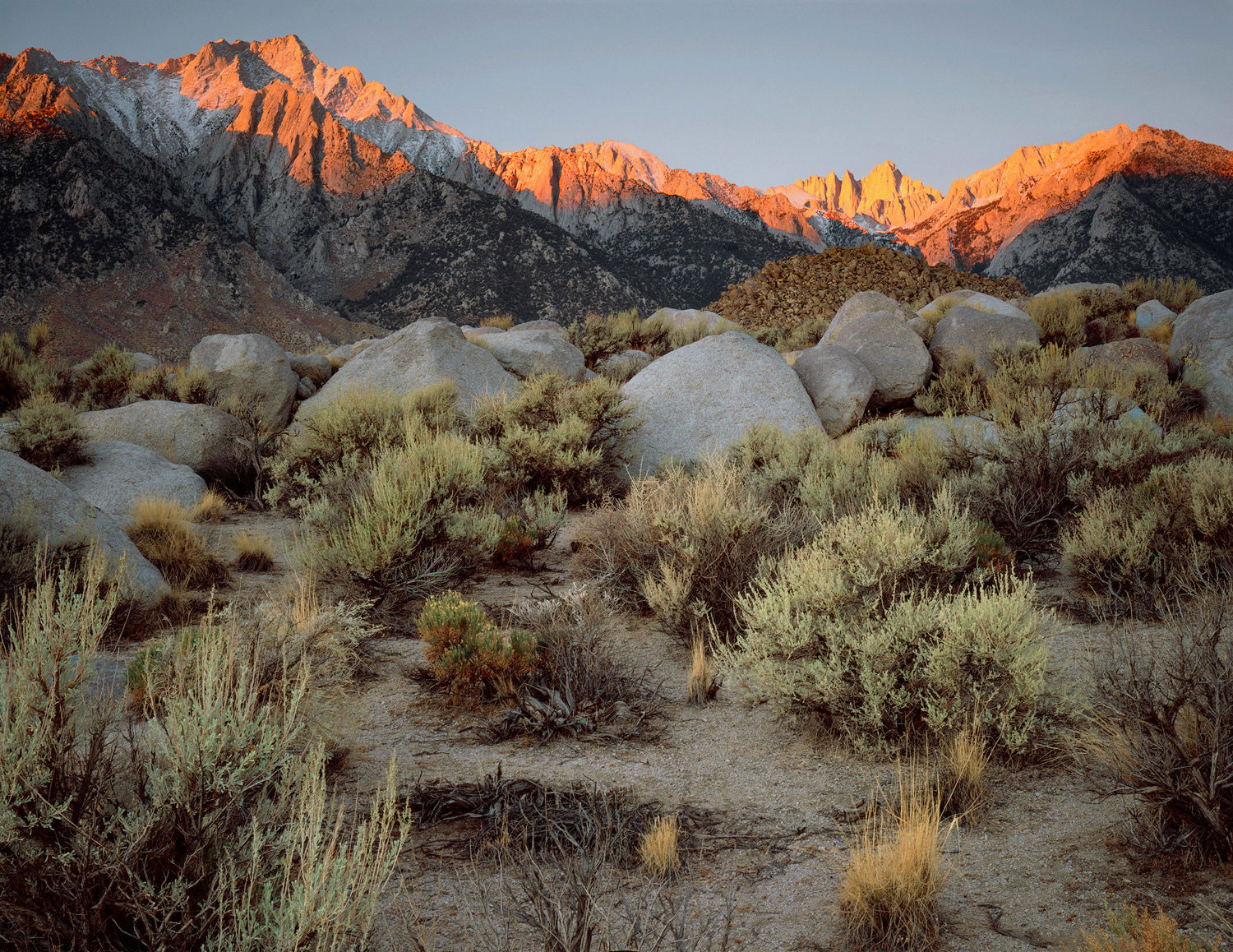
Preston: Love the scene and the comp and especially like the light on the peaks with the lone exception of the peak showing in the gap in the URC. On my monitor it is blown a bit despite using your GND. I applaud your craft with the 4x5, something I almost took up but chickened out and made my investments in digital instead. Top notch shot of a really nice scene. >=))>

Having just been there, it is a treat to see other people’s versions. It is a nice composition, but I wish the mountains poked up higher. The color balance does seem too yellow and I tried correcting it in PS but it is above my pay grade. Maybe my brain is trying to make an Astia film print look like a digitial print, which might be impossible since I’m not really familiar with film color prints. Thanks for posting. I missed shooting and printing with film so relish seeing these “relics” from the past.

Preston, I’m thoroughly enjoying the depth of the scene and the first light on the peaks. The foreground sage does look a bit yellow. I also think that a modest overall darkening lets the contrast between the light and shadow show better and it lets a bit more color show in the sunlit peaks.

Thanks for your comments. Your points are well taken…

Please see the reworked image in the OP.

@Bill_Fach I reduced the luminosity of the sky and the sunlit mountains. Better?

@Tony_Siciliano I reduced the yellows using a Selective Color layer and also dropped the saturation of the yellows just a bit.

@Mark_Seaver I believe I addressed your concerns. Did I?

Thanks again, gents. Your observations are always appreciated.
-P

1 Like

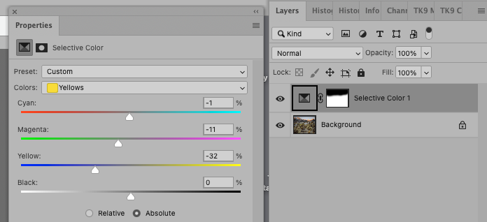
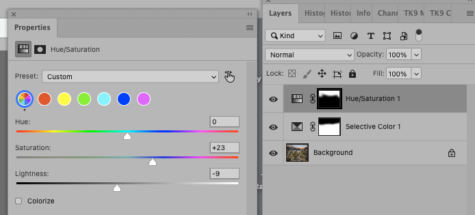
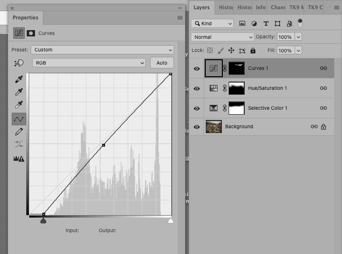
I would try a different approach, as there is too much loss of contrast in the methods used, and the mask edges are too obvious. I don’t know how the FG bushes should look but I tried a selective color and on the layer’s mask I painted out the effect of the peaks.

Then I did a second mask for the peaks and played with saturating the peaks and darkening them a bit.

Then a final small tweak to Whitney.

Here’e the result:

Thanks @Diane_Miller . Our edits and masks are very similar but you took them a bit further. I like the look.
-P

Well, I like the original the best. Preston, I agree with Diane, your redo gets rid of too much contrast. So, it’s not broken, so don’t fix it. LOL