Please share your immediate response to the image before reading the photographer’s intent (obscured text below) or other comments. The photographer seeks a genuinely unbiased first impression.
Questions to guide your feedback
What impression do you get of the conditions in this scene (season, weather, temperature, etc.)?
Other Information
Please leave your feedback before viewing the blurred information below, once you have replied, click to reveal the text and see if your assessment aligns with the photographer. Remember, this if for their benefit to learn what your unbiased reaction is.
Image Description
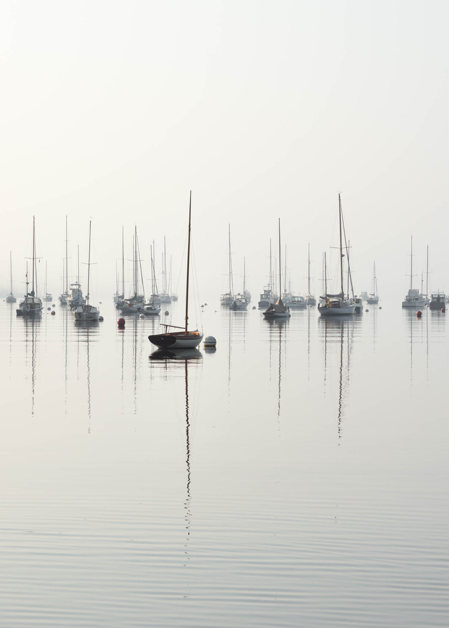
I took this picture on a recent trip to Maine. The weather was unusually warm for early September, and we also had some very hazy days due to wildfire smoke. I thought I could take advantage of the haziness to create a kind of serene, dreamy look in this image with the water and sky seeming to blend together with no clear horizon line.
Technical Details
17-70 mm lens shot at 70 mm, ISO 100, f/7.1, 1/500 second. The main things I tried to do in Lightroom were to brighten the shadows a bit, particularly on the main subject, and to remove a blue cast from the shadows by decreasing the blue color slider a fair amount. I also cropped off some of the edges to remove some distracting elements.
Specific Feedback
Of course, I would appreciate feedback on any aspect of the photo, but one thing in particular I’ve gone back and forth on is the crop. I tried positioning the main subject closer to the bottom of the frame, which seemed to intuitively make sense to me, but then there was a lot of empty sky in the image and I also lost some of the ripples and reflection in the foreground. With the current crop, I removed some of the sky, but I wonder if there is still too much. Any suggestions would be appreciated.
John, I love the simplicity of this one. The one boat that’s closer than the rest stands out nicely. The ripples in the foreground are a nice touch.
It took a while before I realized this was not a black-and-white shot. The colors aren’t really doing much except drawing attention to places where you may not want it. You might consider making it black and white.
As @Don_Peters noted simplicity makes great photos. The high key look is perfect here. There must have been serious fog that you used nicely to create mood with the rear tier of boats. Excellent image as is, but wouldn’t it be nice to smooth out the ripples in the foreground . Ordinarily, I would like the ripples as foreground, but as horizontals in a vertical image, they detract a tad (just IMHO) . Maybe you can (if you agree) using either Generative Fill or the Remove Tool in PS.
Thank you, @Don_Peters and @Larry_Greenbaum, for your feedback and suggestions. I played around with a black and white version as Don suggested and will post it above for comparison. I also tried a slightly different crop on that version. I like how it looks, although I think I’m undecided on which version I prefer. One thing I really like about the color image is the way the light is hitting the wood trim near the bow of the small boat. It’s a small detail, but I feel like the richness of the wood is lost in the black and white version. I appreciate your point about some colors in the image drawing attention where I may not want it, and I think the biggest culprit there may be some of the bright red moorings scattered throughout the harbor. I tried desaturating the reds a little bit, and that seemed to make them a bit less prominent. I might keep experimenting with that.
Larry, I also agree with your point about the horizontal ripples, although I might be too attached to them to remove them. I do have a couple other exposures of the same scene with smoother water in the foreground, so I may take another look at those images and see what I prefer.
Thank you both for your comments. I appreciate it!
A wonderful find, well presented. I think the subtlety of the color version is special. The ripples give a nice base but I could see a version without them where the boats are floating in space. I don’t think I would favor one over the other.
I think there is a bit more sky than needed. I’d consider a crop to about halfway to the top of the tallest mast. Maybe for a version without the ripples it would work to put the horizon in the middle.
Thank you, @Diane_Miller, for your comments and suggestions. I’m adding a re-cropped version above, which I think I’ll call my final version for now. I tried a few different variations (I thought a square crop looked good), but decided on a 4x5 crop. I wasn’t able to remove quite as much of the sky as you suggested, but I wanted to keep this as a vertical image and I’m not too bothered by the amount of sky in this latest version.
Thanks again for taking the time to offer your feedback!