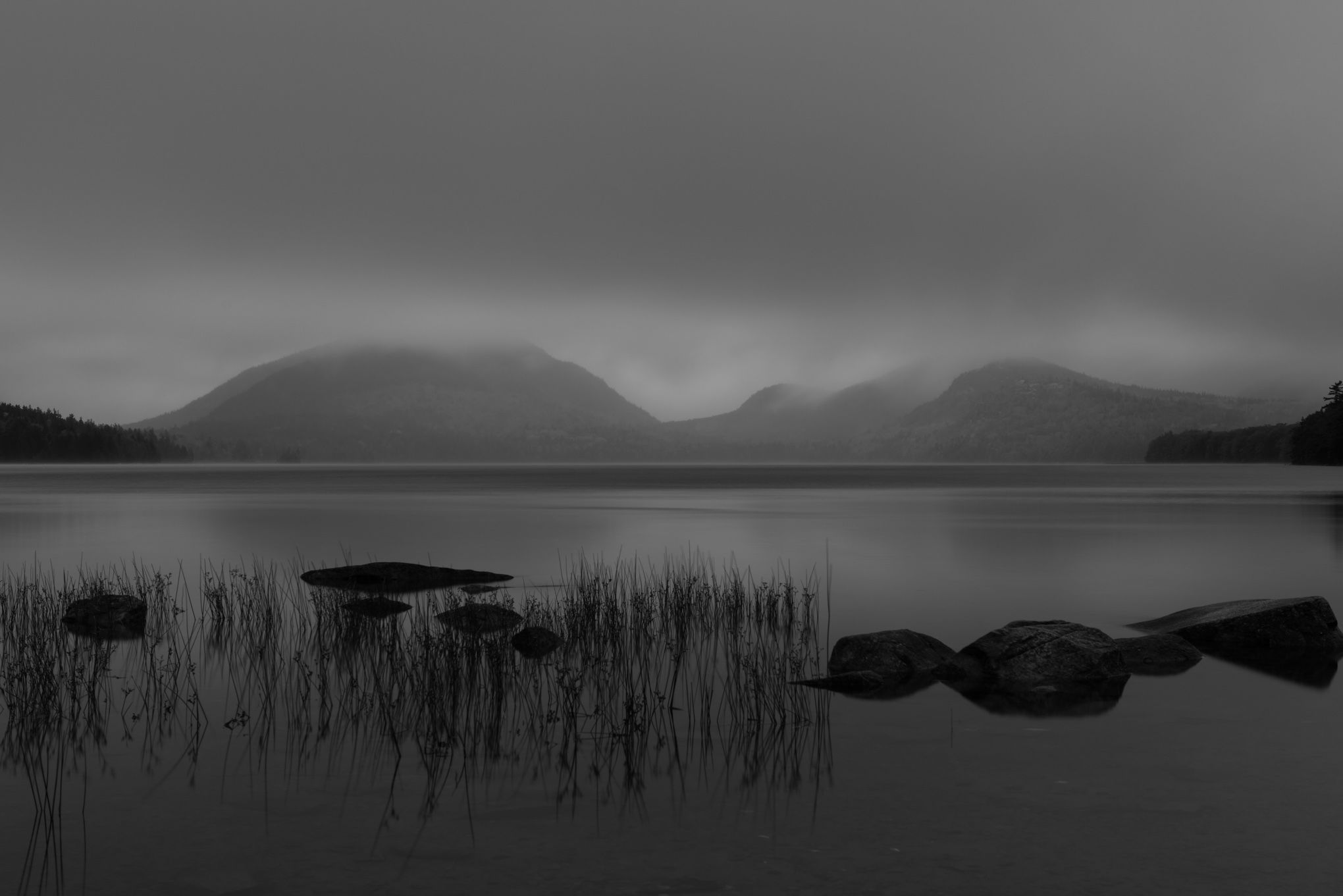
I think B&W does work, however this is a bit low contrast for my taste. It looks like maybe some weather is moving in and so it’s surprising that the water is so still. Those reeds and rocks are so nice together since they are so different. I wonder if coming in a bit tighter on the right would enhance the framing. The trees don’t angle up on the left so a mirror of that slope could be nice. That and lifting the mids and whites too. What a dramatic scene and one I don’t think many people would have picked up on given your location. The clouds are especially mysterious.
A lovely scene! B/W works for me. Soft color might have been wonderful, too, but if it was a typical gray day, B/W works very well. I think you have leeway to bring the exposure up quite a bit. A pre-dawn look could have low contrast and still have more brightness. I think the horizontal lines here are wonderful, and could be further emphasized by cropping about halfway down into the dark top cloud.
Beautiful and peaceful scene. I think I would bring up the white point just a bit. But not to the point where it looks high contrasty. I would play with the Levels adjustment on this one.
Lovely scene and composition, and great overal mood. I think changing the contrast would change the mood here, but I’d try adjusting the exposure a small amount to make it a touch brighter overall: I’d like to see more of the textures on the foreground boulders, and a hint of pure white, or quite near that, in the brightest area of the clouds to make most of the range of the graycale.
Thank you @Kris_Smith@Tomas_Frydrych@Igor_Doncov@Diane_Miller for your comments and suggestions. Kris I think the water appears calm because of the 3 sec exposure plus it was pretty calm anyway but drizzling.
I increased the exposure slightly and brought out some texture in the foreground rocks.
I think the changes are good - especially what you did with the rocks. The addition of clarity there helps lift the overall luminosity range and feels more comfortable if you know what I mean. It feels less crammed into a narrow range. Creative and interesting. I miss Maine.
Yes – @Igor_Doncov’s version has the brightness I feel it needs. It is still calm and suggests early or late light, but now my eyes are invited into the scene. When we view a scene our brains correct for low light. When an image doesn’t, it doesn’t look right. I still feel the top 1/4 is not needed. It is pushing the interesting stuff down where it feels too crowded.