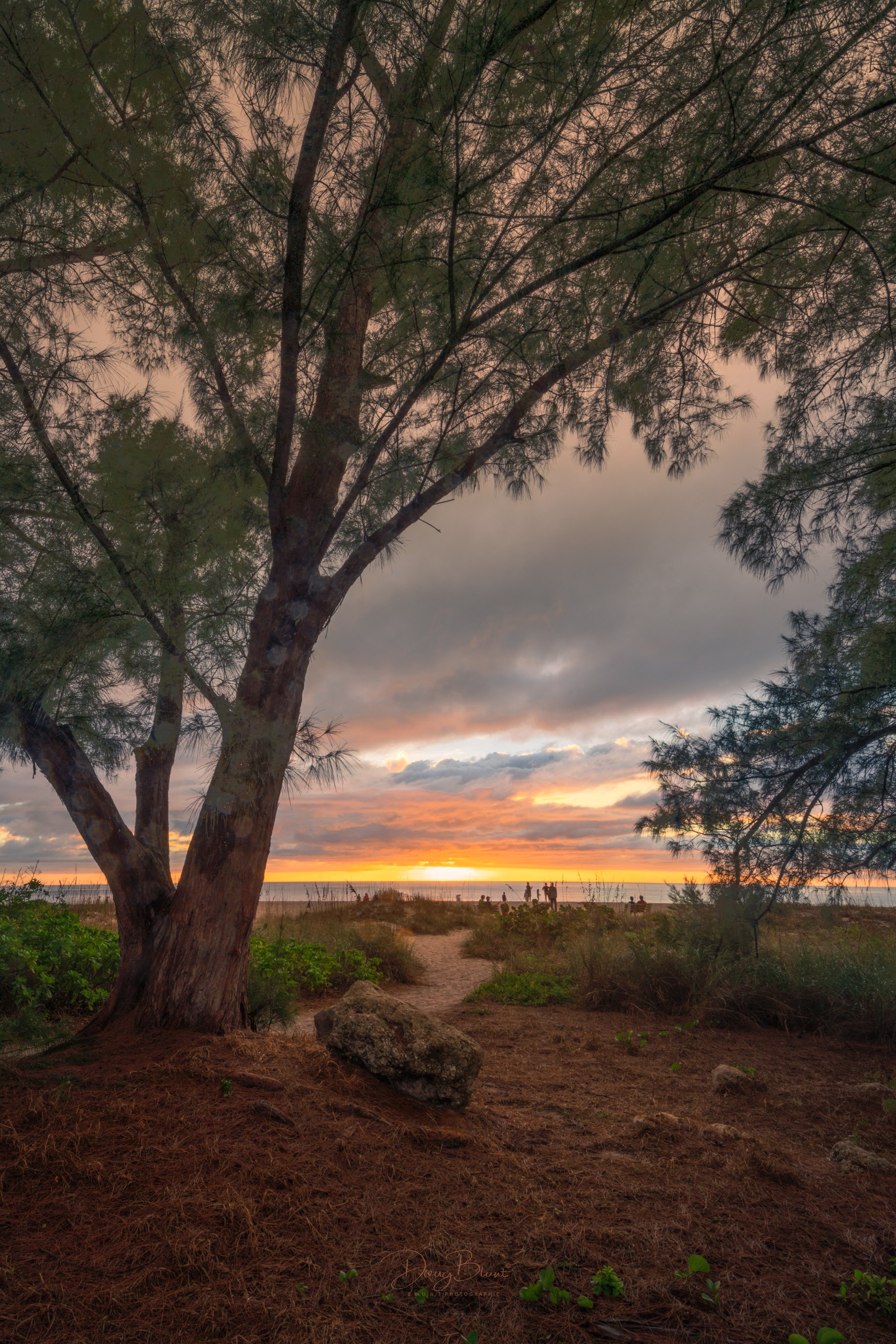
The setting sun went a little white on me…but it wasn’t blown out on the histogram. Does it work visually all right, being white and not yellow?
What artistic feedback would you like if any?
Any commentary is more than welcome.
Pertinent technical details or techniques:
(If this is a composite, etc. please be honest with your techniques to help others learn)
17mm Canon Tilt-Shift, 1/6 sec @ f/22, ISO 100
If you would like your image to be eligible for a feature on the NPN Instagram (@NaturePhotoNet), add the tag ‘ig’ and leave your Instagram username below.
dougbluntphotos
You may only download this image to demonstrate post-processing techniques.
Beatiful framing with the foliage, Doug. The “white” sun works for me because it seems natural to be so. I will lose the bottom a little bit, especially the small vegetation. They seem to hold too much attention for my liking.
You really struck gold during this visit Doug…if I remember properly, you had another spectacular shot from a similar location a few weeks ago!
I really love this composition…the framing of the families on the beach are very nicely managed. I do lose the people just a bit in the sea oats and that can be difficult to manage.
I actually like the foliage in the foreground as it helps fill an otherwise empty space. Yet, the ones on the borders would be tempting for me to remove.
As for the sunset, super interesting skies! The upper part of the sky is a very interesting color. The yellows at the level of the sunset are a bit heavy in saturation for my taste, but that is just a matter of my taste.
There’s some tiny brite spots in the tree trunk - any idea what those are from? Are they “hot pixels”?. As I was pixel-peeping, the splotches on the tree trunk are very interesting and kinda soft in sharpness. I’d be interested in knowing what those are as well.
Thanks for sharing! Perfect time of the year to remember some beach moments!
Beautiful sunset image. The colors are beautiful and I think you handled the dynamic range quite well.
Not sure what “white” areas you’re referring to - there’s plenty of color on the horizon and in the sunset in general.
I could see cropping 1 of 2 ways - either from the top, or the bottom. Either option I think helps emphasize that sunset sky, rather than giving so much space to either the tree top or the foreground, or both. No biggie and of course a personal choice. Quite lovely as presented. No nits
To answer your question, the sky looks fine, the tiny white area near the sun looks as it should and is not a distraction to me. The sky looks really nice, I like the more subdued color here rather than having over-the-top sunset colors. The subtle sky colors allow the details in the rest of the image come through. I would suggest a crop from both the top and the bottom and take this to more of 5:7 ratio, with this crop the sky and the path will be more prominent.
Hi Doug - The white spot on the horizon looks perfectly natural. I agree with Lon and Ed on cropping some of the foreground that would emphasize the sky more.