Nice capture. I cropped in to accentuate the graphic quality of the mountains and give a little more drama to the sky. Not necessarily a better image but another one.
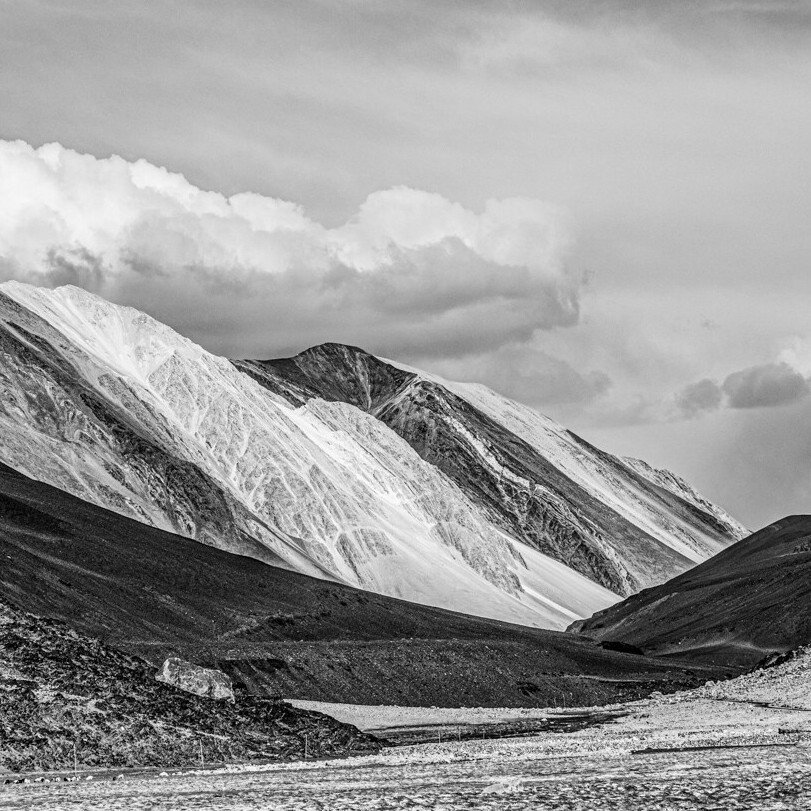
Love both! Since you posted the b&w first, I’ll start with that. Love the contrast and the full range of tones. I really like the grand view of the full frame, although there are almost always viable crops to most images. But I think your original works quite beautifully.
Love the color version as well. Although I prefer the b&w, and here’s why. The colors are wonderful and I like the blue sky contrasting with the warm earth tones of the mountains and slopes. The yellows at the bottom are a nice color contrast and accent as well. But the yellow color also stands out and as such I’m wishing there was a bit more as it feels a little cut off. Sounds like there wasn’t time to do much different, but that’s why I give the b&w the edge.
Composed on the fly whilst driving, i was only thinking of this image as documenting the beautiful drive - especially since in the middle of the day - hence the B/W consideration.
Wow! Such low clouds yet they feel airy rather than heavy from a rain storm. I agree with @Eva_McDermott. The contrast is amazing and very attractive. I could see more space added to the bottom to make that triangular wedge a bit wider.
Hi Karl,
This is my first critique, so I hope I’m doing it right. I love the layers of tones in this image. I wanted to see what it looked like with a square crop because I feel like there’s too much sky. I’m not sure if I like it better than your original, though.