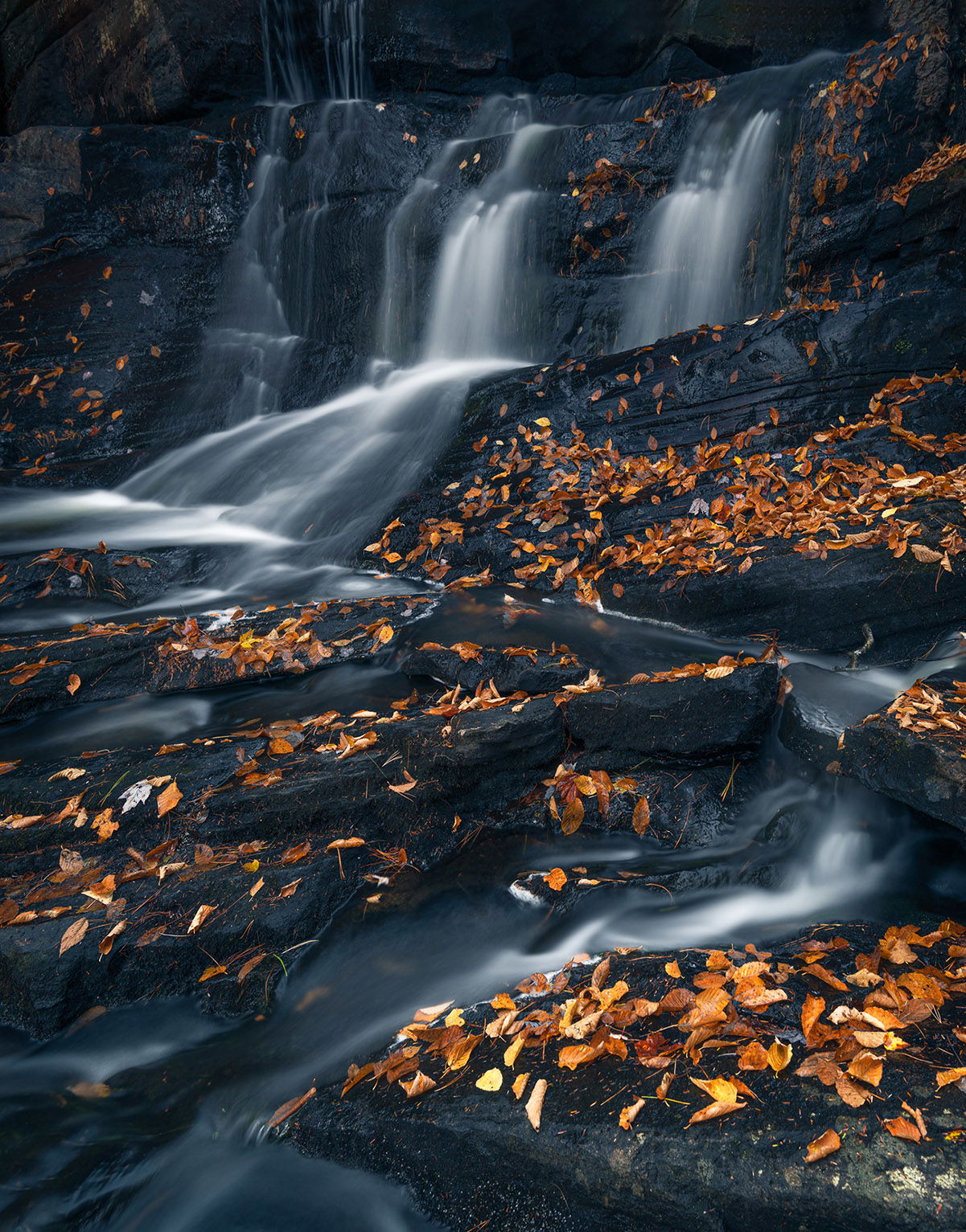
Took this shot of Potts falls in Bracebridge, Ontario, Canada, last fall. It was late in the day and I was drawn to how the fallen leaves looked against the dark granite. I wanted to take more of an intimate close up of the falls, as opposed to the full wide-angle shot.
What technical/artistic feedback would you like if any?
Any feedback appreciated
Pertinent technical details or techniques:
16 mm - 10 sec - f/6.5 - iso 65 - CPL
If you would like your image to be eligible for a feature on the NPN Instagram (@NaturePhotoNet), add the tag ‘ig’ and leave your Instagram username below.
I like the contrast and mood that caught your eye as well as the composition as presented here. I also like that the distribution of leaves helps them be the main subject and the falls become secondary IMO. The top edge of the frame is a very minor negative for me, I don’t have a helpful suggestion though. I looked at a scroll crop and was not convinced it was an improvement.
Regardless, I am enjoying this intimate scene as presented.
Oh, wow, this is gorgeous! I’m a big fan of the golden brown/gray black palette. The angled lines of the falls give a good energy. The only thing that catches my eye is the small patch of dry rock in the ULC. Perhaps if you burned this a bit, so the tonality was more in line with the wet rocks, it would fade into the background.
Magnificent image!!! This is tremendous. Agree with the others about the upper layer/ULC. I personally would crop off the top of the image and let the water fall in from above.
I agree, the leaves are the star of this show, which elevates the image significantly. The color of the leaves is that wonderful yellow/brown that you get from late season leaf drop. The composition is a great illustration of using an S-Curve to move the viewers eye throughout the image. I also like how the S-Curve of the water cuts against the grain of the diagonals in the rocks, it creates some nice dynamic tension in the image.
My only nitpick is the top of the image. The edge of the falls feels very tight to the top edge of the frame, and IMO it could use some more breathing room. If you don’t have that extra space in the original image, here is a rework with Add Canvas and Content Aware Fill to create some extra space.
Both the water and leaves seem once both active and calm.
For me the upper edge is perplexing because it alone has no amber leaves, so I put some there, smoothing the transition to the main body of the image. (along with toning down the ulc rock)
I’m with the group that feels the top should be cropped off. The leaves are so dominant in both color and tone that the upper areas get lost. Crop it off even below the top of the waterfall.
 I’m a big fan of the golden brown/gray black palette. The angled lines of the falls give a good energy. The only thing that catches my eye is the small patch of dry rock in the ULC. Perhaps if you burned this a bit, so the tonality was more in line with the wet rocks, it would fade into the background.