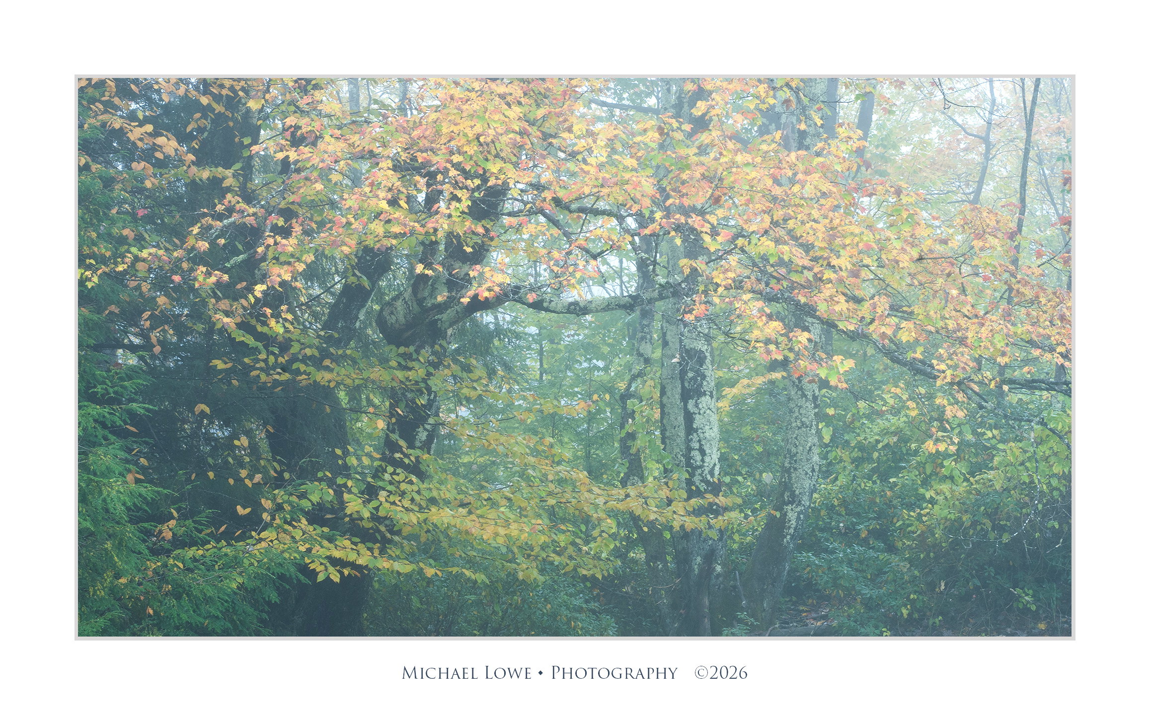
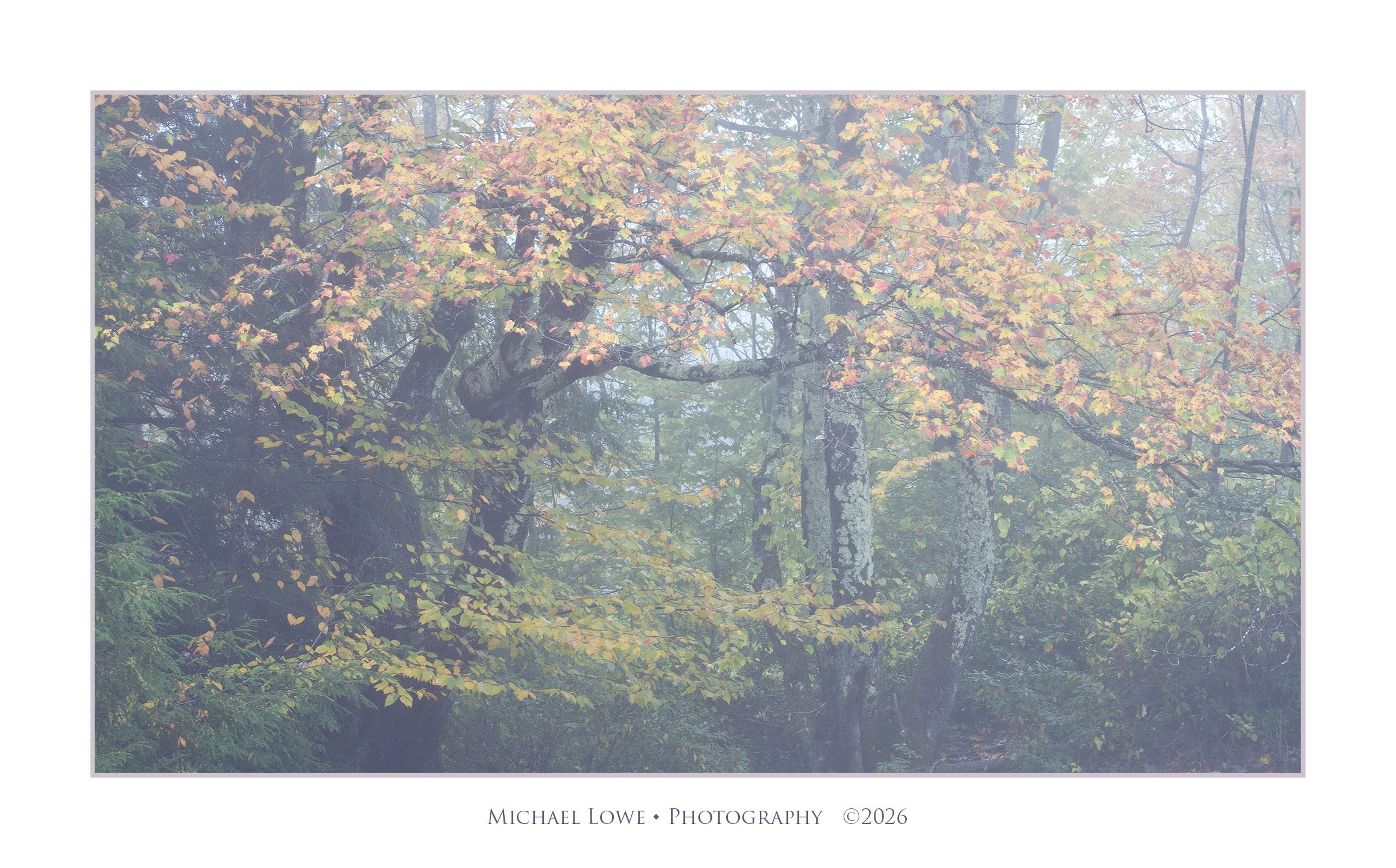
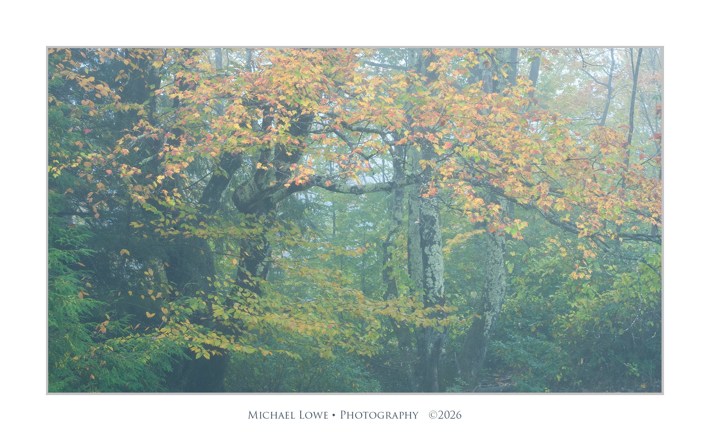
I think the composition is really good and the even light works well. The question I have is whether this is real mist or added in post processing. The reason is because in fog or mist closer objects have greater detail than farther ones. So I guess this is a stylistic choice you made to have everything with the same level of low contrast. It’s personal choice. I do like the colors though. I would like to see it with a bit more contrast. Just to see how it looks.
It’s a lovely forest image, Michael, and think the composition and colours are very nice. I personally have such a hard time making nice compositions out of such chaotic forests, and i think you’ve done very well here.
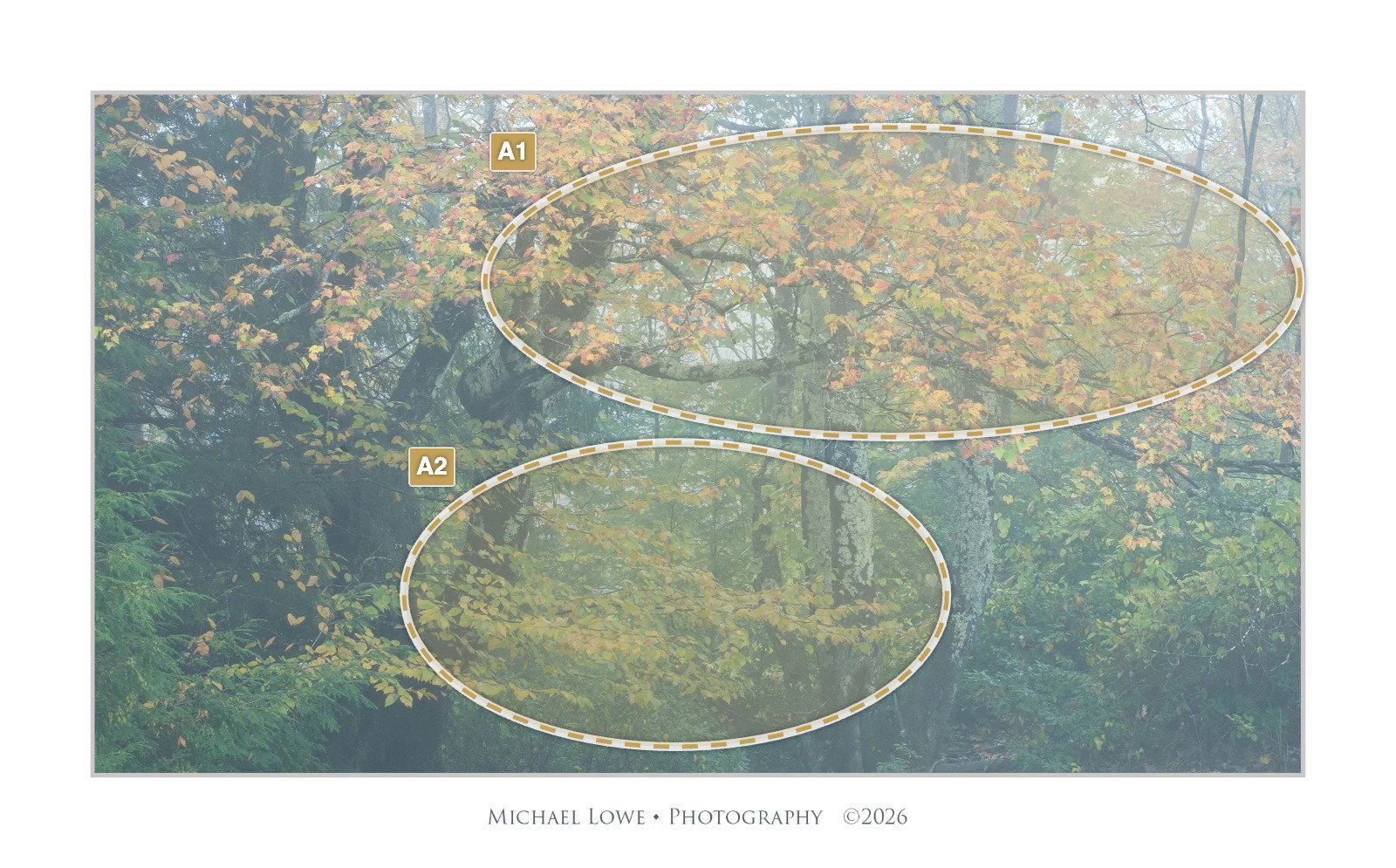
i do agree with @Igor_Doncov re the mist and contrast, and find that if feels slightly unnatural because the foreground matches the background with regards to contrast. I wonder how it would feel with some contrast added to the main foreground elements?
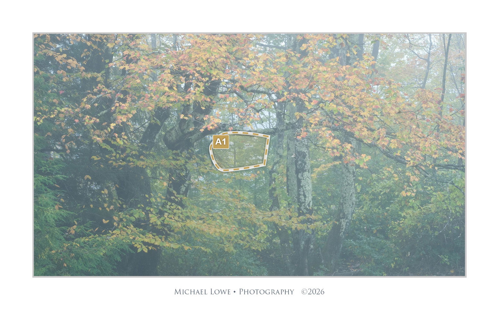
A lovely image, Michael and I don’t mind the uniform misty look. This isn’t a negative, but I found it interesting that when I just sit and enjoy this image my eye is drawn to the indicated hole between the branches even though there’s nothing of special interest in the background there. I wonder if others have the same experience.
Quiet as it is, I think this is just gorgeous!! The contrast doesn’t feel unreal to me but I think it could be interesting to punch up those branches as suggested by @Doug_Wilson . I hadn’t noticed the area that @Dennis_Plank points out but it must be the vertical trunk standing out a bit. Maybe subdue it slightly? I find a lot to explore here, both in the nearer and farther areas, and get a delightful feeling of rhythm and visual interactions.
I like your take on this intimate scene better than mine as your version has slightly denser fog. I seem to remember the light fog/mist moving through the image rather quickly and changing by the second. I do not have a problem with the mist being uniform as I like the peaceful mood. I think it puts me there and lets me enjoy the lush dampness again. My only tiny suggestion would be just a little more saturation as I think it gives that larger branch; full of autumn color; just a little more pop. Maybe something like this. Just my opinion of course as this is wonderful as is.
Michael: Late to the party but not too late to say I like this pretty much as is. The uniform mist was no consideration for me until others commented but after careful meditation I pronounce it marvelous as is. Nicely seen and superbly captured.>=))>
Igor, I downloaded and opened both in PS side by side and to be totally honest with my eyes I really can’t see any difference. I guess my eyes just aren’t good enough to pick up the subtleties. Regarding the sharpness, I uploaded a picture of the original raw file in LR with no adjustments. Here’s a little added.contrast.
Thanks @Doug_Wilson, @Diane_Miller, @Ed_Lowe, @Bill_Fach, @Igor_Doncov, @Dennis_Plank for the comments and suggestions. Doug, I added a revision with more contrast in one of my comments. Dennis, I think it’s because of the “frame” created by the branch and the leaves underneath. Ed, your revision looks good.
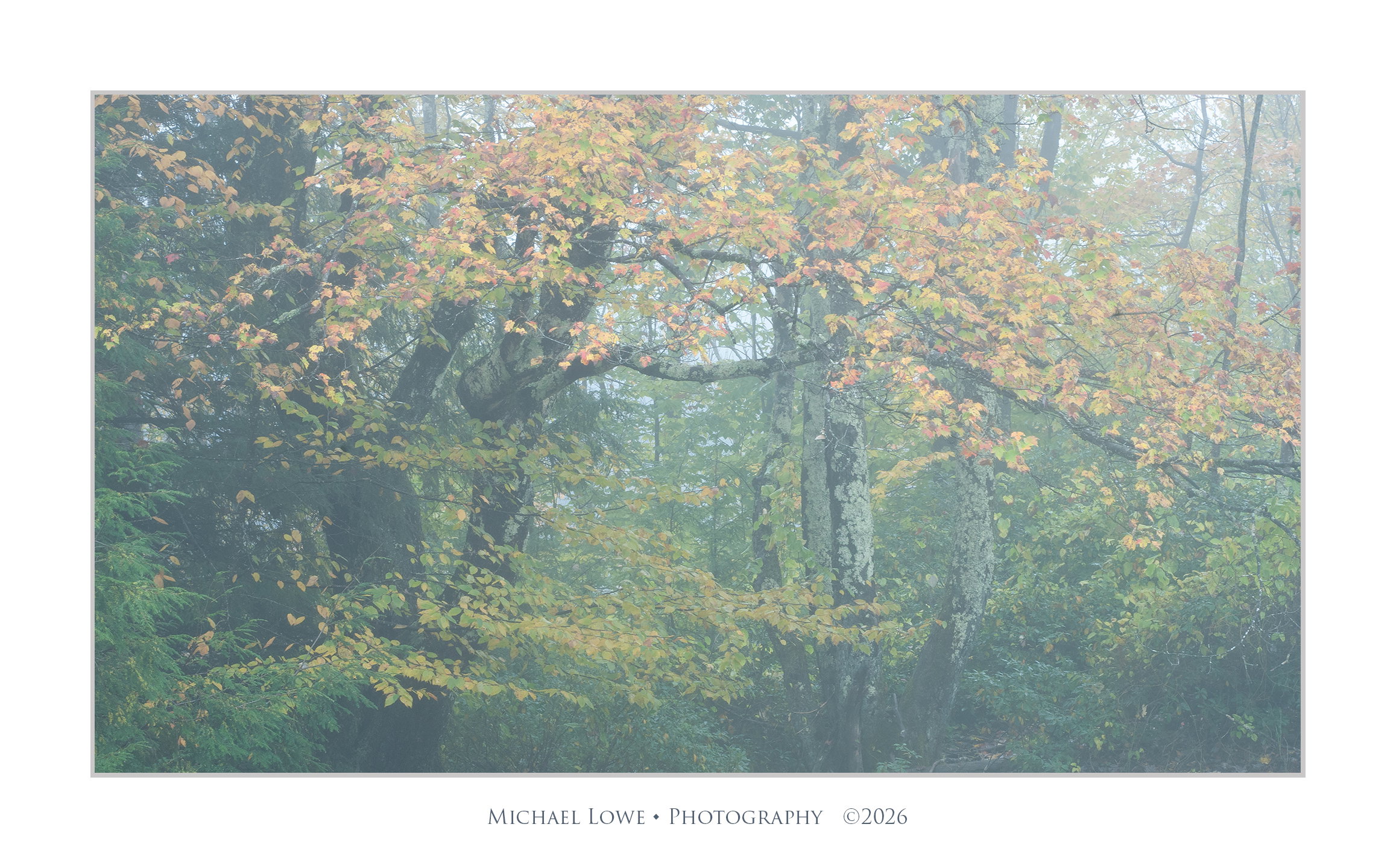
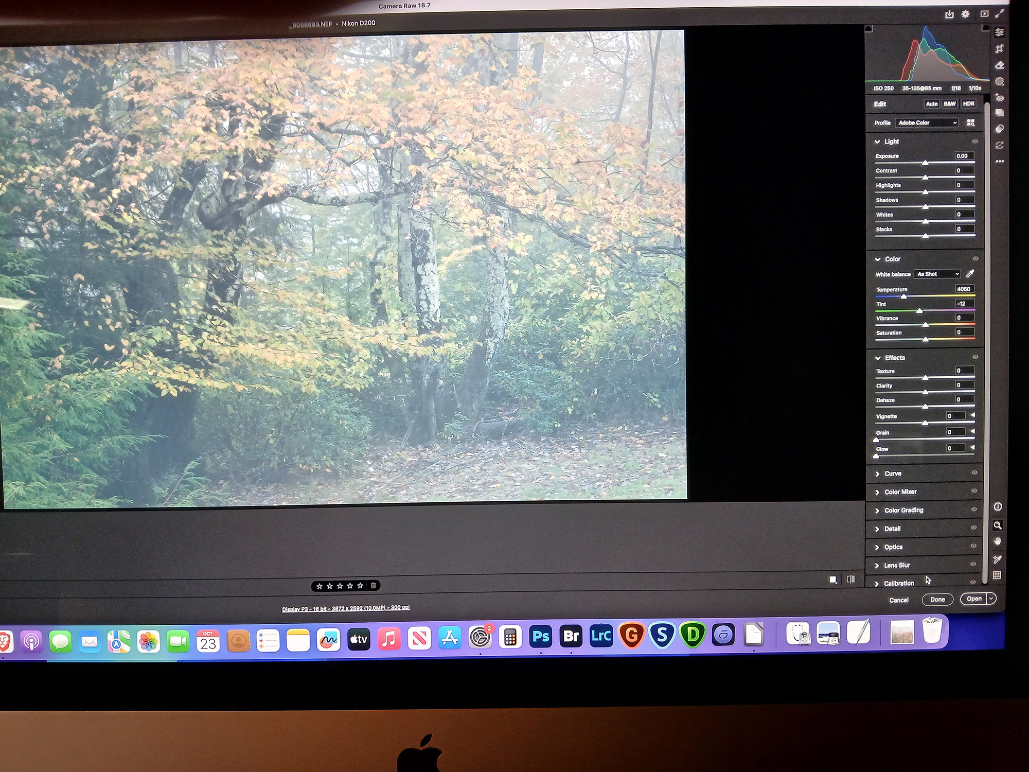

 I really can’t see any difference. I guess my eyes just aren’t good enough to pick up the subtleties. Regarding the sharpness, I uploaded a picture of the original raw file in LR with no adjustments. Here’s a little added.contrast.