Misty Shores (+revised)

Revised Version

Revision 2 (latest)
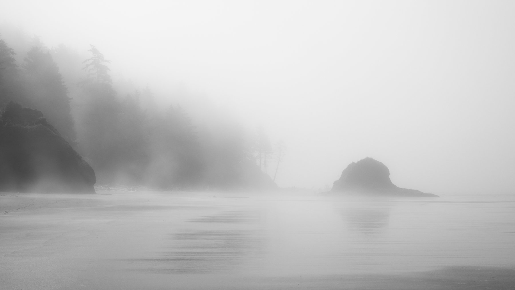
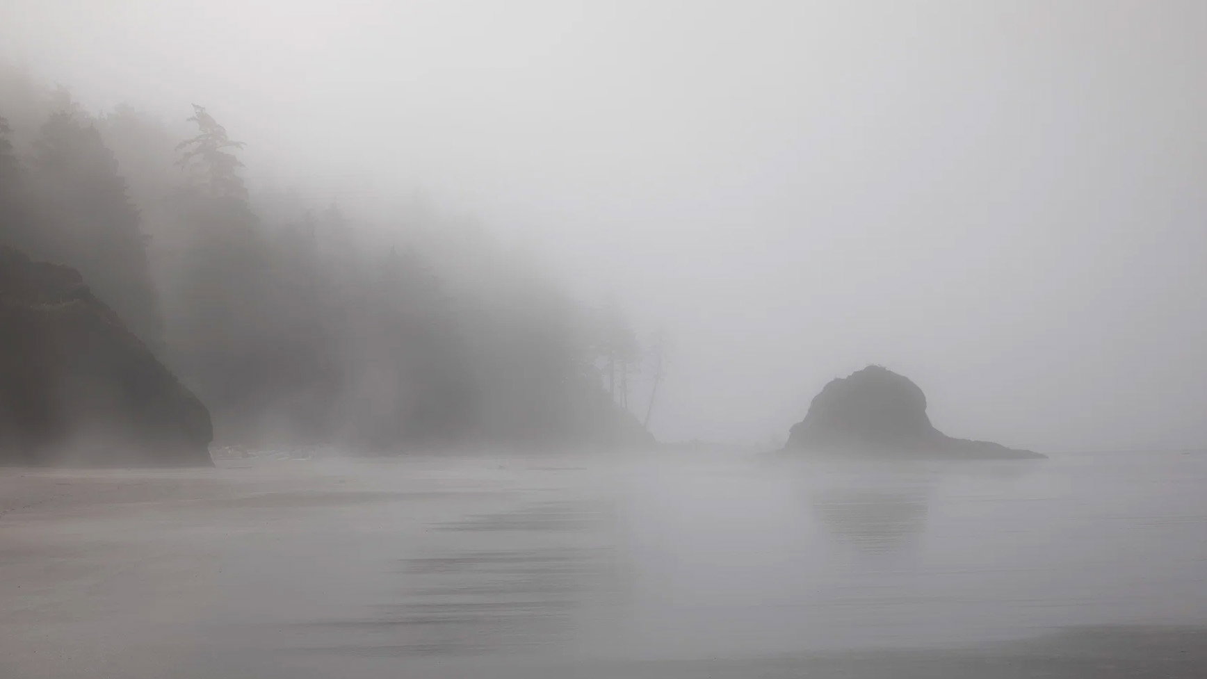
What changed: I did a black and white conversion of the the other revision, and when a bit brighter. I like that it makes it a totally different mood, kind of a different image rather than better. However, I’m always interested in folks’ preferences. ML

Revision 1
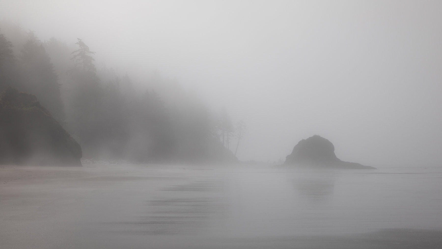
What changed: I removed the two rocks that intersected with the sea stack, did a tiny CCW rotation, and increased the contrast in the left bank a tish. I also have a b/w version I’ll share above this one.

Added after receiving feedback from the community.


Original Version
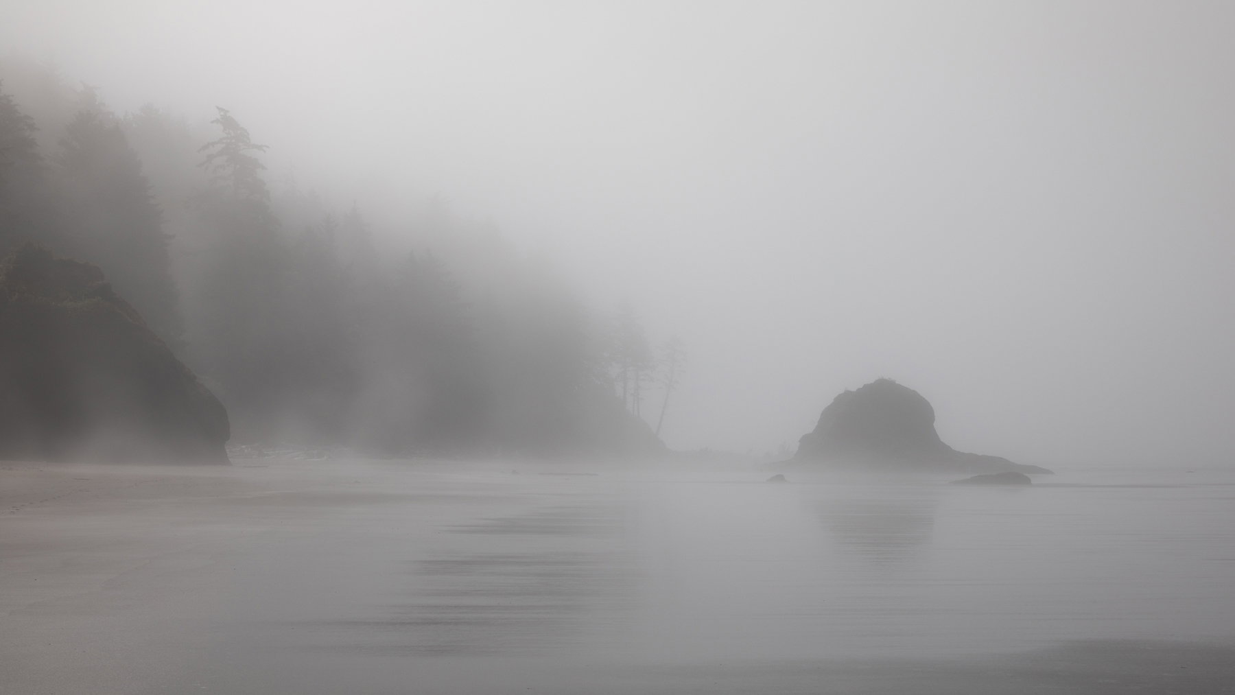
Wider View, Color (but not much there to begin with)
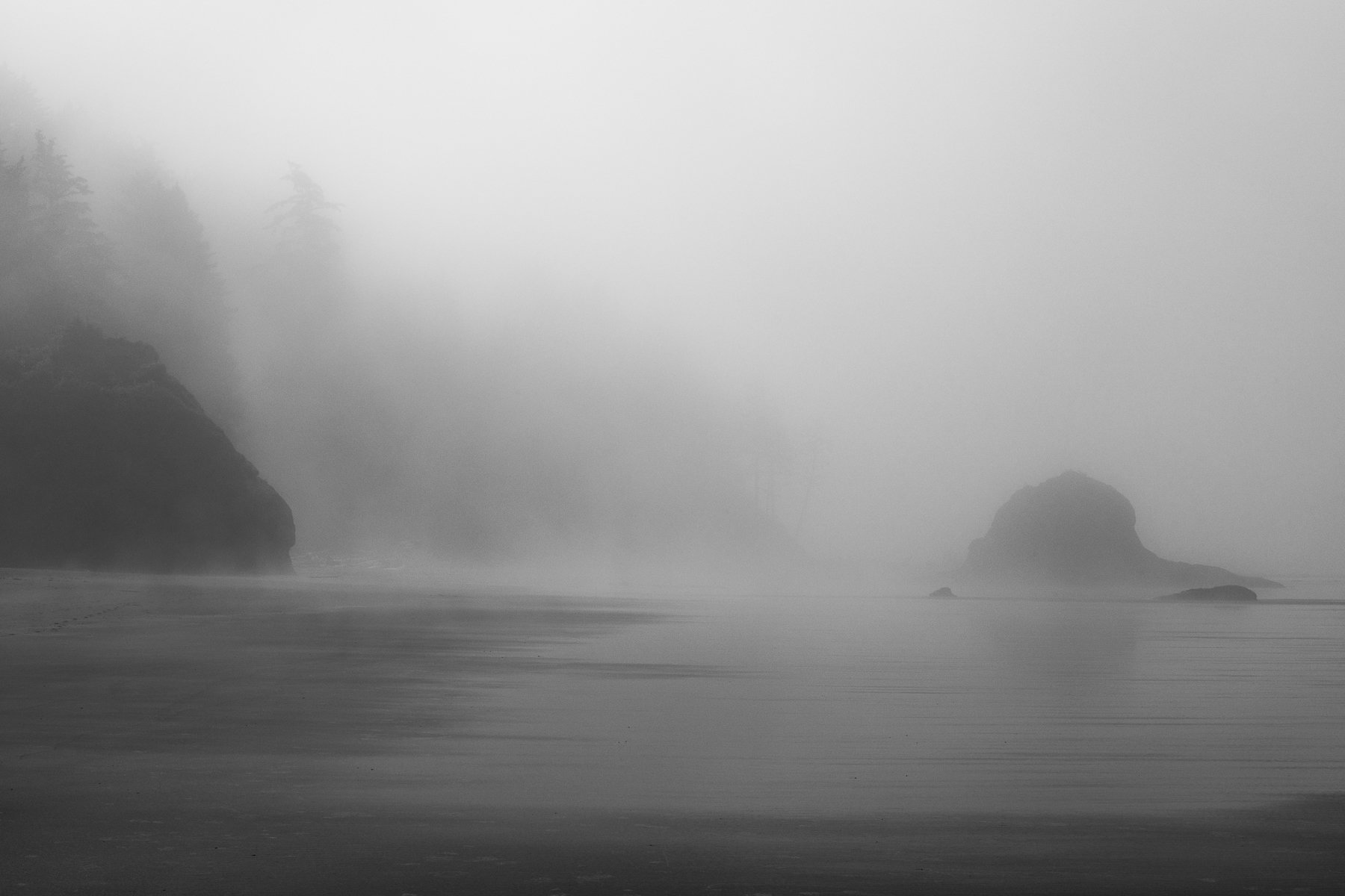
Closer View, Black and White Conversoin

Critique Style: Standard

The photographer is looking for thoughtful feedback on the image as a whole, especially around the areas noted below.

Feedback Focus: Artistic / Expressive

About This Image

These two images are also from Second Beach, in the Olympic Peninsula, but they are facing southward, toward a less iconic sea stack on that beach. I was so focused on the sea stack with trees (posted last week), that when I turned around and saw the washes of mist against the bluff and the sea stack, I kind of ran to get ahead of people who were walking that direction.

Feedback Requested

I was hoping to evoke a sense of curiosity and the damp feeling of walking on a west coast beach while the marine layer is still literally dripping. I associate that feeling with solitude, hence my sprint to avoid people.

I’m always open to any and all feedback. In particular with these two:

  1. Do you prefer the color or black and white?
  2. Do you prefer the closer or wider crop?
  3. Are they too murky or just right for the mood?
  4. Are they level? I struggle with that when on the beach or where a shoreline curves.

Technical Details

Both shot with the Canon 5DIV with 24-105mm, ISO 100 for both (getting wave action earlier)
Wider View: 45 mm, f/18, 5 sec exposure
Closer View/Black and White: 55mm f/18, 1/20sec, LR black and white treatment
1 Like

A wonderful scene and capture!! I prefer the wider version but not sure why – just a little more expansive feeling, I think. I have the feeling of it needing a little CCW rotation. In a scene like this there is no hard and fast clue and it may be an optical illusion so I just go with what feels right. A very nice reward for seeing the possibility!

To me, it’s clearly more colourful and wider.

I really like the various sets of triangles in the image, and the way they relate to one another,

I don’t think it can be regarded as ‘murky’; it looks natural to me just as it is.

I can’t decide whether it’s level or not, so I reckon it’s fine…

Marylynne, I like this one very much.

It’s not level. I suggest using the bottom of the rock on the right as a guide. Water is usually straight.

Unless you’re in a documentary mode, I suggest removing the two smaller rocks on the right. I also thought it could use a hair more contrast. But it’s a good one either way.

Hi Marylynne,

These foggy moody beach scenes just keep getting better and better. While both are quite nice my favorite is the wider more expansive view. I also like the fact that those trees trees down towards the water’s edge; while still being very much surrounded by the fog; are just a little more noticeable. I also love those patterns in the water along the beach. It is certainly not a deal breaker by any means, but I do like the removal of those two rocks in the rework by @Don_Peters. Beautifully done!

Thanks @Don_Peters @Ed_Lowe @Diane_Miller @joaoquintela.

I’ll tweak the contrast a tish, level it, and remove those rocks, I have family visiting so I’m a little slow on things this week.

What do you all think about that lower right corner?

I notice it more on the thumbnail than the full view.
ML

Marylynne,

What great atmosphere and mood! While I certainly don’t get a sense of curiosity (of course I wasn’t there,) but most certainly I feel the cold, dampness and solitude for sure. Even if there was a single person walking in the scene, it would still have a sense of lonliness.

Color vs. b&w??? I honestly didn’t think either was color! But now I do see color in the sand on the left of the 1st image. Personally, you might as well take it all the way to b&w; color isn’t providing any value for me.

Comp wise, the wider view is the clear choice for me. I especially like that few trees visible at land’s end near center frame are more visible. Plenty of fog to elicit the mood, but enough clarity in the trees. OH, I also really like the banded/layered reflections on the beach; a positive element to the overall scene.

As far as the levelness goes, I’m good with as presented. You could tilt it CCW a tad and I’d be fine with that. On the other hand, I know and expect that a beach has a slight slope to the water (most always anyway), and so while it visually looks like it could be corrected, it also feels natural at the same time. Hope that makes sense.

Fine as is.

The LRC is just fine IMO Marylynne.

The original poster added a revised version of their image.

The original poster added a revised version of their image.