Revised Version
Revision 2 (latest)
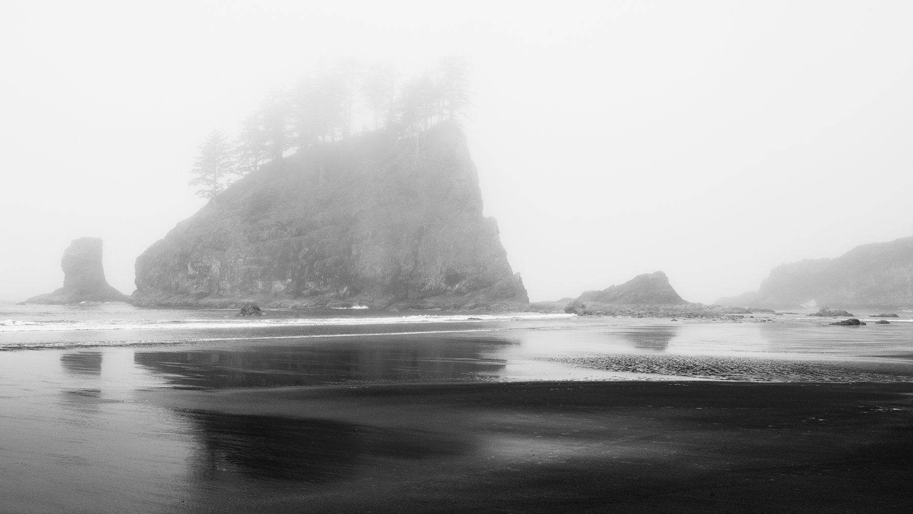
What changed: I also did a black and white conversion: one in LR and one in Nik SilverEfex Pro, which I haven’t used in a couple of years since LR’s BW panel has gotten pretty good. This is the Nik version, a kind of “through a glass darkly” variation that I like as well. It feels moody, moreso than the “hope of sun” I was originally going for. But I like it. Let me know if y’all have a favorite. I’ll move on to other comps from this beach, looking the other direction entirely.
Revision 1
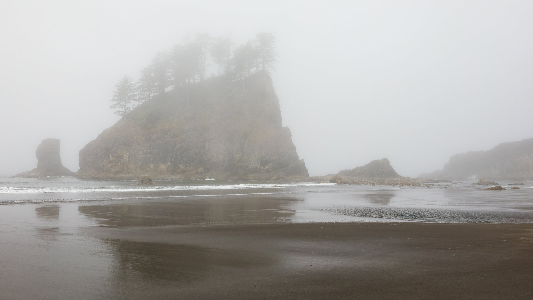
What changed: This is a different frame a few feet closer. I used a linear gradient from the bottom to increase contrast and clarity in the foreground reflections, and I got rid of the “deceased walrus rock” that plagued me from every direction. I also burned the seastack area that had a bright band. Not sure what caused that vertical band, and it was natural, but I found it distracting, like a smear of something on the lens.
Added after receiving feedback from the community.
Original Version
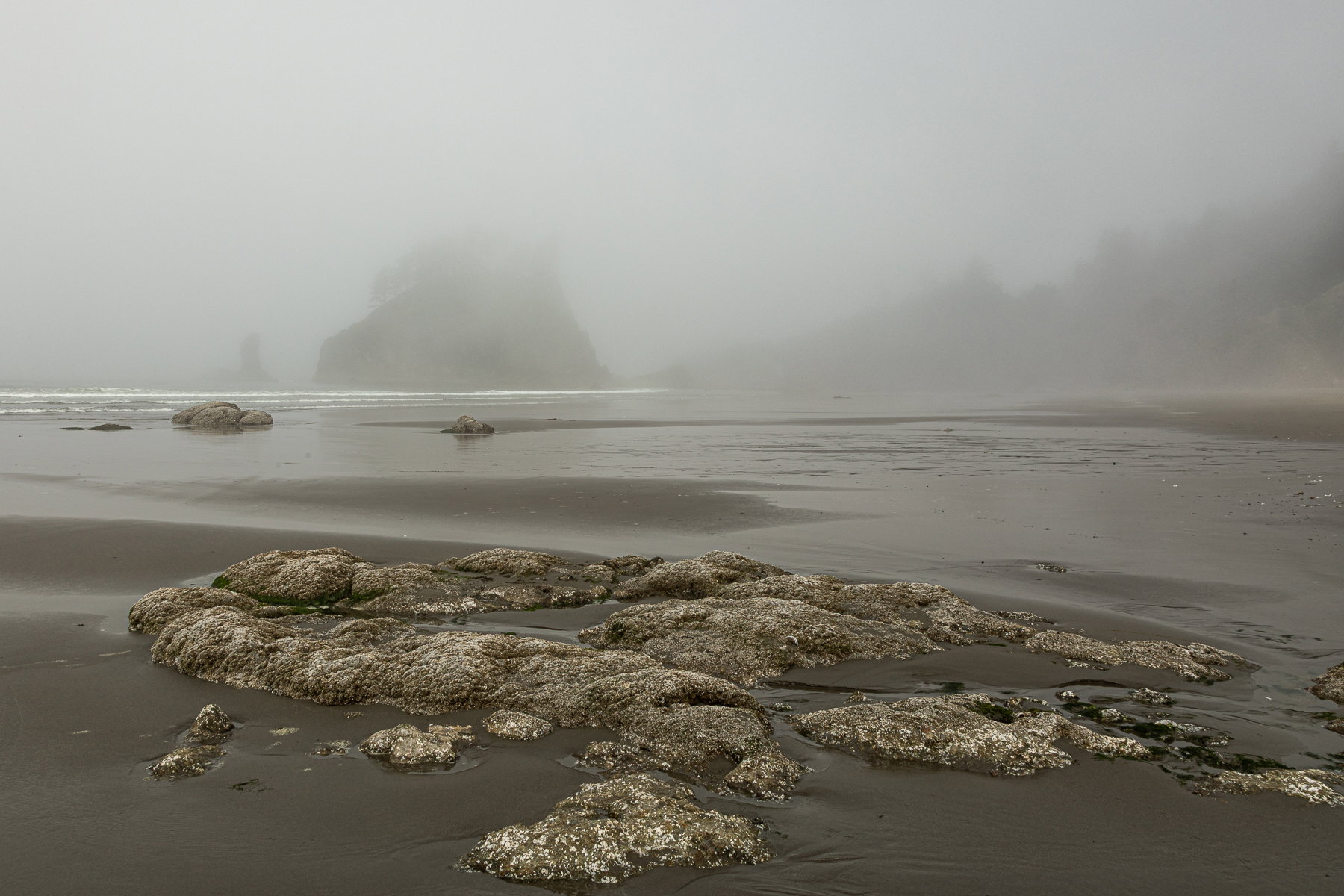
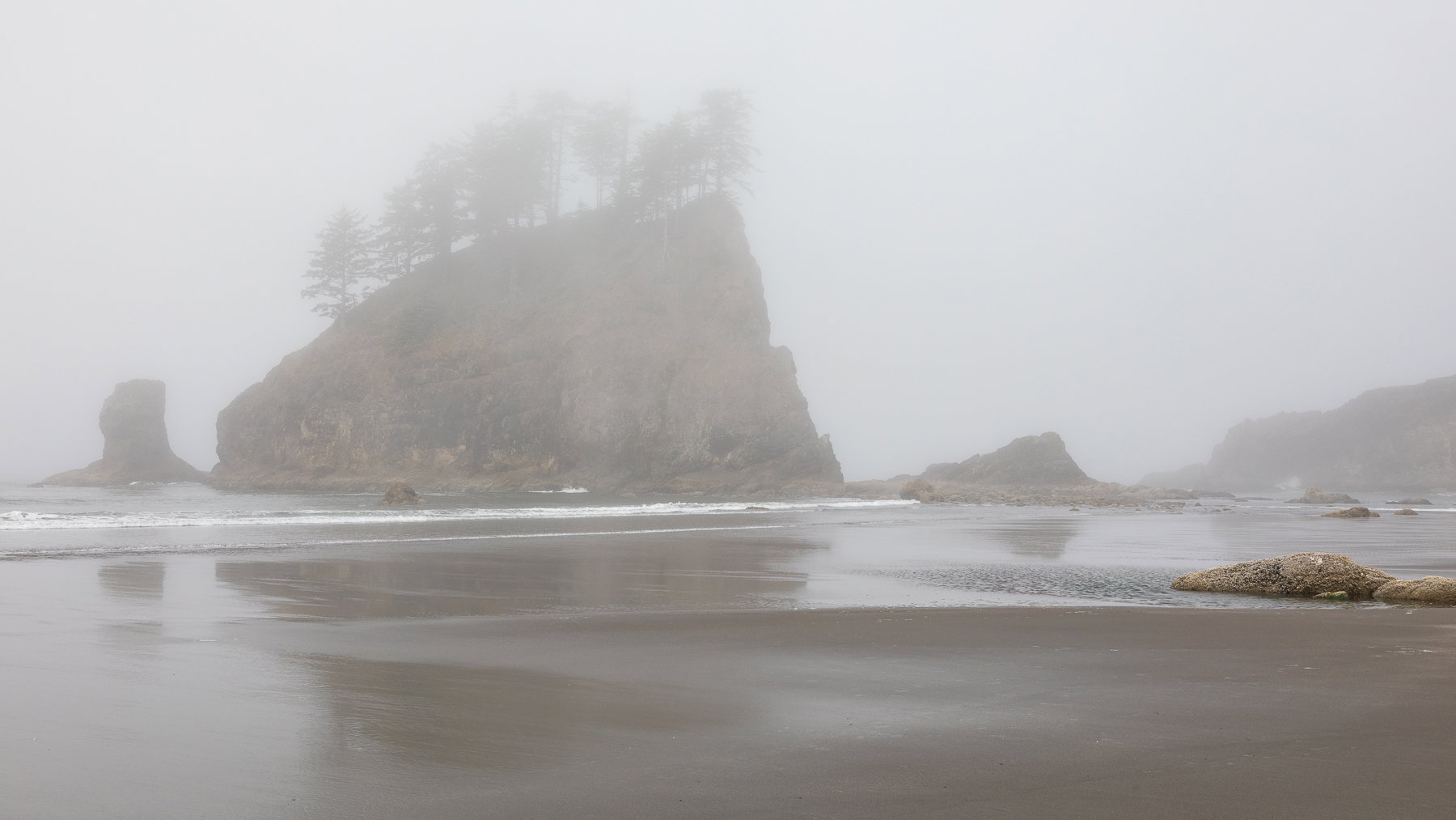
Image 1
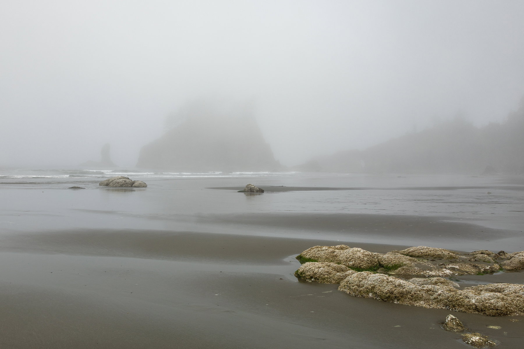
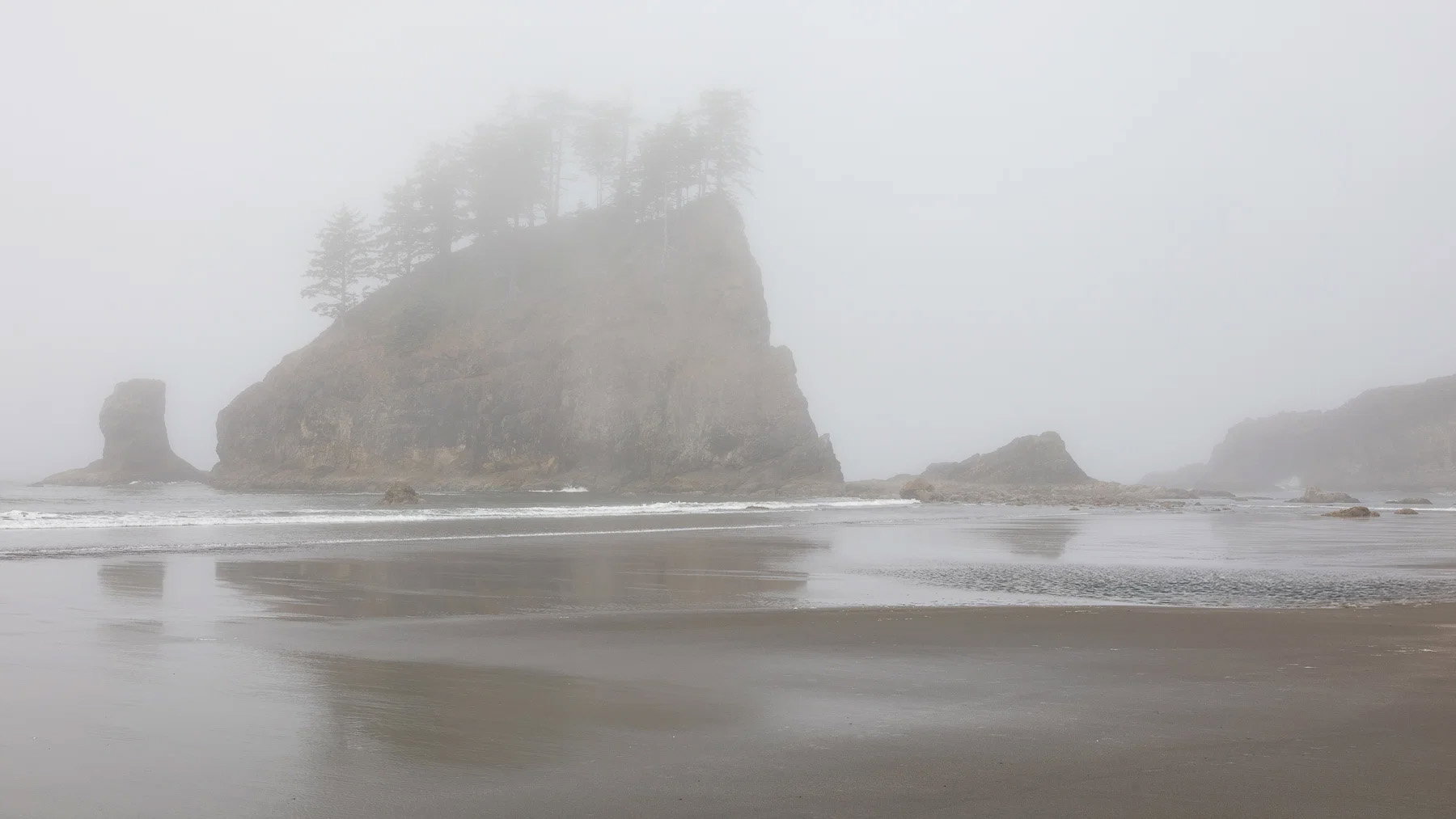
Image 2
The photographer is looking for thoughtful feedback on the image as a whole, especially around the areas noted below.
About This Image
I spent a few days along the beaches of the Olympic Peninsula after meeting up with the NPN PNW regional group for a planning meeting. The conditions were a bit challenging. I found it very foggy most mornings and evenings, and kind of crowded mid-day. I decided to see what I could do with what the day brought me at each of the beaches I visited.
I’m sharing two framings of the main sea stack at Second Beach.
Feedback Requested
Given the foggy conditions, I went for a moody, misty look. It’s not something I’m very good at pulling off. There’s the counterintuitive things about exposure and fog, and then there is also challenge of dialing in how misty and foggy v. clear and contrasty to process it.
Just noticed a small dust spot on both. I’ll clean that up.
As usual, I’m open to any and all feedback, including a yawn of “Oh yeah, icon alert in bad conditions. Just go back for a dramatic sunset.” In particular though, I’m curious about the following:
- Do you prefer one of these compositions over the other? I thought the fg rocks were interesting, but on the computer screen, they feel like a barrier between the viewer and the primary sea-stack. So I’m sharing the alternate framing.
- Does the image work? Hold your interest? Make you feel like you are on a cold, gloomy beach and in awe of the sea stack? It’s been a long time since I’ve done much landscape (been kind of abstract lately). I need a second opinion on whether it’s worth working on more.
- How would you treat the foreground beach/rocks and background ocean/sky/sea-stack when it comes to some basics like contrast, luminosity, clarity, saturation? To me, they each look either a bit green or a bit magenta, so I’m struggling to find the right color temp and tint. SOOC, they felt fairly green.
- Is there a magenta cast to the sky? It showed up after some processing, and I tried to reduce it.
Thanks, as always, for the generosity of your time, and for any feedback or suggestions you can offer.
ML
Technical Details
Canon 5DIV with 24-105mm lens at 24mm in the first image and 32mm in the second.
ISO 100, f/20, 1/50s in the first image and 1/60s in the second image
Processed in LR: Slight crops, linear grad filter adjustments to exposure, contrast, saturation, clarity