This was taken during twilight a couple months ago. The composition caught my eye right away in the field but now I’m not so sure about it. Does it feel unbalanced? What do you all think of the edit so far and direction I’m taking it in?
What artistic feedback would you like if any?
any and all feedback is welcome and appreciated!
If you would like your image to be eligible for a feature on the NPN Instagram (@NaturePhotoNet), add the tag ‘ig’ and leave your Instagram username below.
You may only download this image to demonstrate post-processing techniques.
3 Likes
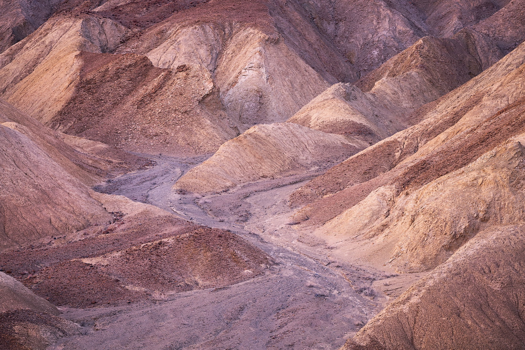
I’d be happy with it as-is, but it’s sure fun to play with crops and watch the changes in how my eye moves through the frame, as well as what parts rise to prominence or drop back. I’m taken with a tiny crop from the top and a stronger crop from the left, which make the stream bed become the focus of the comp. I’d call this a “versatile” composition that starts off well and continues to provide interest as you move around. Not many comps stand up to that kind of examination, but yours most certainly makes the grade.
1 Like
Lovely shot Stefanie, I love the tones, textures and the meandering leading line through the middle. I don’t see anything I would change.
1 Like
It’s good to see you on this site Stefanie!
I like the zigzag in your composition and the soft pastel hues. No suggestions for improvement for me
1 Like
@Hank_Pennington thank you for the crop suggestion and your thoughtful comments on the composition. I kept going back and forth on liking/not liking the comp but I’ve decided this photo is a keeper!
@Blake_Randall Thank you! I appreciate the feedback. I’m worried I added a little too much crunch to the texture and might dial it down a notch…
@Nathan_Klein Hey Nathan! It’s good to see you on this site too my friend! Thanks so much!
Nice composition and I like the overall cast to this image. A slightly different option is a small crop off the bottom to put emphasis on the distant mounds and away from the wash. Not better, but different.
2 Likes
Stephanie, I love your processing here, you have just the right amount of contrast and exposure to maintain a soft feeling that does not compete wit the delicate colors. The pastel colors are very pleasing (especially the pinkish tones), and create a wonderful mood. The composition looks very well thought out, I really like how the wash pulls my eye through the scene, and the semi-X shape that it creates. My only suggestion would be a crop from the bottom, to slightly reduce the amount of negative space at the bottom of the wash. But that is getting pretty nit picky, this is a lovely image as presented.
2 Likes
Stephanie, this looks fine as presented. You’ve got a good mix of meandering wash and eroded hills that balance well. The twillight lets the shapes and textures dominate while the fine mix of warm browns make this quite inviting.
1 Like
Stefanie, I like the composition as is, but as a couple of others have mentioned a slight crop at the bottom might work. I would like to see you dial down the crunchy texture a little bit. Tones and colors are excellent.
1 Like
Stefanie,
This is wonderful! I think it’s finely balanced with the dry wash curving through the eroded formations. Honestly, I don’t see any crops or anything that would make this better.
Processing, tonality, color/WB are excellent as well. Of course this looks like an image where you could take this in many different directions with color and saturation, but I think you’ve handled it all beautifully. I have no nitpicks or suggestions!
Lon
1 Like
Excellent image. I love the soft light and colors combined with a pleasing composition. One very slight adjustment I’d possibly make would be to darken the light spots on the left and right sides just above center. They aren’t a huge distraction, but when I cover those spots with my fingers while viewing the image, it seems to pull my focus more towards the center of the image.
1 Like