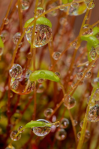
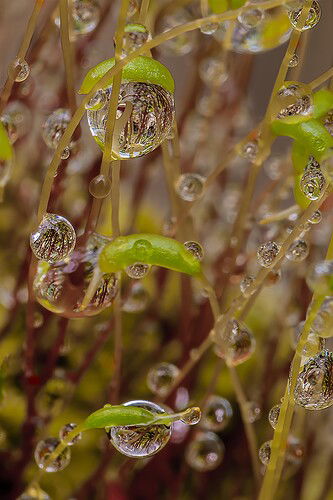
Moss Sprouts After an Overnight Rain Shower

ORIGINAL POST

RE-POST

During a morning walk, I found moss sprouting on top of a broken tree stump. This photo is a small area cropped from my original photo.

I like the red color of the stems, how the water drops reflect/refract the stems and how the one water drop is capped by the leaf.

Specific Feedback Requested

What are your thoughts on cropping out the larger photo to bring focus to the most interesting part. Also, do you feel I have the white balance about right.

All comments are welcomed.

Technical Details

Canon 5D IV | EF 100 Macro w/Extension Tubes | f11 | 1.0s | ISO 100
Processed using ACR and Photoshop

4 Likes

HI David thanks for posting. These types of images are always tricky. Background control can be an issue as its hard to be selective. First of all the white balance is pretty good and I would not worry about that. I agree with you in that interesting as the image is there is a lot going on. The top droplet is nice but the cross over stem does take away from it and its looks difficult to get it from another position. My eye goes down to the bottom droplet and if it was my image I would do a tight crop on that including the droplets behind. I think it’s the strongest aspect but as a general image its quite pleasing to me!

Hi David,
I like that about this shot as well!

The amount of cropping all depends on what you intend to do with the image, web share as it is here, or print it large, keep in mind that this could be printed in 8x10 with good results, I used to print photos from images with less pixel count and files sizes smaller than this with no degradation.
Printing technology has improved quite a bit as well (since the late 90s when I was printing a lot).

It’s hard to tell without seeing the original scene and image.
I always set my camera to a neutral color profile so the camera records the shot with slightly less color than the scene or subject so I can do my own color correction, white balance is difficult even if you pre-set it in the camera, so you’re better off using auto white balance, then adjusting it by the slider in ACR, at least that’s been my experience and what works best for me.

I feel that this image has too much red in it, there’s even a strong red cast in the areas between the stems in the upper portion of the image, that may have been there before but it seems like either a post process effect or maybe the camera caused a little bleed over when it recorded it, or maybe I just think it’s one of those two.
Either way, that red cast makes the image feel as though it’s all shot by a red lamp for lighting the scene and it’s not natural looking.
To me, there’s two things that can cause an image to loose depth, one is too much focus front to back or, two, there isn’t enough color separation between elements.

BTW, I love how you are using long exposures with low ISO settings to do some of these shots! It’s one of my favorite methods even in the field.

I played around with your image and I can’t tell you what all I adjusted, I tried a bit of everything and it was all too much to write or remember.
My goal was to remove the red from between the stems as much as possible but still keep the red stems (with graduated red to yellowish orange).
To me it has more depth and the color separation adds interest to the scene.

I hope this helps, David

Edit: I didn’t use any masks for any of it, just basic adjustments, the color adjustments were done in the Color Mixer HSL panel in Adobe Camera Raw.

Love the shot , too :slight_smile:

Hi Merv,

Wow, what a difference the edits you made make. You found and resolved what was bothering me about this photo, but didn’t know how to articulate.

Thank you very much for your help with this. I will go back and work to make the adjustments to reduce the reds and bring depth to the photo.

David, this is stunning. Simply stunning. While I like what @Merv suggested works, your original version just rocks. What a wonderful image. Well done.

2 Likes

You are very welcome, just glad I could help.
That HSL panel is your friend for this one.

I’d love to see what you come up with so please post a rework whenever you’re ready.
Oh, I forgot to mention that depth is also controlled by having the BG a little darker than the FG (or at least slightly more muted).

Thanks for the response, David! :slight_smile:

1 Like

I finally got around to re-editing my photo and welcome any comments. Using suggestions @Merv made, I sent the photo back to camera RAW and worked with the color mixer to tone down the reds and adjusted the yellows slightly. I also made a small adjustment to the WB.

Wow, David, the repost is really good!!

The BG color is very neutral and natural looking and the color separations are distinct which improves the overall appeal even more than it was before.

I think you done much better than I did!

I really appreciate being able to see your reworked version! So, thanks for posting the reworked version for us to see.

I still like this very much, it has a certain appeal that’s difficult to express in words.
It’s almost like it’s an alien forest on a distant planet.

I just like it :slight_smile:

Thanks again! :slight_smile:

1 Like