The remake

The first image
I did a complete remake of this image(see the first one above) and I am very curious what you find of it.
Specific Feedback Requested.
All feedback is very welcome
Technical Details
Is this a composite: No
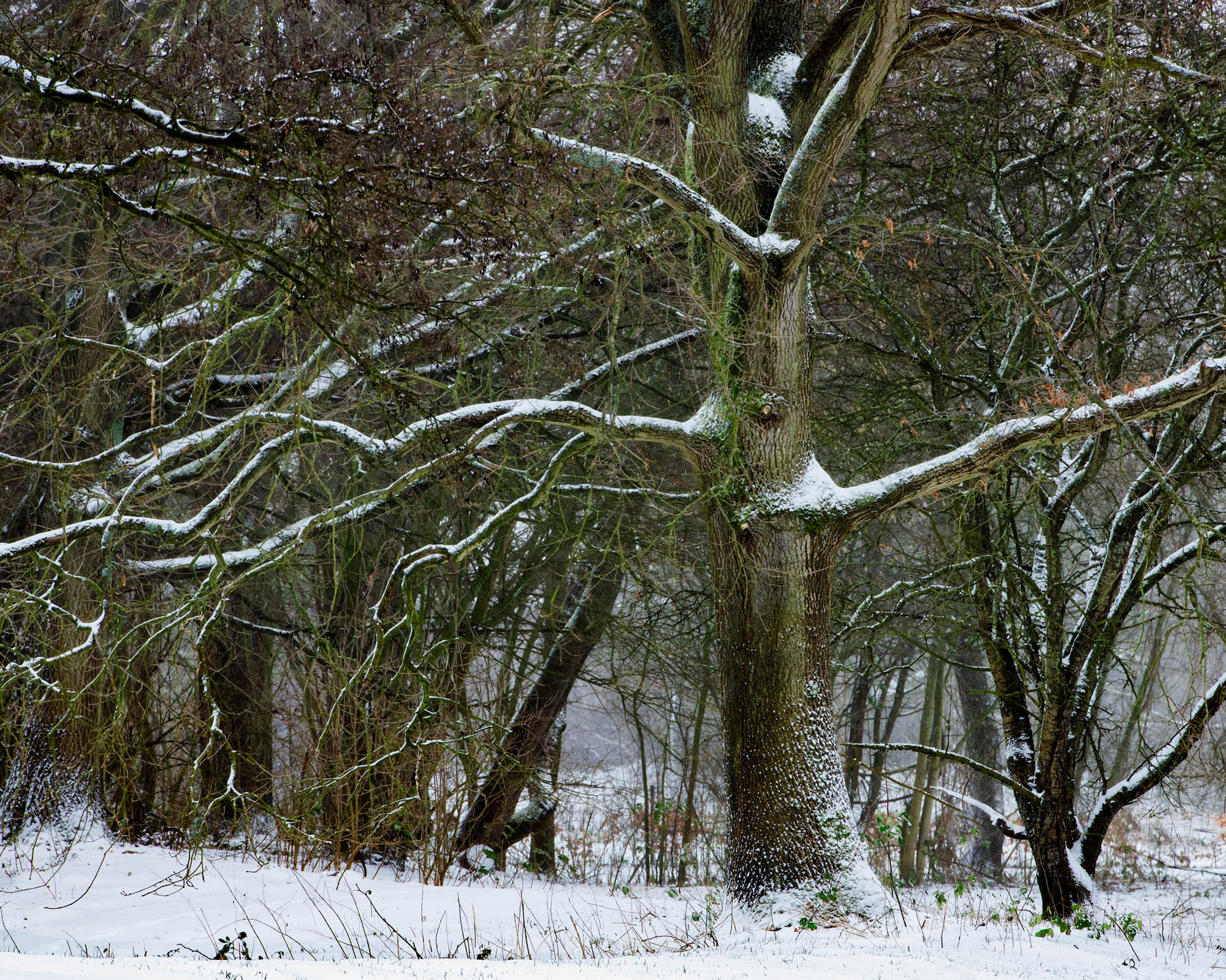
The remake
The first image
I did a complete remake of this image(see the first one above) and I am very curious what you find of it.
All feedback is very welcome
Is this a composite: No
Ben, for comparison purposes I would suggest that you edit this post to also show the prior version, making it easier for people to see what you have done with the current version.
I think this is a much stronger image than the earlier version of this in your prior post. The strong green color cast in the prior image is essentially gone, the whites here are much purer looking. The greens that remain here look more natural. I also like the crop you did that shifts the image to the right, I think it balances the composition better. I like that second tree in the background, the shape of its limbs sort of mimic the shape of the primary tree. The trees here have a very graphic shapes and the snow helps accentuate those shapes. The rework here is a good improvement over the prior post Ben My only additional suggestion would be to slightly burn the highlights in the snow in the LRC.
I agree with Ed, this second version is much stronger. I found the background in the first version to be very distracting and my first thought was to have shot with a long lens with a wide aperture so as to get the “star” of the show to stand out. The second version does a pretty good job of performing the same effect. I might be tempted to a bit more dodging and burning , particularly dodging, as well as a touch more texture/clarity to really pull the tree forward. Because it really is a beautiful tree.
I very much prefer the composition in the remake, but the processing in the original. The remake looks to have that greenish cast previously discussed. Really like the image, though.
Another vote for the remake Ben. The added contrast has lended much more clarity to the scene and while it definitely brings focus to the main subject tree one also has a clearer view of the trees in the background and your title now seems so much more appropriate.
I definitely like the rework Ben. It has a much crisper look with the color cast gone.
I got mixed feelings about this one;
I much prefer the original composition but the green tint does not work for me.
I think the remake is somehow “lost” with the new and improved information.
i would try a B/W version.
Both compositions work well for me, but I strongly prefer it without the green tint.
@Ed_McGuirk , @Kerry_Gordon ,Ed and Kerry Thank’s for your in -depth comments. Which were very helpful . @Harley_Goldman , @Eva_McDermott , @joaoquintela , @John_Williams , @Bill_Crich ,It can all be good as long as the photographer himself is content with the making of the image. I always think it is the beauty of photography, there is few right or wrong as long it is sharp, in balance in composition and color. Thank you all so much !!
@linda_mellor , @Alan_Kreyger thank’s for your likes.